Baume & Mercier Finally Debuts an Interesting Watch
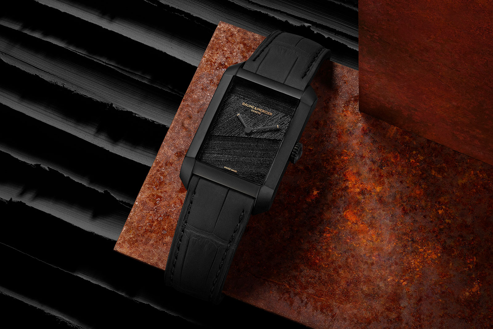
After several years of drift – and a low-priced, Kickstarter-type watch – Baume & Mercier has finally returned with something surprisingly interesting. Based on the brand’s trademark oblong watch, the Hampton “Hommage à Pierre Soulages” is based on reproduces a work by the titular French artist on its dial in textured, three-dimensional relief. With the dial pattern apparent only up close and the case entirely in matte black, the aesthetic is strikingly low key. Like Mr Soulages’ best known works, the dial relies on texture, direction, and the absence of colour, although concessions are made for branding and time telling. Initial thoughts Though some of its ladies’ watches do well in certain markets, Baume & Mercier (B&M;) has had a difficult recent history. While cycling through several chief executives, the brand also launched a great variety of products over the period, but none of them really caught on. But now it has created something unexpected. The concept is straightforward – a dial that recreates a work of art – but it still manages to be original and unusual. Despite its simplicity, the watch manages to capture the artist’s spirit on a tiny canvas. The monochrome finish and emphasis on texture is exactly what Mr Soulages himself is famous for. The retail price of a bit under US$6,000 is pretty steep for a time-only watch powered by a stock ETA 2892, but several factors count in its favour. One is the intrinsic appeal of the watch, and another...
 Time+Tide