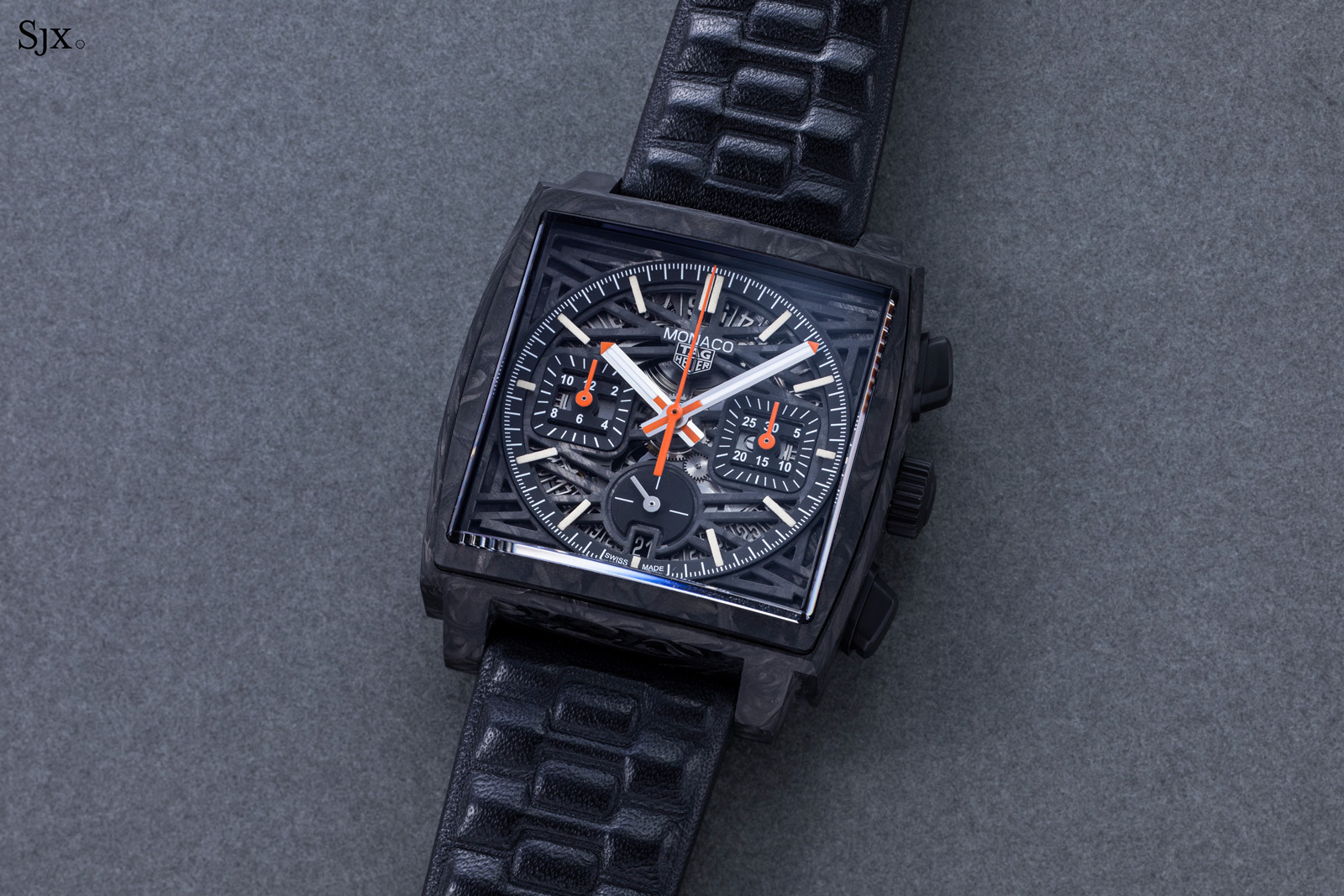
Deployant
Review: Hajime Asaoka Tourbillon Noir (new for 2023)
Hajime Asaoka released yet another of his piece unique tourbillons. This time in 37mm with the same Art Deco aesthetic with a black lacquer dial.
5,348 articles · 998 videos found · page 138 of 212
Deployant
Hajime Asaoka released yet another of his piece unique tourbillons. This time in 37mm with the same Art Deco aesthetic with a black lacquer dial.
Worn & Wound
Brew has been on a hot streak with their Metric ever since the first examples were shown back in the summer of 2021. In the time since, brand owner and designer Jonathan Ferrer has iterated on the basic Metric principles to great effect, adding new dial colors as well as gold and black PVD coated cases that transform the 1970s sport watch in terms of its character and overall presentation. But until now, the Metric had always been built on the same Meca-quartz platform, with a VK68 hybrid movement built by Seiko that allows for quartz timekeeping and a mechanical chronograph operation. Today, Brew unveils the Metric Automatic, the first Metric powered by a mechanical movement, and the first non-chronograph in the line. A lot of the design cues here will feel very familiar to Metric owners and longtime Brew fans. The 1970s vibes of the original Metric (as well as watches like the Retrograph and Retromatic) really come primarily from the case, which in the case of the Metric resembles a rounded square, with a bracelet that appears to be integrated to the case. The size is also key – the Metric Automatic comes in at the same svelte dimensions as its Meca-quartz counterpart, with a diameter of 36mm, a lug to lug span of 41.5mm, and a case height of just 10.75mm. It’s a refreshingly compact design, and really does feel like a vintage watch on the wrist. For this first mechanical Metric, we get a simple black dial with chunky hour markers and Arabic numerals counting off...
Hodinkee
Glashütte Original reimagines its Senator Chronometer crafted in white gold with a hand finished dial in shades of silver and blue – complete with haptic feedback!
Deployant
Seiko continues to focus on their high end King Seiko, and releases a new reference with a Edo-kiriko style geometric dial. Here is teh SJE095.
Time+Tide
Glashütte Original is back with two new limited edition variants of their retro-inspired Seventies Chronograph Panorama Date The rounded-square TV case recalls the freewheeling fashion aesthetic that dominated the 1970s Two matte lacquered dial choices are available, a pale ochre and a muted grey-blue The latest offerings from Glashütte Original conjure up nostalgia-fuelled visions of … ContinuedThe post The Glashütte Original Seventies Chronograph Panorama Date “Golden Bay” and “Ocean Breeze” limited editions are a retro holiday from the ordinary appeared first on Time+Tide Watches.
Video
Hodinkee
Taking the form of the Aquis diver, this follow-up features a shimmering green dial inspired by the waters of the salt marshes along the Wadden Sea.
Revolution
Get up close with our newest limited edition in collaboration with NOMOS Glashütte, the Nomos × Revolution Tangente neomatik 41 Update ‘Resilience,’ featuring the Fibonacci sequence, a symbol of growth and resilience, subtly integrated into its minute track. For a sleek, pared-back aesthetic, it has a midnight blue dial with white indexes and hands and […]
Time+Tide
The Longines HydroConquest GMT departs from the cult-classic look for a more familiar case shape. The green and brown dial options are especially sumptuous, with gold details and colour-matched date wheels. The new GMT design may be divisive among HydroConquest fans, but will certainly attract a wider audience. Longines are one of the biggest players … ContinuedThe post Does the new Longines HydroConquest GMT signal a collection redesign? appeared first on Time+Tide Watches.
SJX Watches
Seiko has unveiled a limited-edition iteration of its vintage-inspired timepiece, the King Seiko. The King Seiko SJE095 features a textured dial adorned with a uniquely Japanese motif-a geometric pattern known as kiku tsunagi-mon inspired by the chrysanthemum flower. Save for the patterned dial, the limited edition maintains the compact case profile found in the King Seiko SJE089 and SJE091 was earlier this year. Initial thoughts While the latest King Seiko models have a notably streamlined case, the stylistic resemblance to the original from 1965 bordered on being a vintage remake. Fortunately, Seiko has decided to create a standout iteration (albeit a limited edition) that, as is often the case with Seiko and Grand Seiko, pays homage to Japanese culture in the dial decoration. The highlight is the intricate geometric pattern on the dial. Besides evoking traditional Japanese cut-glassware, the engraving possesses a degree of elegance, while upholding a sense of balance in the dial. The balance could have been improved if the date window were absent, allowing the engraving to run uninterrupted across the dial. This limited edition carries a price of US$3,400, just US$100 more than the standard King Seiko. The small difference makes this a no-brainer over the regular production model, though it can be argued this is somewhat pricey in absolute terms for a mid-range Seiko model. Rooted in tradition This limited edition draws substantial inspiration from the chrysanthe...
Hodinkee
The brand dresses up their iconic pilot's chronograph with a cool grey dial for this US exclusive.
Video
WatchAdvice
Pros Unique sapphire crystal The cool Ceramos bezelSkeletonized dial Cons Crown operations can get trickyCombining Square faceted sapphire crystal and Skeleton dial can get busy.Design cues for the DiaStar are not for everyone. Overall Rating: 7.75/10 Value for money: 7.5/10Wearability: 7.5/10Design: 8/10Build quality: 8/10 Rado’s iconic DiaStar model gets another update following last year’s 60th anniversary of the DiaStar edition, getting a case material change from hard metal to Rado CeramosTM and a one of kind Square faceted sapphire crystal. The Rado DiaStar was first introduced in 1962, and what an introduction it was. A milestone for the watch industry, the Rado DiaStar came with a ‘funky’ design and, more importantly, a scratch-proof case. Rado designed the very first DiaStar as a ceramic timepiece with a material called “tungsten carbide”. Although some people may argue that it’s not ceramic, tungsten carbide is considered ceramic, at least by the American Ceramic Society. This is important because no timepiece at the time of DiaStar’s debut could offer a scratch-proof watch. When it comes to material innovation, the Diastar in ceramic was a breakthrough for the watchmaking industry. In modern times, the use of ceramic on timepieces is a more regular occurrence; however, for the industry as a whole, brands didn’t get on board with this material till around the 1980s. This highlights how far ahead in terms of material expertise and usage Rado wa...
WatchAdvice
The chance to experience the latest 3 day Radiomir from Panerai was too hard to pass up. But how did it hold up, especially comparing it to the 8 Giorni I road-tested a month or so ago? What We Love Vintage styled design aestheticSlim case profile sits flush to the wristTextured dial and aged lumed numerals What We Don’t Thick strap is a little chunkyNo see through caseback3 Day Manual Winding Overall Rating: 8.875/10 Value for money: 9/10Wearability: 9/10Design: 8.5/10Build quality: 9/10 Back in June, I was able to experience the new Panerai Radiomir 8 Giorni that the brand released for Watches and Wonders this year. I was immediately drawn to the distressed look of the eSteel and the blue smoked and textured dial. Check out my review of it here for the full details. So when the opportunity came up to wear the Tre Giorni (three day) version for a couple of weeks, and be able to compare directly to the 8 Days variant, I jumped at the chance. And what better place to photograph a watch with nautical and Navy roots than down by the bay and marina! Seemed fitting to take a naval inspired watch to the marina for some photos First Impressions Now, the differences between the Tre Giorni and the Otto Giorni are not huge, and other than the movement’s power reserve, it’s basically aesthetics. But then the look of a watch is a major factor when it comes to what you choose. It either looks good and resonates with you, or it doesn’t. The first impression of the Tre Giorni is ...
Time+Tide
The Bovet 1822 Récital 23 is advertised as a women’s watch, however it can suit any lover of opulence. The Writing Slope case angles the dial towards you for easier reading. The moonphase display only needs adjusting every 122 years, and the twin-barrel movement offers 62 hours of power reserve. Bovet are a brand with … ContinuedThe post The new Bovet 1822 Récital 23 in green and blue is a visual extravaganza for the wrist appeared first on Time+Tide Watches.
Revolution
An up close look at Grail Watch 9: Moritz Grossmann x Kari Voutilainen Benu 37 ‘Silver Bullet’. The 37mm white gold case measures 46mm from lug to lug and features a captivating sterling silver dial adorned with intricate guilloché with Clous de Paris motif and Breguet numerals. It is complemented by one of the world’s […]
Deployant
Bell & Ross adds a green dial to their BR 05 Chrono in Steel to 11 watches in the collection. Available with a steel bracelet or a green rubber strap.
Video
Deployant
Swatch release four new references in Bioceramic in a square case in black, gray, green and beige (blue dial). Introducing the BIOCERAMIC WHAT IF?
SJX Watches
As the Summer Olympics in Paris approach, Omega introduces a special edition of the Seamaster Diver 300M. Limited editions for the event are a given, but this latest Olympic edition is dressed in unusual livery for a Seamaster. The brand’s Moonshine Gold alloy is used for bezel, while the dial is bright white ceramic. Initial thoughts Considering Omega’s long association with the Olympics stretches back 91 years, the number of limited editions for the games is numerous. Many were regrettably rather mundane in design, featuring the customary dial colour changes and Olympic markings. However, this particular edition stands out with its lighter tones, a departure from the typically dark hues of Omega’s dive watches, which was also the usual look of previous Olympic editions. And because this is an Omega, the colours are as much about aesthetics as materials. One aspect that particularly appeals in this release is the Moonshine Gold bezel. The golden insert complements the white ceramic dial and the stainless steel case and bracelet. This gives the watch a sense of visual luxury, making it different from the typical diver special edition without being gimmicky, which arguably gives it more longevity in terms of style. The price of this special edition stands at US$8,700, notably higher than the standard steel model, which is rationalised by the gold bezel no doubt. It will only be available, for the moment, at Omega boutiques in Paris. That said, the brand has not yet ...
Worn & Wound
Most dive watches we come across qualify as such thanks to a chunky bezel, gobs of lume on the dial, and halfway decent depth rating. Vulcain, never keen to adhere to the well beaten path, took a different approach with their diver, the Nautical Cricket, and it shows at first blush. The impressive depth rating is there, sure, but the rest of the formula kind of goes out the window. It’s an approach I’d love to see more of in modern divers, and am thrilled to see Vulcain return to the concept 60 years after the original, and 10 years after the first attempt at resuscitation. It’s entirely confusing at a glance, and even if you know what you’re looking at, it still might require an explanation. The new Nautical Cricket is the latest chapter in Vulcain’s modern resurgence. The Nautical Cricket is, as you may have guessed from the name, an alarm watch, which can be set via the thin 4th hand with bright red tip. While unique, that’s not the most unusual element to this watch. That would be the inner portion of the dial, which is littered with rings and number sets and a long thin aperture which reveal further sets of numbers when turned. These tables are used in conjunction with the alarm timer, and if used correctly, will give you the length of your decompression stops at 3, 6, and 9 meters on your ascent. How this works exactly is a bit trickier to decipher, but makes the watch all the more interesting as a dive tool. Things begin with the planned length of your...
SJX Watches
Longines marked a historical milestone last year with the well-received Master Collection 190th Anniversary, a watch that combines classic good looks with a modest price tag. Now the brand has taken the same styling and applied it to another model to create the Master Collection Small Seconds. The Small Seconds makes its debut in a pleasing variety of dial colours, including a fashionable “salmon”. As much of a value proposition as last year’s anniversary model, the Small Seconds retains the same aesthetic as its predecessor but with a subsidiary seconds at six that gives it a more retro feel. But because of the small seconds, it becomes a noticeably thicker watch. So even though it looks much like the anniversary edition, the Small Seconds feels different. Initial thoughts The Small Seconds is largely identical to its centre-seconds counterpart, so it has much of the same appeal. The design is a pleasing vintage style with all the right elements like Breguet numerals and leaf-shaped hands. Admittedly, the styling is somewhat generic – it’s vintage inspired rather than a remake – but the result is appealing, especially considering its affordability. Although the watch is clearly an industrial product, the details are done well, the engraved numerals are especially attractive. This is especially so on the anthracite and salmon dials, which have the numerals in contrasting plating. The anthracite dial is especially striking because it is a relatively uncommon co...
Worn & Wound
Origin stories in this hobby influence the rabbit holes we follow. My story began when I learned not all modern watches have batteries. The simple idea that mechanical watches were still being made, sold down the street from me, and could run for years without intervention blew my mind. Partially because it was mechanically impressive, but mostly because of how unnecessary it was. The concept of dozens of components interacting to move hands around a dial, when a perfectly functional watch can be purchased at the grocery store for $20, resonated with me. My discovery of these rebelliously absurd contraptions came at a time in my life when I had two kids in daycare and income was not disposable. My first mechanical watch was a one-handed Luch, a watch I loved dearly, and purchased for about $50. I didn’t care about finishing or accuracy, just that I had something unnecessarily complicated strapped to my wrist. Years later, my philosophy hasn’t changed much. When considering a new watch, I always ask myself three questions: What does it do? Does that thing excite me? Is there anything about the watch that doesn’t excite me? That third question is the one that keeps my collection and budget in check. The answers I come up with, always rooted in my original fascination with accessibly priced mechanical timekeeping, have surprised me. Some are movement specific, and others centered around design. Photo by Nathan Schultz So, to kick off a two-part series where I will try n...
Video
Time+Tide
The Raymond Weil Freelancer Pop Bi-Compax Chronograph adopts the light blue trend in style. Its bright contrasts, moody dial and name take influence from pop music. Between the dial, case and bezel, there’s a lot of interesting texture. The Raymond Weil Freelancer Chronograph has always been a laid-back, go anywhere, do anything watch. The new … ContinuedThe post The Raymond Weil Freelancer Pop Bi-Compax Chronograph is a high-contrast proposition with a titanium build appeared first on Time+Tide Watches.
SJX Watches
Having made a specialty of artistic Super-Luminova that began with the Moomin in 2020, Finnish independent watchmaker Sarpaneva now applies it to a motif inspired by the water spirits of Nordic folkore. The Sarpaneva Näkki has a hand-finished dial open worked to create over 650 apertures that are then filled by hand with luminous paint, creating a multi-coloured scene – with the brand’s trademark moon phase looming overhead – that is best appreciated in the dark. Initial thoughts The Näkki is quintessential Sarpaneva in combining the art and history of its home region along with the brand’s distinctive design. Though its style is similar to Sarpaneva’s past models, particularly last year’s Nocturne, the Näkki is more elaborate in terms of dial decoration and finishing. In fact, unlike past Sarpaneva models with Super-Luminova dials, the Näkki is almost as colourful during the day as a result of the pigmented lume that still has colour even when not luminescent. Dial aside, the rest of the watch is identical to the standard Sarpaneva automatic, which means a high quality case and customised movement with an especially elaborate rotor made in-house. Though the movement itself is outsourced and no-frills, the execution of the rest of the components is high quality. At €21,000 before taxes, the Näkki is amongst the most expensive Sarpaneva watches. The price is arguably justified by the complexity of the dial, though it is probably close to the price ceiling...
Hodinkee
A vintage pièce unique Patek dial is the perfect inspiration for this collaboration.
SJX Watches
Parmigiani Fleurier has again partnered with Singapore-based Sincere Fine Watches, resulting in the Tonda PF Micro-Rotor Steel Pacific Blue SHH Edition. Conceived for the retailer’s independents-focused store, Sincere Haute Horlogerie (SHH), the watch features a unique, light blue hue for the barleycorn guilloché dial, while retaining the characteristic integrated-bracelet design and an ultra-thin automatic movement. Initial thoughts The Tonda PF has been a crowd favourite due to the fact that it’s an original take on the popular integrated bracelet design, while also having excellent proportions. At the same time, the barleycorn guilloché dial arguably boasts amongst the finest engine turning on a sports watch. So a new shade for the dial is a welcome thing, since it adds an good looking option to an already appealing watch. However, I would have hoped for something more distinctive to set apart the SHH Edition beyond the dial colour. Another guilloche pattern for the dial, for instance, would have made it truly stand out. While the standard model has proven extremely popular – Parmigiani has since unveiled many complicated iterations of the model – it is nice to see that this will only be produced in a limited quantity, adding a level of exclusivity to the new dial, which will surely be appreciated by clients of SHH. Priced at around US$27,000 before taxes, this carries a 10% premium over to the regular-production version. Considering that this is a limited ed...
SJX Watches
Citizen’s flagship mechanical dive watch gets an upgrade with the Promaster Mechanical Diver 200m “Fujitsubo”. The new “Fujitsubo” diver features a gradient-finish grey dial, but its standout feature is the case and bracelet in the brand’s proprietary hardened titanium alloy coated with diamond-like carbon (DLC). Initial thoughts Sometimes underestimated, Citizen’s dive watches don’t garner as much attention as those of its competitor Seiko, primarily due to the scarcity of mechanical dive in Citizen’s lineup. Most of Citizen’s dive watches are solar-powered or quartz. Nevertheless, the Japanese watchmaker has recently taken significant steps towards boosting its mechanical offerings, particularly with the introduction of the oversized and modern Promaster 200 m diver. The “Fujitsubo”, on the other hand, takes inspiration from the Challenge Diver of 1977, explaining its vintage styling. But this latest iteration exudes a more contemporary feel owing to the gradient grey dial and the DLC coating on the case and bracelet. The resulting shades-of-grey livery makes this stand apart from its predecessor, which was essentially a like-for-like remake. Priced at US$1,195, the “Fujitsubo” DLC is a bit more expensive than the standard titanium model. Nonetheless, it justifies the higher price tag with improved aesthetics and the superior durability offered by the DLC coating. That said, it would have been even more appealing with the option of a rubber ...
Video
Question, suggestion, or just want to say hi? Drop a note.