 SJX Watches
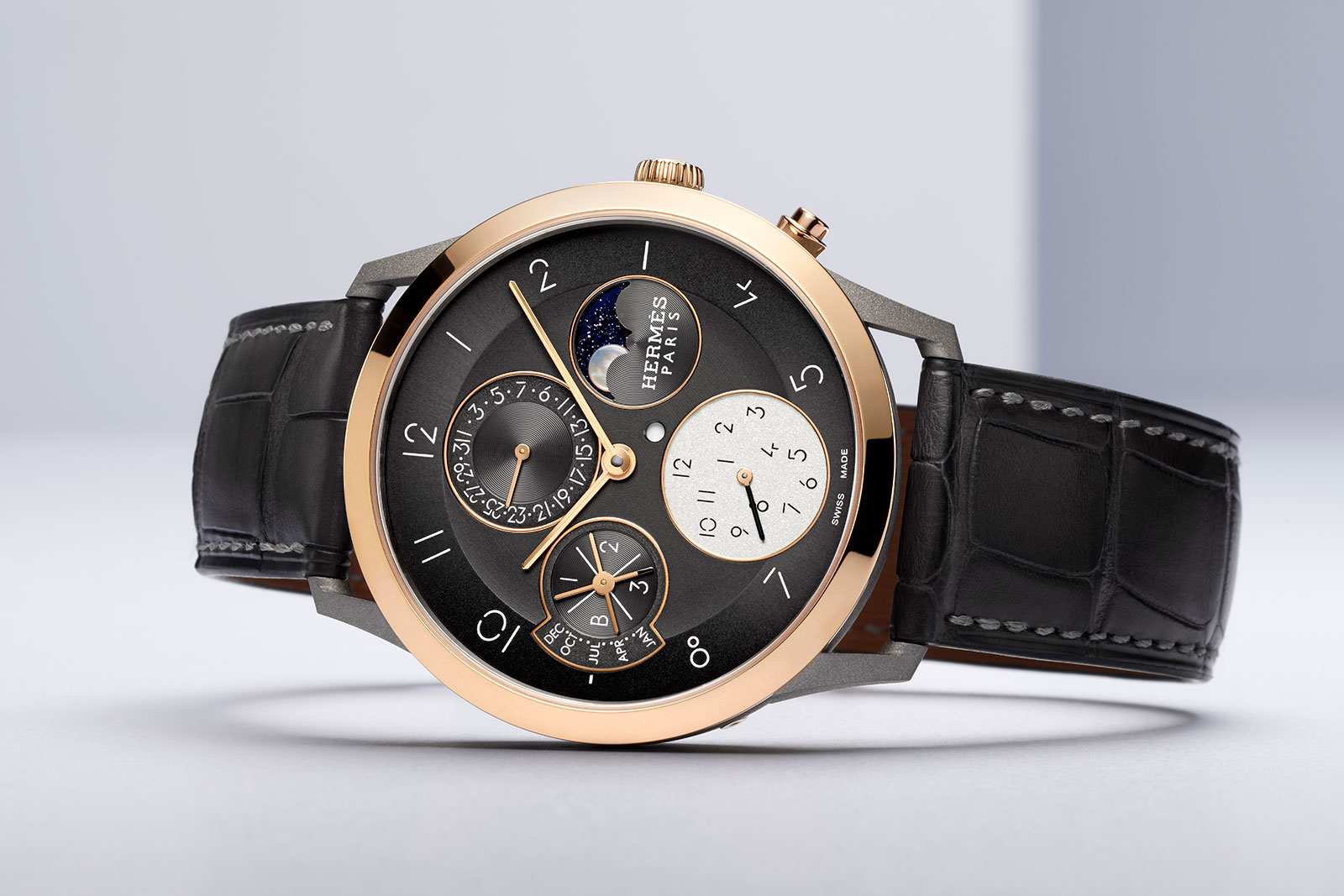
Hermès Introduces the Slim d’Hermès Quantième Perpétuel in Titanium
Originally introduced in pricier precious metals – in gold and also platinum – the Slim d’Hermès Quantième Perpétuel has been given a makeover that renders it more affordable, and arguably more striking. And like last year’s time-only Slim d’Hermès, the key feature is a titanium case. The new perpetual calendar features a twin-metal case made up of a titanium middle along with the bezel, crown, and pushers in either rose gold or platinum. That, combined with the two-tone grey dial, gives it a modern look that goes well with the Slim d’Hermès font that was designed specifically for the model. The Slim d’Hermes font was created by graphic designer Philippe Apeloig to go with the eponymous watch Initial thoughts Hermes’ house style is always elegant, often quirky, and usually distinctive. Already the Slim d’Hermes design is slim and wears well, and probably slightly better in this iteration since the use of titanium would reduce reduce its weight. A simple design characterised by clean lines, the Slim d’Hermes is recognisable in all its iterations thanks to its smart details, like the angled lugs and custom typography. Though the layout of the perpetual calendar is fairly conventional – everything is arranged into four sub-dials – it manages to be slightly unusual thanks to the seemingly random armament of numerals for the second time zone at six, a minor, offbeat detail that is in keeping with the brand’s style. The titanium-and-platinum versi...