 Time+Tide
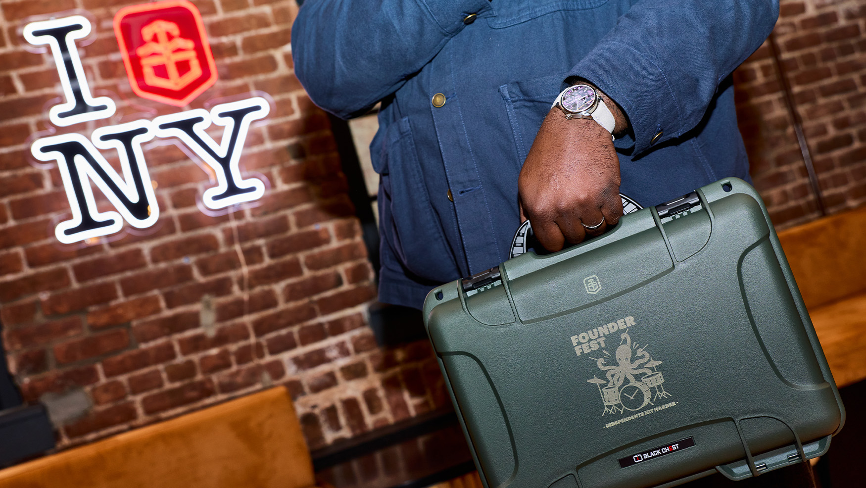
The Ultimate FounderFest Flex is the Entire Collection in One Box
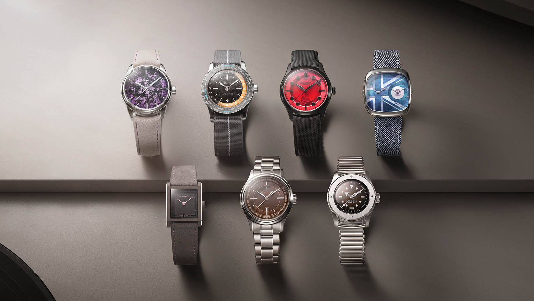
The complete FounderFest box set, seven exclusive Time+Tide Studio Editions, one seriously tough box, one serious collection
8,115 articles · 66 videos found · page 32 of 273
Time+Tide
The complete FounderFest box set, seven exclusive Time+Tide Studio Editions, one seriously tough box, one serious collection
 Time+Tide
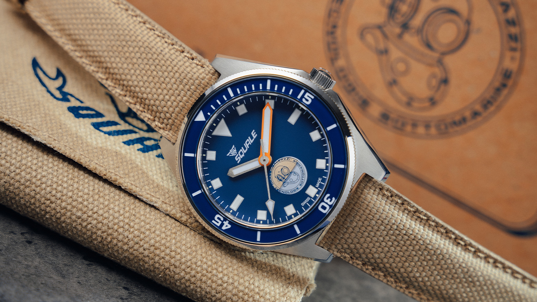
The Squale Galeazzi Artiglio combines 1960s skin-diver style, 600m water resistance and a cool Wet Indicator in a 500-piece limited edition.
 Worn & Wound
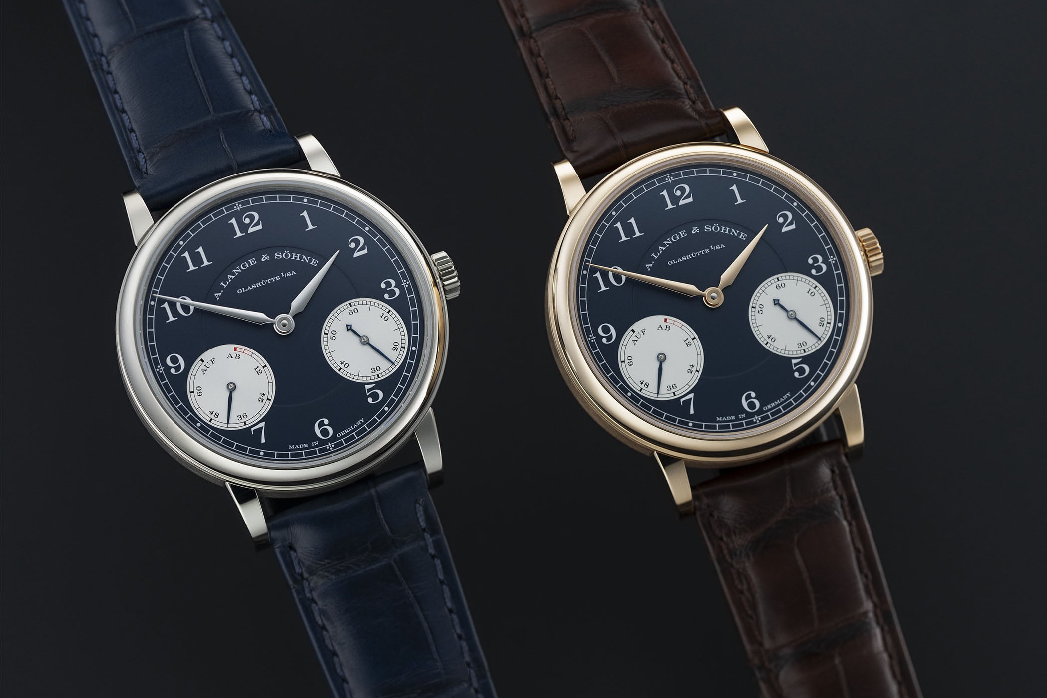
A Lange & Söhne has introduced new limited edition versions of their 1815 Up/Down model, one of the brand’s key references for years. The Up/Down is a true enthusiast favorite, prized by Lange collectors for its unique and very German presentation of the power reserve on the dial, located within a circular subdial at the 8:00 position. This style of power reserve indicator is traced back to German pocket watches made in the late 19th century, and I personally have always loved the way it looks on Lange 1815s. The new references are newsmaking primarily because they are sized down from the brand’s current standard 1815 Up/Down, which measures in at 39mm. The original Up/Down, which is highly collectible today, had a 35.9mm case when it debuted. The case size of these new limited editions, in either white or pink gold, comes in at 37.5mm. That seems to me to be a pretty good compromise for a watch like this, which has always been conceived as a pure dress piece. It remains impressively thin, with a case height of 8.7mm. The dial is a cool, desaturated blue, with silver subdials for the power reserve and running seconds at 8:00 and 4:00, respectively. The color here would appear to be a bit of a tribute or callout to the original Up/Down, which was available in a similar but not quite identical shade. Blue is a color Lange frequently returns to for special editions and limited releases. Otherwise, the dial is fairly standard 1815 Up/Down fare, which is to say it’s ...
 Time+Tide
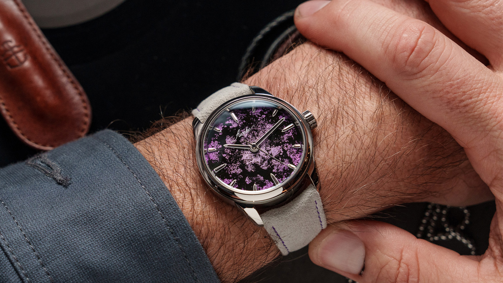
Awake and Time+Tide join forces to create quite possibly the most captivating dial in the FounderFest collection
 Monochrome
A Lange & Söhne’s 1815 collection honours the year of Ferdinand Adolph Lange’s birth with a lineup of traditional watches with design details inspired by Lange’s historic pocket watches. The seemingly straightforward 1815 Up/Down, with its power reserve indicator on the dial, has a fascinating historical background and was inspired by patent no. 9349 granted […]
 SJX Watches
A. Lange & Söhne’s mid-sized 1815 Up/Down is reincarnated as a dark blue panda 300-piece limited edition in a slender, 37.5 mm case. More faithful than usual to the Glashütte watchmaking tradition, inside and out, the 1815 Up/Down has a lot to offer for an “entry-level” Lange, if ever there was such a thing. Initial Thoughts The dial’s layout is inspired by the most common location for a up/down indicator on a pocket watch, at 12 o’clock, while the running seconds sits in a small sundial at six o’clock. But when a hunter-type movement is packaged into an open face case the up/down indicator moves to nine o’clock and the seconds to three o’clock, as was the case for many deck watches made by the first A. Lange & Söhne company during the Second World War, which is a very handsome dial layout. The lack of up and down, F and E, haut et bas, or, in this case, AB und AUF, on modern power reserve indicators is a pet peeve of mine, and one of the many things Lange does right. Another is two tone dials, the Datograph, especially the sleeker Datograph Up/Down, is one of the best-looking watches out there, and this look quite similar. That, combined with the smaller 37.5 mm case size (down from 39 mm) makes this 1815 Up/Down quite different from its past lives. For me, it is certainly more up than down, with the best-looking dial and a contemporary mid-sized case, so making it a limited edition of 300 pieces in each colourway is disappointing. Another letdown: I pr...
 Time+Tide
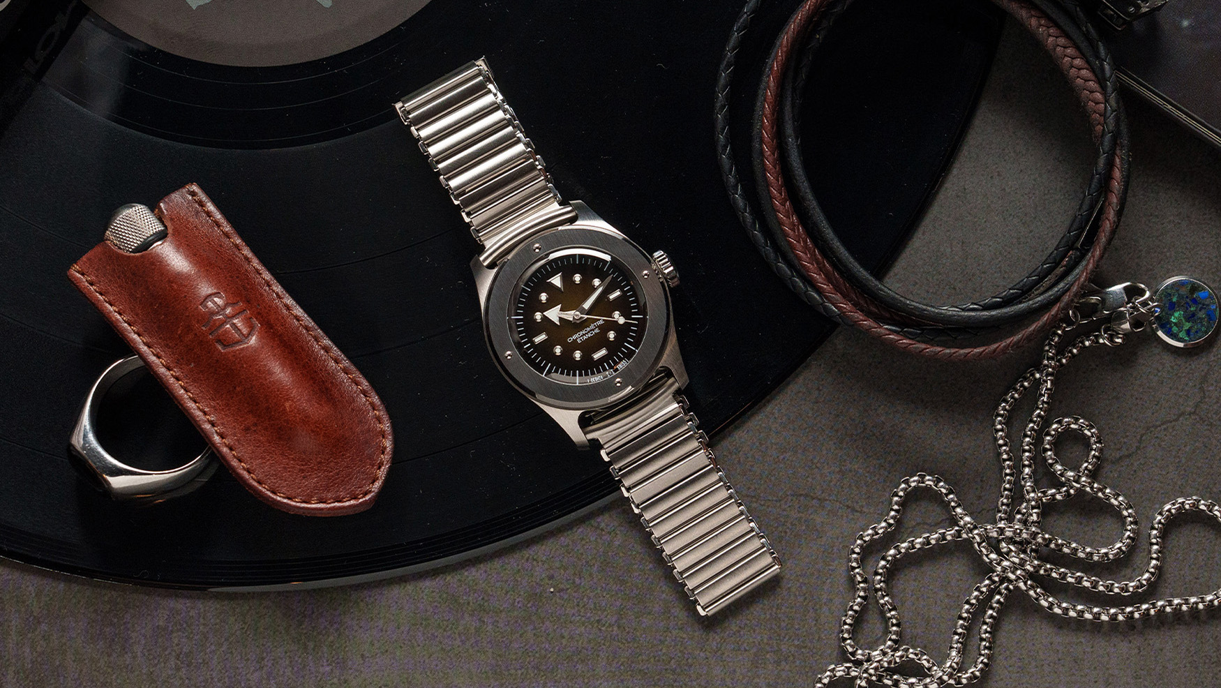
Serica x Time+Tide's Ref 7505 channels rock history's most legendary guitars, with a tobacco-sunburst enamel dial
 Time+Tide
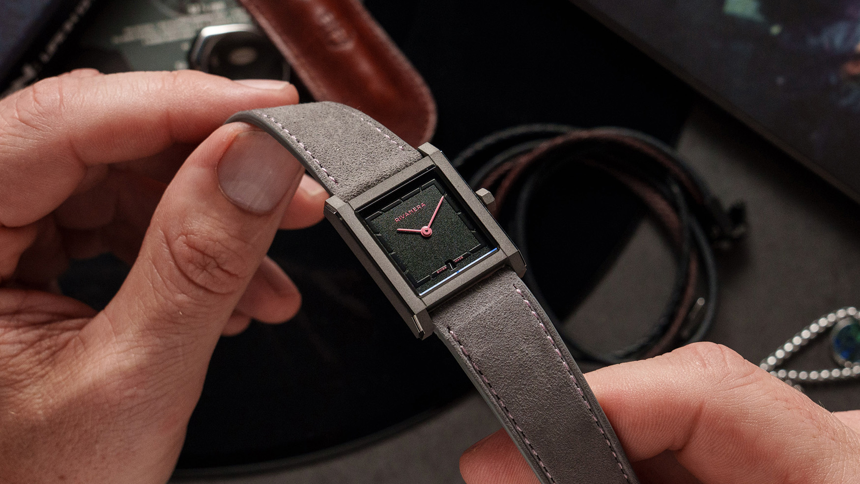
Echo/neutra's Rivanera Piccolo "Rosa d'Epoca" Time+Tide Studio Edition pairs a titanium case with a grained black dial with pink details
 Time+Tide
FounderFest launches, Time+Tide heads behind the scenes at MotoGP, and Tom reflects on why not every watch needs to be an everyday watch.
 Time+Tide
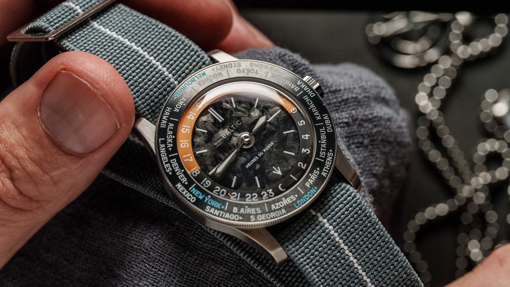
Baltic’s Heures du Monde “Horizon Line” Time+Tide Studio Edition pairs a forged carbon dial with a worldtimer complication.
 Time+Tide
This September the Time+Tide Studios in London, Melbourne, and New York will host a watch fair reimagined like you've never seen before.
 Hodinkee
What We Know Swiss brand Albishorn, carving out a niche with "imaginary vintage" designs, just released a simplified version of its regatta chronograph with the Marinagraph Classic. I first covered this complication in my hands-on review two years ago with the Albishorn Maxigraph, the brand's debut model and a collaboration with Massena LAB. Since then, the regatta chronograph has lived on under Albishorn's "Water" collection as the Marinagraph, combining the complication with a tide bezel. Today's Marinagraph Classic isn't all that different from the Marinagraph Classic Racing. Visually, the biggest difference is the swap from that colorful aluminum insert tide bezel to a large bidirectional sapphire bezel with more traditional, lumed markings. And yes, there are new dials too. While the sunray-brushed black dial remains, the new dial comes in the form of a white fumé color, with what could have been misconstrued as a shadow in the brand photography actually a subtle dark fade around the edges of the white dial. The black dial sports contrasting silver hands and markers, while the ones on the white fumé dial offer a stark black contrast. On both dials, the ten-minute retrograde regatta countdown scale at 7 o'clock is colored in blue and red, while the chronograph and regatta seconds hands are matched on each dial in either red for the black dial or blue for the white. My favorite feature since the first Maxigraph has been the aperture at 3 o'clock, serving as a running ...
 Worn & Wound
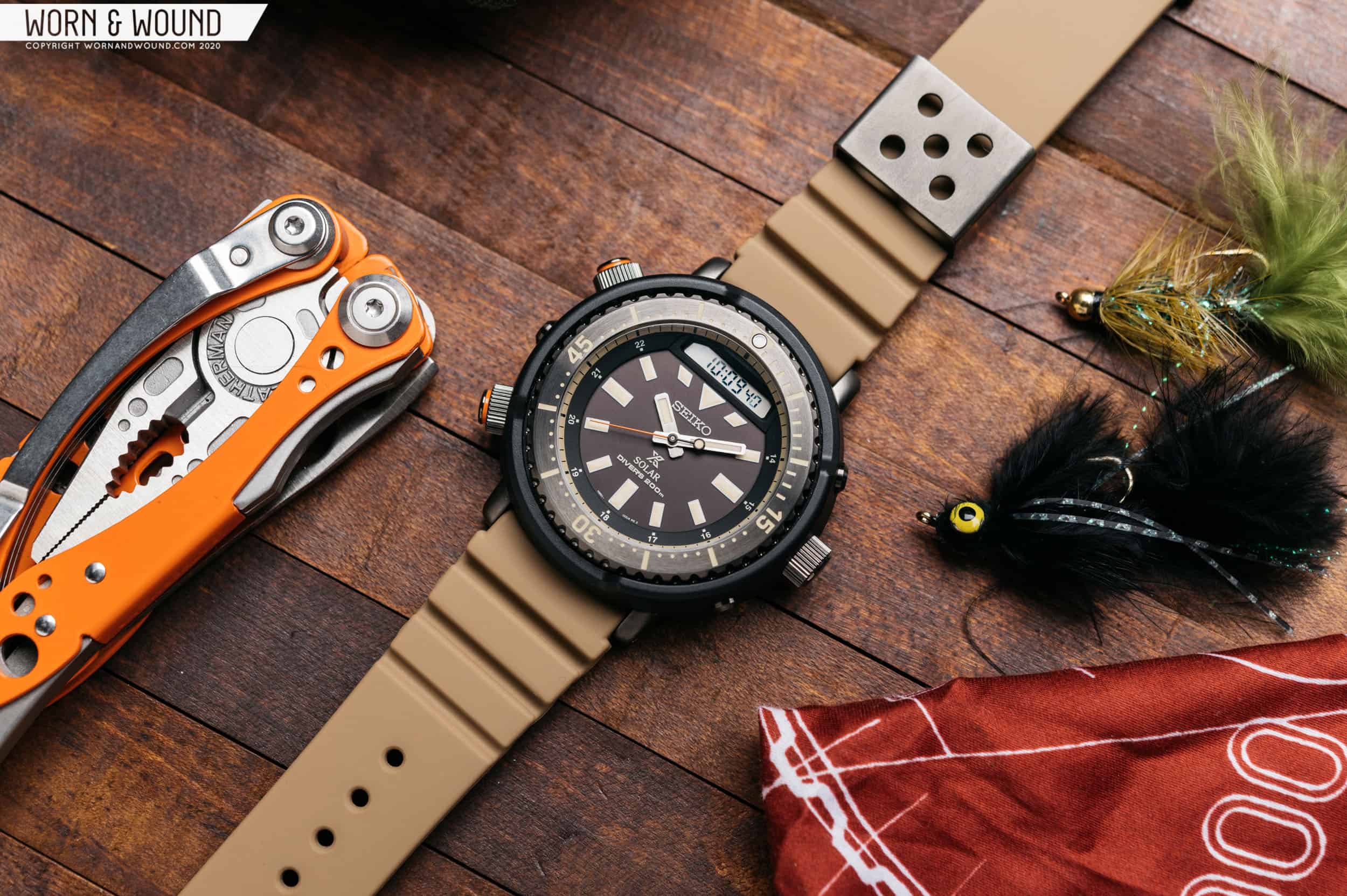
Analog and digital timepieces used to wage war on the wrists of horological enthusiasts. Nowadays, though, they’re more of a united front against the tide of smart watches and phones, offering wildly differing price points, use cases, and aesthetics. No longer is a digital calculator watch seen as “nerdy”, as celebrities and public figures like New York mayor Zohran Mamdani are frequently seen rocking the classic Casio silhouette. And despite their seemingly anachronistic focus on tactile functionality and focus, analog watches have never been more popular with young people looking to escape the crushing presence of their digital lives. That’s where the analog-digital (“ana-digi”) format comes in. A clever combination of the best features of both types of “old school” timekeeping, new iterations like the Autodromo Group C Turbo Sport are priced compellingly, and cast a wide net despite sometimes venturing outside of most design conventions. They can be a great introduction to the larger world of watches, and unique conversation pieces in their own right. So, let’s dive in and take a look at some notable ana-digi watches from watchmakers you already know and love, and what sets them apart from their more traditional stablemates. G-SHOCK Starting with the undisputed king of digital watches, Casio’s G-SHOCK sub-brand has a frankly staggering amount of ana-digi options on hand. Their aptly-named Analog-Digital collection boasts over 100 models currently a...
 Time+Tide
Listen, I won’t pretend Time+Tide is not in the engagement business. Punchy, punny headlines and tasty watch photography and video drive clicks, likes, and shares, and allow us to keep doing what we are doing. But I am proud to say we have never really engaged in horological rage bait. Speaking just for myself here, … Continued
 Fratello
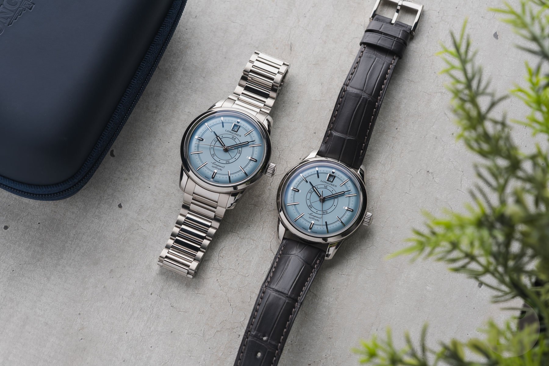
When it comes to the Longines Conquest Heritage Central Power Reserve, three years are important: 1954, 1959, and 2024. 1954 marks the year of the Conquest collection’s birth, 1959 is the year in which the first Conquest with a central power reserve indicator debuted, and 2024 marks the 70th anniversary of the Conquest collection. This […] Visit Feel The Power! The Newly Refreshed Longines Conquest Heritage Central Power Reserve to read the full article.
 Time+Tide
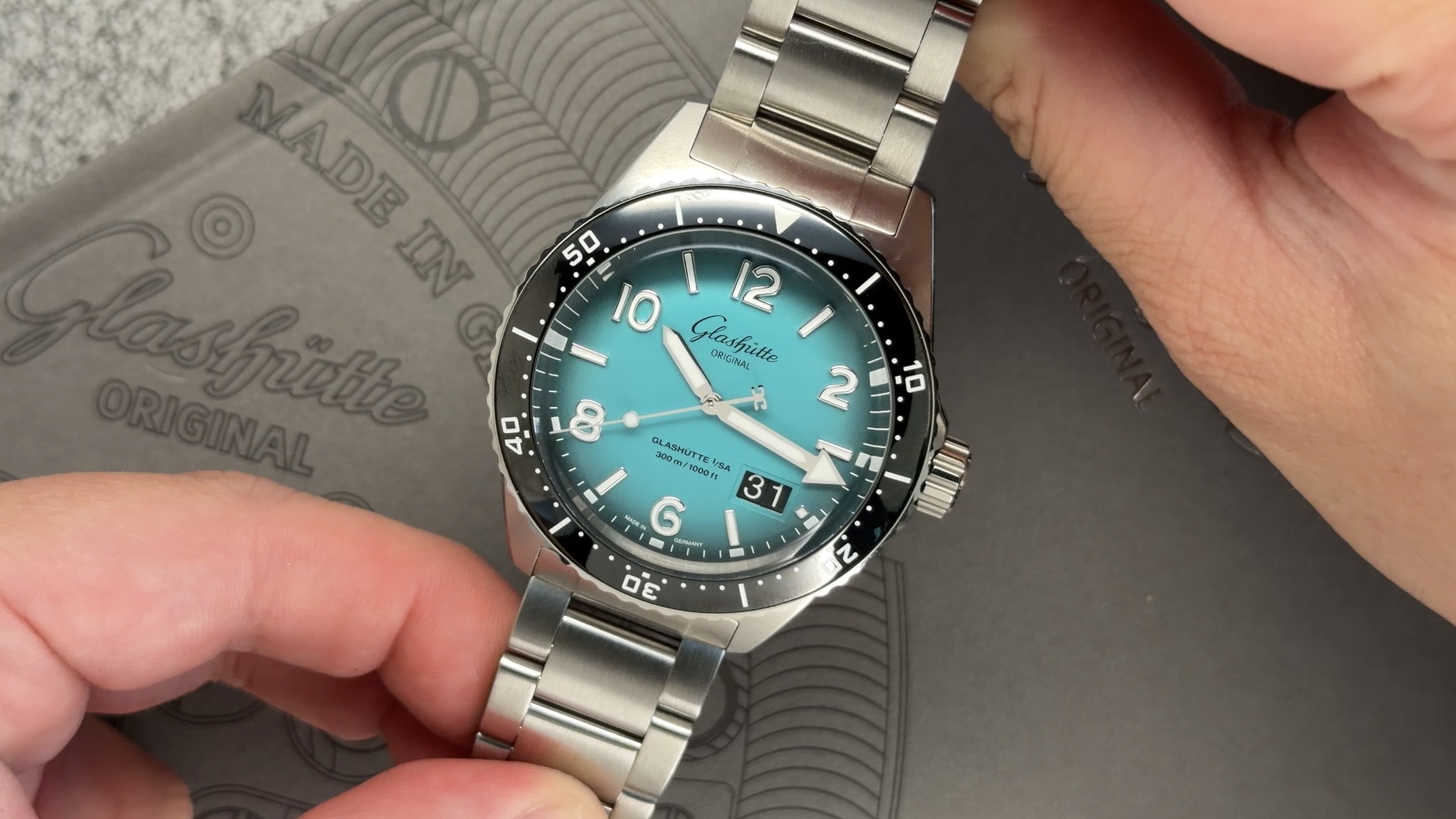
The Glashütte Original SeaQ 'Northern Tide' Limited Editions bring a fan-favourite turqouise hue to a pair of dive watches with real depth.
 SJX Watches
Watch designer Franc Vila kicked off his comeback with the FVF1 skeleton tourbillon, which he then followed up with the FVF2, a non-tourbillon watch that likewise indicates the time and day. The FVF2 Openwork strips away the dial, giving the watch a more mechanical appearance thanks to the exposed under-dial works, revealing the jumper spring for the retrograde day indicator. The reverse of the Openwork is identical to that of the standard model. The manual-wind movement blends contemporary and traditional elements — the striking, angular design works surprisingly well as a canvas for haute horlogerie finishing. Notably, the FVF2 movement is also its case: the base plate is one with the case middle, an approach FVF describes as a “unibody” architecture. Initial thoughts Because the FVF2 was created by a designer, it has a unique aesthetic that blends many elements and inspirations. The look doesn’t overemphasise any singular influence, making it more interesting than most time-only watches on the market today, many of which converge on the same few historical styles. Even though the FVF2 is a little bit of this and a little bit of that, everything comes together well. The standard FVF2 has a dial, offered in a wide range of materials, while the Openwork version does not. That is essentially the sole distinction between the two, but it makes a big difference in terms of aesthetics. In this sense the Openwork is similar to Roger Smith’s open-dialled watches, especi...
 Time+Tide
HSNY's Melbourne watchmaking classes are being hosted at the Time+Tide Studio on Collins Street, book a spot before it's too late!
 Time+Tide
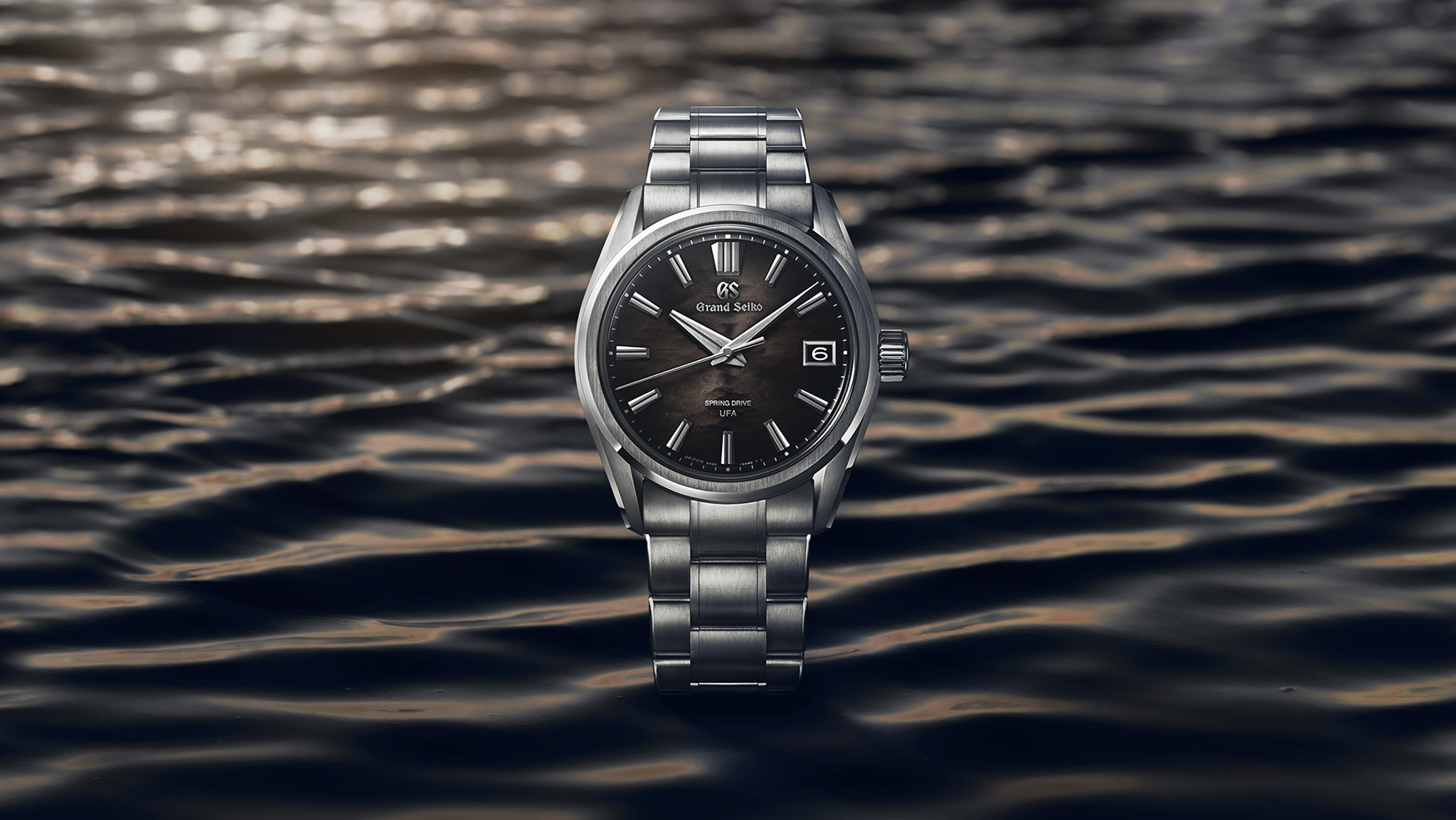
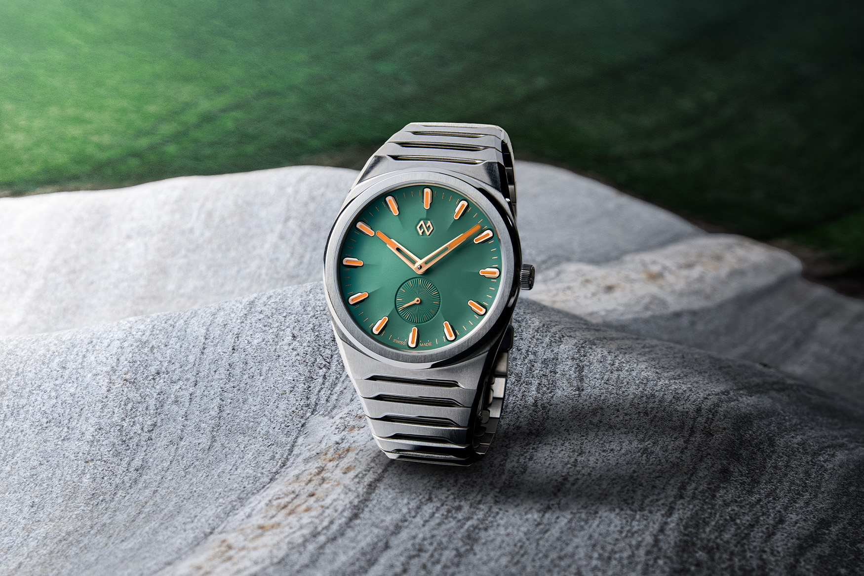
Sometimes, small improvements are all it takes to turn a good watch into a great one. Baltic brings back the Scalegraph in the permanent collection in an array of colours, Sartory-Billard dedicates a SB04-E to the Time+Tide Studio in NY, and Grand Seiko brings the long-awaited bracelet updates to many of its staple, fan-favourite pieces. … Continued
 Time+Tide
The Time+Tide NYC Discovery Studio proudly hosted the launch of the Formex Aria and an in-depth discussion about the details that shape it.
 Time+Tide
Beaucroft teams up with Time+Tide for a special limited edition, marking the British Weekender in NYC, and the global reach of Time+Tide
 Time+Tide
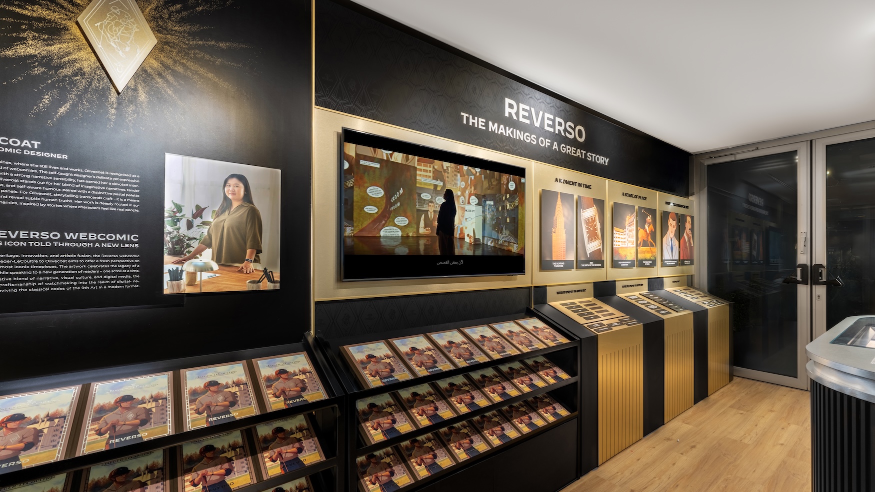
JLC is bringing its Reverso Stories exhibition to Miami, and this weekend, the Time+Tide will host the British Watchmakers' Weekender in NYC.
 Time+Tide
Why does it only look like a three-hander on the surface? Because this is the new Parmigiani Fleurier Tonda PF Chronographe Mystérieux.The post This chronograph is hiding a secret: New Parmigiani Fleurier Tonda PF Chronographe Mystérieux appeared first on Time+Tide Watches.
 Time+Tide
BA111OD announces the acquisition of BCP Tourbillons, bringing tourbillon development in-house, and proves it with a new tourbillon noveltyThe post BA111OD strengthens its watchmaking credentials with BCP Tourbillons acquisition and new Chapter 4 Tourbillon T.V.D. appeared first on Time+Tide Watches.
 Time+Tide
Hamilton's latest Khaki Field Mechanical draws inspiration directly from U.S. Air Force-issued references, and is only available during 2026The post Hamilton’s new Khaki Field Mechanical 36mm takes direct aim at its 1970s military origins appeared first on Time+Tide Watches.
 Time+Tide
Venice-based Venezianico draws on local inspiration for its interesting, value-driven triple calendar, the Arsenale CalendarioThe post Venezianico looks close to its Venetian home for inspiration for the new Arsenale Calendario triple calendar appeared first on Time+Tide Watches.
 Time+Tide
TAG Heuer revisits the iconic Formula 1 Solargraph collection for 2026, introducing a new line of pastel-coloured limited editionsThe post TAG Heuer’s Formula 1 Solargraph receives a pastel-powered upgrade for 2026 (live pics) appeared first on Time+Tide Watches.
 Time+Tide
A new collection of perpetual calendars from IWC marries its mastery of the pilot's watch with crown-set QPs.The post The New IWC ProSet Brings Practicality to the Perpetual Calendar appeared first on Time+Tide Watches.
 Time+Tide
TAG Heuer places the new Professional 500 between a standard Aquaracer and a Superdiver, offering 500m of water resistance in slick titaniumThe post TAG Heuer’s new Aquaracer Professional 500 brings even more depth to the Aquaracer, in more ways than one appeared first on Time+Tide Watches.
 Time+Tide
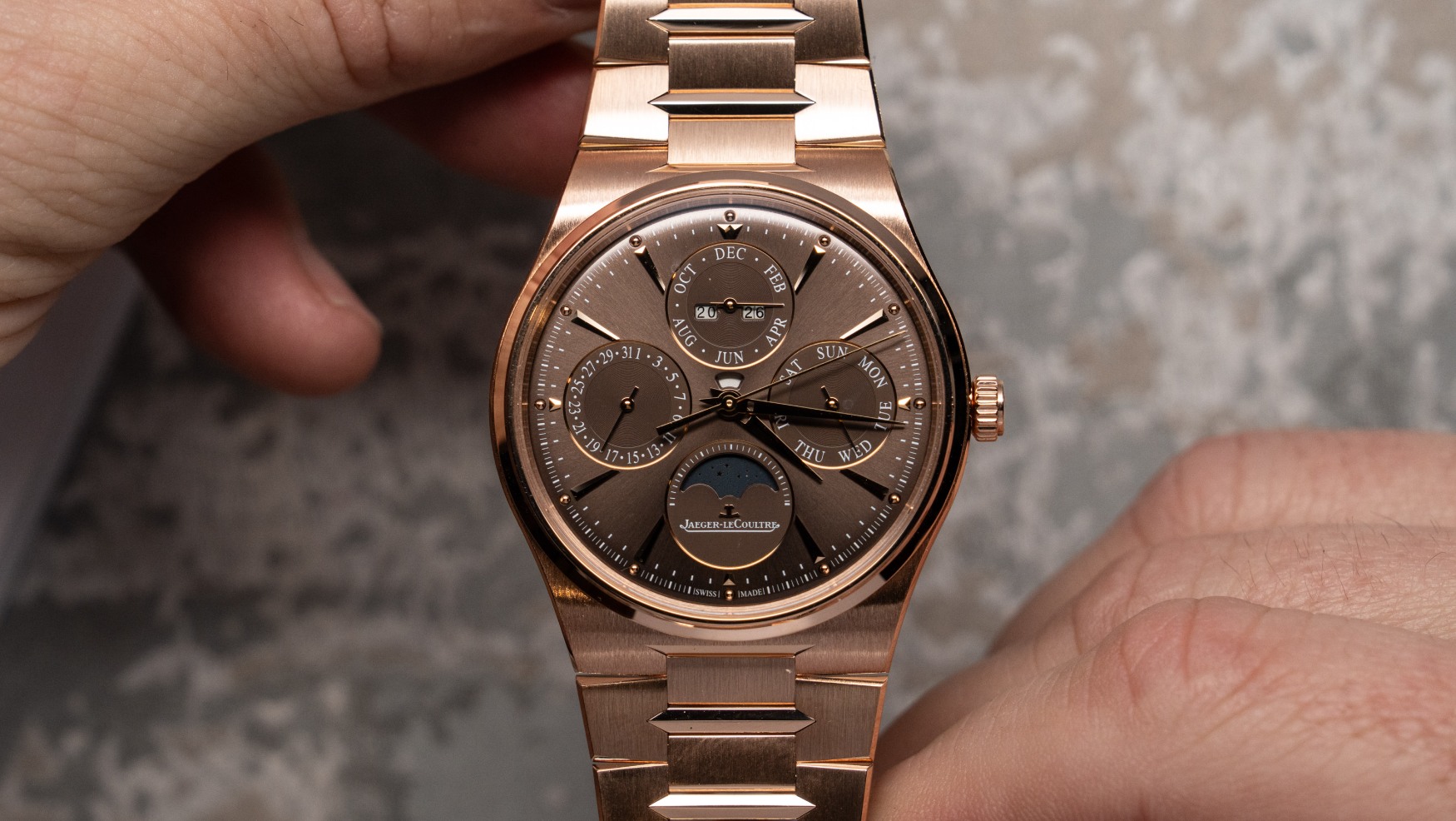
A new era for the Master Control collection with fully integrated bracelets in three new models and one new movement. The post Jaeger-LeCoultre reinvents the Master Control collection with an integrated twist appeared first on Time+Tide Watches.
Question, suggestion, or just want to say hi? Drop a note.