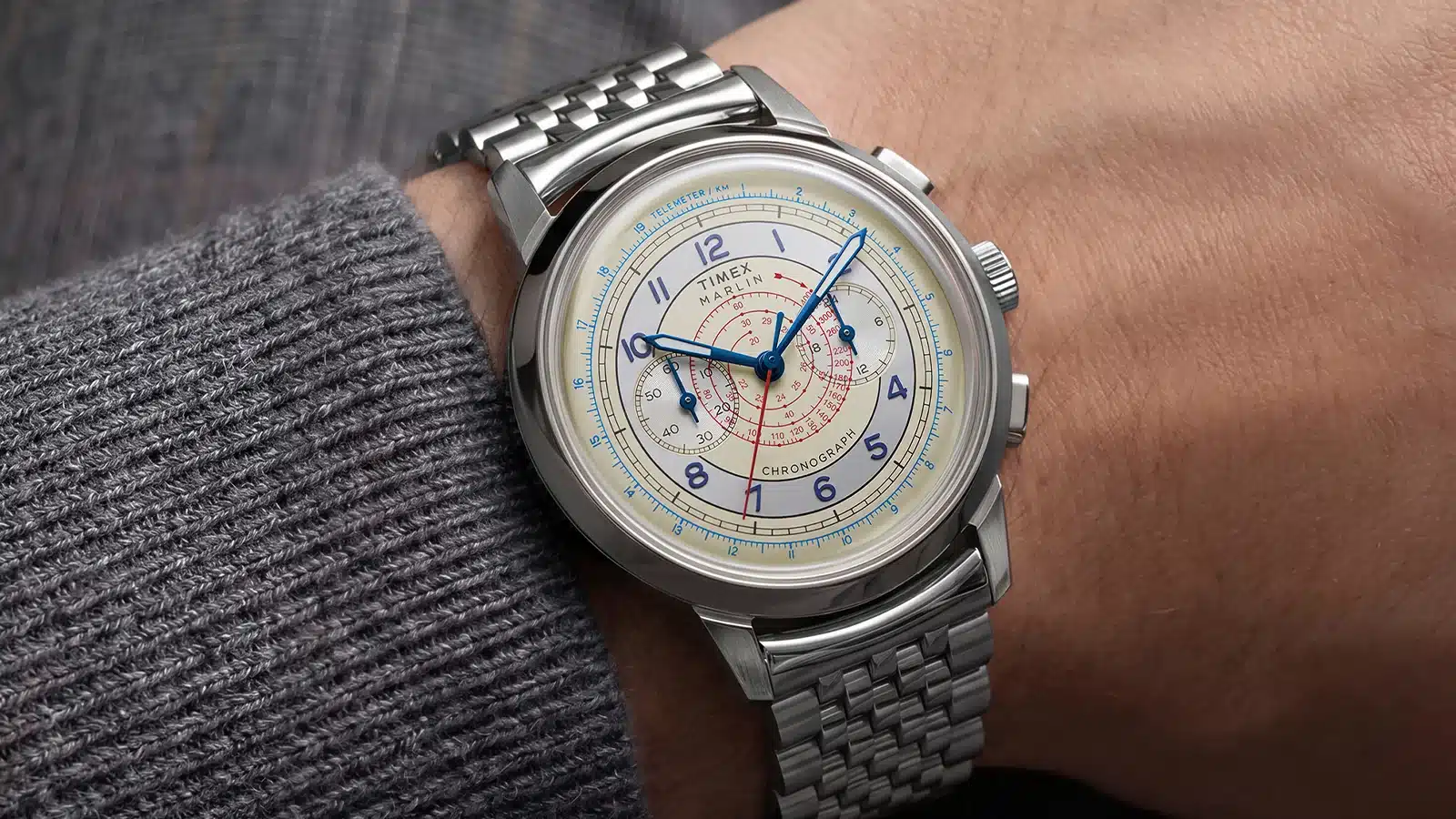
 Two Broke Watch Snobs
This Timex Chronograph Makes Expensive Swiss Watches Harder to Explain
The Timex Marlin Neo Classic Chronograph reaches into vintage chrono design with a busy dial, navigational scales, and plenty of character.
3,088 articles · 130 videos found · page 56 of 108
Two Broke Watch Snobs
The Timex Marlin Neo Classic Chronograph reaches into vintage chrono design with a busy dial, navigational scales, and plenty of character.
 Quill & Pad
New year is traditionally a time for taking stock and wine lovers are no different. Many will review their own cellars, assess what is ready for drinking, what needs more time and in some cases, what might have passed its best window. They will also look to the future. What should they target? Ken Gargett shares his tips on the wines to consider adding to your cellar.
 Quill & Pad
The Bollinger 2012 is fast gaining a reputation as one of the very best vintages of this century. Ken Gargett thinks it's fantastic champagne, and while truly wonderful now it has a great future. 98/100. Just wow! A couple of cases of this and we would feel a lot better about an extended period of isolation!
 Worn & Wound
For their tenth anniversary, Monta has released a pair of limited editions paying tribute to the Swiss watchmaking town of Neuchâtel, where every Monta from the earliest days of the brand has been developed. The two new watches, variants of the Triumph and Skyquest, offer a bunch of unique Easter eggs for longtime Monta fans while also remaining attractive and accessible timepieces on their own. Like all Montas, they are understated and built on a love of vintage tool watches, but for their tenth anniversary the team has allowed themselves to get a bit reflective in some of the design details, which I think many enthusiasts who’ve been with them from the beginning will appreciate. The Neuchâtel X collection, as it’s known, is marked most obviously by new opaline dials to set them apart from the rest of the Monta lineup. The Skyquest Neuchâtel X features an old school printed layout with beige lume for a vintage effect, as well as custom dial typography for the Monta logo not seen prior to this collection. The Skyquest’s handset is also unique to this watch, and draws on a sword hand style popular with collectors of vintage sports watches. The Skyquest remains at 40.7mm in diameter and 11.8mm thick. The red and blue 24 hour bezel allows the tracking of a third time zone with the help of Monta’s Caliber M-23, a rebadged Sellita SW330 “caller” style GMT. The case is water resistant to 300 meters and of course is paired with Monta’s excellent bracelet with a...
 Fratello
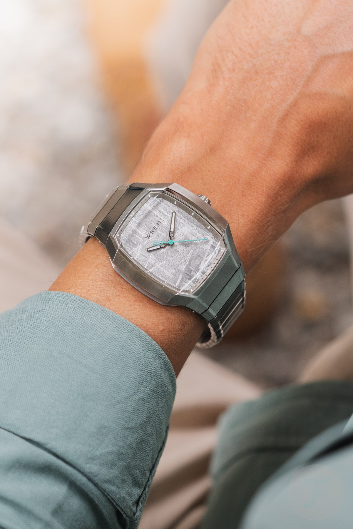
After the 41mm Diver One and the fan-favorite Diver 38 Seafoam, New York-based Wrist Enthusiast founder Craig Karger is back with a new Wren watch. Karger felt there were already too many vintage-inspired integrated-bracelet sports watches, so he asked designer Max Resnick to help him develop a future-oriented one. However, there was one challenge: Karger […] Visit The Wren Vessel: A Surprisingly Wearable Integrated-Bracelet Watch For The Future to read the full article.
 Hodinkee
What We Know It seems as though Raymond Weil has been everywhere this year as the Geneva-based, family-owned independent brand celebrates its 50th anniversary. The company entered the integrated-bracelet sport watch realm in June with its A.R.T. collection, launching a lovely chronograph—The Fifty—featuring a vintage, new old stock Valjoux movement from the year the brand was born, 1976. But RW is marking another milestone this year. Today, on October 10th (also World Watch Day, btw), Raymond Weil himself would have turned 100 if he were still with us. A frequent and enthusiastic traveler, the brand is paying tribute to its founder with a limited-edition model, the Freelancer World-Traveller. The star of the show for this run of 260 pieces is, most certainly, the dial. It's a relief-rendered world map in the style of the Mercator projection, rendered in textured champagne, against a dark blue background, representing the oceans. Rather than the brand logo, Raymond Weil's signature sits at 6 o'clock and above the date window. The indexes are applied and surrounded by a 24-hour scale in blue for the evening and beige for the daytime. The outer ring of the dial features 24 world cities and their corresponding time zones. Turning the knurled bezel rotates the city ring to allow for shifting time zones or tracking. The local time display features tapering baton hands filled with Super-LumiNova, while the GMT hand, which can be manipulated by moving the screw-down cro...
 Worn & Wound
We’re at an interesting time when it comes to the dialogue in the watch community on vintage inspired watches. Watches that make explicit references to the past are simply less common now than they were a decade ago, or even 4 or 5 years ago. I’ve long believed that a maturing group of collectors who entered the hobby when these watches were all the rage have aged into a point in their collecting journeys when more adventurous and contemporary designs simply have more interest. But this theory really only applies to what most of us refer to as “midcentury” watches. Think about the earliest dive watches from Rolex, Blancpain, and others, the types of dress and everyday watches worn by Don Draper on Mad Men, and extending through to the earliest bits of 60s and 70s funkiness. That’s the vintage inspired wheelhouse for watch brands seeking to tap into the community’s desire to commune with the past, whether through real or imagined nostalgia. Watches from a century ago are an entirely different category. Enter the Hamilton American Classic Cushion Mechanical. This is an entirely new collection from the brand that finds them looking to designs from the 1920s for inspiration. Watches from this period never really had a widespread moment of resurgence like divers from the 1960s, but if you’ve spent some time in the hobby you’ve undoubtedly encountered collectors who are deeply into exactly this kind of thing. There are a number of interesting reasons to colle...
 Hodinkee
What We Know This week, Hamilton dropped the latest in their series of vintage-inspired watches. But where most brands lean hard on their mid-century offerings for their re-editions, here Hamilton takes a different tack, reaching deep into their archive to resurrect watches so old, they'd be better described as antique rather than vintage. So, it is with the Hamilton American Classic Cushion, which breathes new life into a century-old design. And before you ask, these aren't quartz fashion watches dressed up in vintage clothing; these are tried-and-true hand-wound mechanical watches. The new collection — and it really is a collection, with six models split across two case sizes — is directly inspired by cushion-case watches made by Hamilton in the 1920s. If they seem eerily familiar for watches designed 100 years ago, it may be because Cillian Murphy wore an antique Hamilton cushion watch in Oppenheimer. Here, those watches have been quite respectfully updated for 2026, and though absolute fidelity was not the goal here, these remain easily among the most faithful-feeling reissues we've seen from Hamilton recently. As I mentioned earlier, a big part of the appeal of these watches comes down to the choice to use a hand-winding mechanical movement in these watches, rather than the quartz movements so often used in these small-size vintage reissues. Here, Hamilton is using the H-42, a manual-wind caliber that is, in essence, Hamilton's branded version of the ETA 7001. It'...
 Hodinkee
For the life of me, I can't remember if I've ever owned an Alpinist. I think I did, for a little while. I know I at least borrowed one for a while, but the Alpinist was never as central to me as it has been for a lot of watch guys of my vintage (by that, I mean collectors who got into this whole thing in the late 2000s). If I did own an Alpinist, it was a brief, flirtatious affair meant to satisfy curiosity before I found my way back to the SKX (a watch I have owned many, many examples of). Still, the Alpinist — specifically the SARB017 Alpinist with its green dial, compass bezel, and gold numerals — seemed as close to omnipresent as a watch could get in my early days of collecting and learning. They made daily appearances on wristcheck channels on forums, and their sudden appearance on one of my friends' wrists was a great sign that they were becoming properly watch-enthused. It's hard to quantify the Alpinist's impact, but here's the thing: while the Alpinist may not be the Seiko thatmost watch enthusiasts collect today, if you control for "dive watch," I'd hazard a guess it's at least close. And in an era when it felt like a Seiko was the price of entry to "watch enthusiast," it was a watch that mattered. And then, it vanished. Okay, that's maybe a little dramatic. The Alpinist had a long run, and like so many of the watches Seiko introduced in the '90s and '00s, it was eventually sunsetted and, a few short years later, replaced with something that looks awfully sim...
 Hodinkee
What We Know The 2025 revival of the Louis Vuitton Monterey was a curious moment for the brand. Certainly influenced by a recent surge in popularity for the original LV I and LV II watches among celebrities and vintage collectors, it was a small(ish) 188-piece run (priced at $60,000) meant to show the brand was paying attention to what was happening around it. While the original LV I was a quartz watch with several complications, the brand simplified the aesthetics with the revival—gone were the complications and the distinctive, busy dial with all of its markings, as the new Monterey was time-only with a mechanical movement. But that Monterey also demonstrated the craft of La Fabrique du Temps Louis Vuitton, introducing a simpler dial in grand feu enamel. While it may have seemed like a small blip in the brand's overall plans, Louis Vuitton has more to say about the pebble-like designs from 1988 by Italian architect Gae Aulenti—the Monterey Ceramic, a duo of watches that focuses on the smaller LV II. Now, the Louis Vuitton Monterey Ceramics are not part of a limited edition and officially enter the brand's permanent collection. The cases are faithful to the original, preserving the model's smaller 37mm case size and both original ceramic colors: green and black. The polished, pebble-shaped case is slightly thicker at 11mm, however, because it houses the automatic LFTMA01.02 caliber rather than the original quartz movement. Like last year's Monterey, the Monterey Ceram...
 Worn & Wound
In terms of analog intricacy and an unyielding enthusiasm for the vintage and enduring, watches and the automotive realm are a natural A-to-B: it should come as no surprise that the Venn diagram of watch nerds and automotive nerds is eerily close to a circle. Yet, there’s more to the world of branded cross-promotion than, say, TAG Heuer and Porsche. Some of the most off-the-beaten-path collaborations are worthy of deep dives, and the six examples highlighted here (including many from Heuer!) are collectible and worthy of appreciation by those who know. Because there’s only so much that can be represented by Steve McQueen, in that white racing suit, giving the British equivalent of the middle finger. Thankfully, the world of mechanical fascination runs so much deeper than that. IWC Mark XII x Saab “Born from Jets” was the advertising slogan of the now-defunct Saab for the last 20 or so years of its life, and while there was a distinct difference between Saab AG the defense contractor and the General Motors-owned division, it made for some really, really cool television ads. IWC, who built its reputation on pilot’s watches, lent its flagship Mark Series to a Saab tie-in in 1997: if you put down the deposit for a limited-edition 900 Mellow Yellow Cabrio, you were awarded one of these Mark XIIs, each one customized with a yellow leather strap and “Saab Automatic” on the dial instead of the usual “Mark XII Automatic.” Today, if you can find one, they go fo...
 Worn & Wound
J. Press’ Vintage Watches New York Fashion Week wrapped this week, and I was lucky enough to attend a few shows, most notably J. Press, which is now under Jack Carlson’s leaderhsip. From my front-row seat, there was plenty to take in, from the Fall-Winter 2026 collection and the debut of J. Press womenswear to John Slattery from Mad Men sitting across the runway from me. But once the show started, I was more focused on the models’ wrists than anything else. For the show, Jack Carlson worked with Eric Wind and Wind Vintage, who brought a collection of 50 vintage watches to New York for Carlson to choose from. Pieces from Rolex, Jaeger-LeCoultre, Heuer, Universal Genève, Tudor, and Dunhill found their way onto the runway, selected and paired with looks throughout the collection. Now showing his second season, Carlson’s vision for the brand is coming into focus, where his knack for worldbuilding and getting the fine details perfected continue to shine through. Insta360 Luna Pro I’m going to be 35 years old in two weeks and, I have to tell you, thank God I’m not any younger. I grew up at the perfect time for being online. While I’m not a digital native, I’d say I’m a digital green card holder. I’ve been online long enough to understand the lingo, but I didn’t grow up completely immersed in the culture. Had I been, I definitely would have had a YouTube channel. And an embarrassing one at that. I would have sung on there (à la Millie Bobby Brown), tried m...
 Fratello
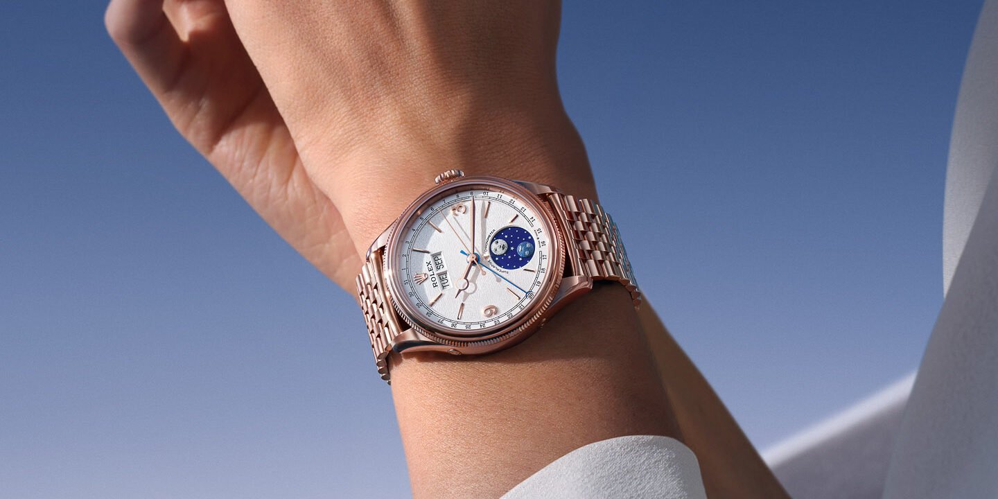
Rolex has added a rather unexpected complication to its Perpetual collection with the new Perpetual Padellone. Taking its name from the vintage reference 8171, the watch combines a 39mm case with an annual calendar and a moonphase display. At first glance, it is perhaps the dial that grabs your attention, particularly the blue enamel moonphase […] Visit Hot Take: Rolex’s Perpetual Padellone Annual Calendar Takes A Nod From The Past to read the full article.
 Hodinkee
If you've never collected Rolex Bubblebacks before, you should probably forget nearly everything you know about vintage watches. At least, that's what it feels like you should do when you start wading into the space. Things like reference numbers are much less valuable to remember than movements, case designs, printing details, and a general ability to just remember everything you've seen to get a sense of feel for what is right and what isn't. And trust me, a lot isn't. You could spend decades looking at these watches, but "Bubble Back" by Masahiro Endo, the owner of vintage retailer Private Eyes in Tokyo, is a great reference to jump-start your understanding of an iconic (and currently underappreciated) model. I mentioned this in last week's review of John Nagayama's "96," but the only watch I'd be more afraid to deep-dive into than the Patek ref. 96 is the Rolex "Bubbleback." It's not even an official model, but a nickname for Rolex watches made from 1933 to the mid-1950s with a domed, "bubble-like" caseback. So when you open Endo-san's book, you'll probably immediately be struck by the fact that none of the examples (except the later ref. 6062 and ref. 8171) have reference numbers. According to collectors, that's not the most useful thing for understanding the Bubbleback. Basically, every other detail matters more. We've previously published a story about the bubbleback with a lot of thoughts and tips for understanding these models, courtesy of Ken Jacobs and Justin Gr...
 Worn & Wound
Vintage Seiko, as most collectors know, is a rich tapestry. Once you learn the story of Colonel William Pogue, or try to track down the funky bracelet that Bruce Lee paired with his own Speed-Timer, the wormholes naturally open themselves, each with their own dizzying amounts of reference numbers, specific models, and fun nicknames for the mind to notice and then squirrel away for later. But what about the ones you might have overlooked? Midcentury Seiko chronographs are a riot of design variations, bold patterns, and contrasting color schemes—and all backed by genuine innovation in the guise of the first automatic chronograph, flyback movements with stacked register hands, collaborations with luminary designers, and freakish dabbles with postmodernism. It’s what makes them so much fun to pay attention to. Hence, these six Seiko chronographs that play with the form, proving that even across the decades there are still surprises to rediscover. Not just familiar references, but obscure offshoots. Seiko 6138-8000 “Baby Panda” Seiko’s dual-register chronograph debuted shortly after the 6139, which we all know as the world’s first automatic chronograph. And while both watches represent futuristic seventies design, the slimmer 6139 takes a backseat to this lineup’s exaggeratedly bulky cases and clashing, patterned color schemes that have garnered nicknames like “UFO,” “Kakume” (“square eyes”), and “John Player Special” (a nickname popularized ...
 Hodinkee
What We Know Last year, we covered Baltic's relaunch of the Aquascaphe, their vintage-leaning traditional-style diver (not to be confused with their dual-crown version). That release came in several colors and two sizes. Now they're relaunching the Aquascaphe GMT as a new Mark II version. While the aesthetic changes are more subtle than on the diver, the changes under the hood are more substantial. The Aquascaphe GMT MK-II has a subtly redesigned case profile (39.5mm by 13.8mm, 316L stainless steel, with a 47mm lug-to-lug), with the most distinguishing feature being the new crown guards that make the case distinctly more modern. The rest of the case has been reworked (it is 0.5mm wider and 0.8mm thicker), with vertical brushing on the lugs and 200m water resistance. The watch still has a luminous 24-click GMT sapphire bidirectional bezel. The caseback engraving (which we've posted a picture of later in the story), on the other hand, is simplified from the globe design on the first version. What used to be three color variants is now four, all with glossy black dials and Super-LumiNova BGW9. One has a blue-and-light-blue bezel with light-blue dial text and a GMT hand. Another is a "Pepsi" style with red accents. The third has a blue-and-green bezel, and the last, the newest, is black and grey with orange accents. The hands and indices are a bit bolder and rounder. Inside the case, the brand has changed to a "flyer" Miyota 9075 GMT movement with a 42-hour power reserve. The ...
 Fratello
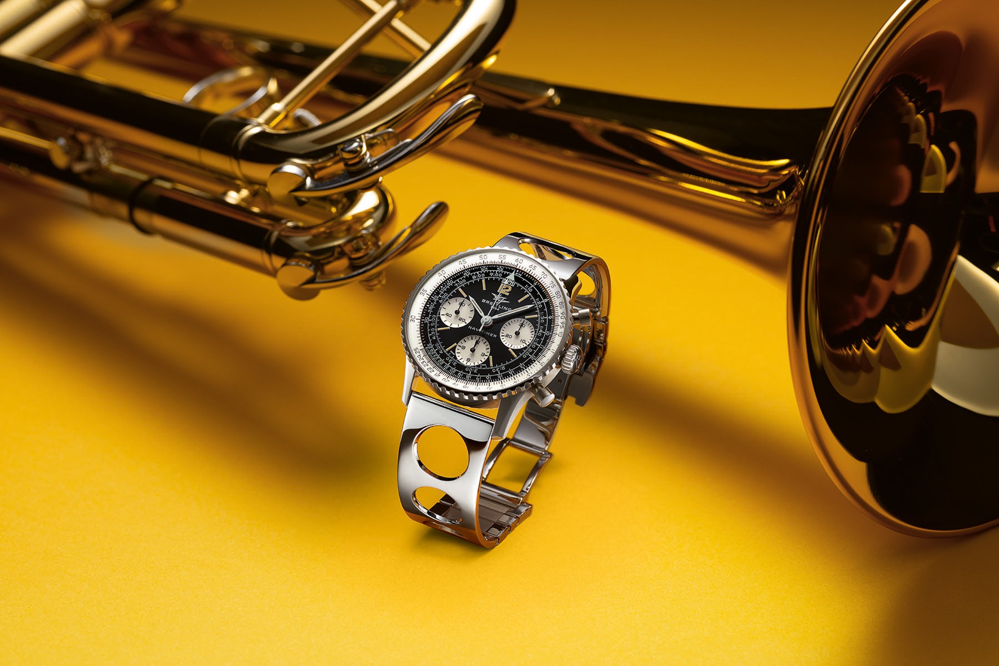
Breitling honors the centennial of Miles Davis’s birth with the new Navitimer B09 Chronograph 41 Tribute to Miles Davis. This limited-edition Navitimer revives a host of vintage design cues to create a fitting tribute to the pioneering jazz musician. At its heart is the manually wound B09 caliber, recalling the hand-wound Navitimers of the 1960s […] Visit Breitling Reimagines A Jazz Classic With The Navitimer B09 Chronograph 41 Tribute To Miles Davis to read the full article.
 WristBuzz
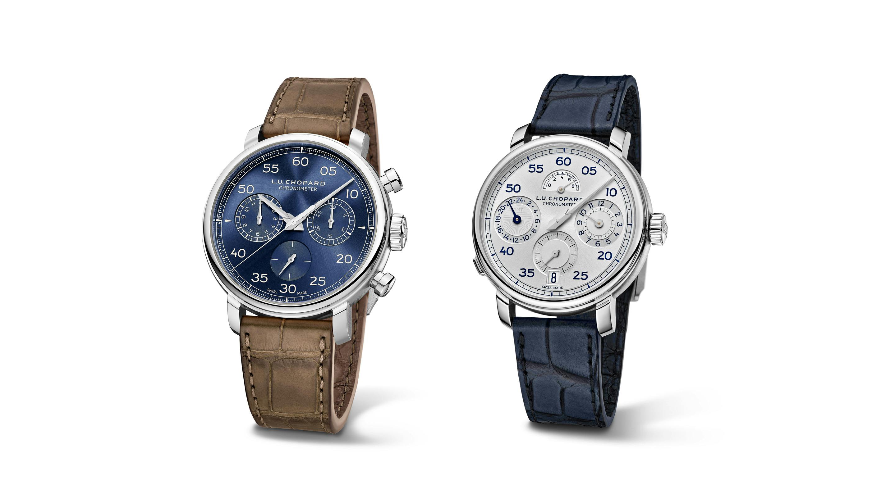
The beloved vintage-inspired chronograph gets a new dial color, and it's a serious upgrade from the forest green original.
 Hodinkee
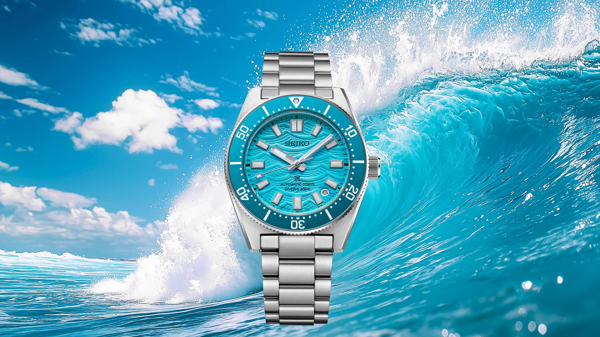
What We Know Seiko has launched a new version of their popular vintage-inspired 1965 Heritage Diver, with a dial and color palette chosen by you. Okay, well, maybe not you directly, but through a fan-selection process that Seiko launched last year to mark the 60th anniversary of the original 62MAS diver. Seiko fans were presented with four variants of a watch that would eventually reach production, each inspired by a different tone and color the ocean can take on over the course of a day. In the end, the winner of last summer's campaign was this "Daytime Blue" color, which evokes the clear blue waters you'll find in tropical locales where the water is clear and the sun is shining. Other options included a bright yellow, deep green, and orange-y red. It's not wholly surprising that the blue dial would have won in a public ballot, but each is compelling, and I'll be curious to see whether Seiko, having developed and shown off the full range, ever chooses to release any of the other colors. The watch itself is a familiar one. The HBC011 shares a spec sheet with the enthusiast-favorite (and James') favorite SPB lineup of dive watches, specifically with the '20MAS' generation released in 2024, which brought with it a host of quality-of-life improvements, including a refined case and new movement. That case, which Seiko claims to be 40mm wide, 13mm thick, and 46.6mm lug-to-lug (and which James measured at 40.2mm wide, 13.4mm thick, and 46.6mm lug-to-lug in his Hands-On), is agai...
 Worn & Wound
You know, I actually wasn’t going to write about this watch. An $18,000 vintage inspired dive watch from a brand that doesn’t hold a ton of personal relevance to me was just not super high on my list of priorities as Geneva Watch Days prep is now in full swing (this time next week, I will be surviving on CHF 10 Coke Zeros). But, over the weekend the collective watch internet kind of lost its mind over the new Blancpain Fifty Fathoms Bathyscaphe 70th Anniversary Limited Edition, so I shifted my to-do list around a bit and, well, here we are. Of course, there have been a lot of memes and jokes about this watch sharing a certain similarity to the Seiko 62MAS and the many, many reinterpretations and reissues of that watch over the years. I’m frankly less interested in those aesthetic similarities than I am in the very conceit of this watch, what it illuminates about Blancpain, and the way it fits into the neverending conversation around price sensitivity that we’ve been having for months as we see MSRPs shoot higher and higher. But what I’ll say about the appearance of the Fifty Fathoms Bathyscaphe 70th Anniversary Limited Edition is simply that, at this point, 70 years on from the advent of this type of watch, I don’t think any brand really owns the aesthetic identity of something so generic. Lots and lots of watches from all kinds of brands look like this, just like lots and lots of watches look like a Speedmaster, or a Calatrava. The design tropes of these wat...
 Fratello
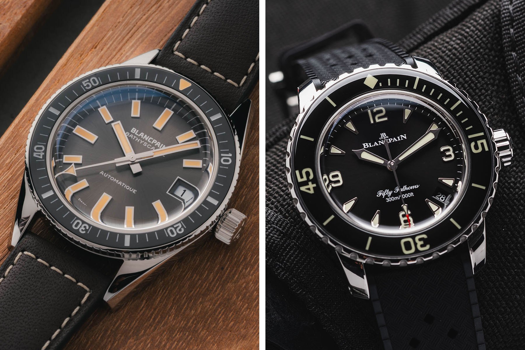
Good morning, and welcome to another Sunday Morning Showdown. Blancpain surprised us this week with a vintage reissue of its 1968 Bathyscaphe. The 37.4mm case of the new Fifty Fathoms Bathyscaphe 70th Anniversary features a sunburst dial and faux patina, while there’s a ceramic bezel insert and a modern automatic movement inside. Of course, Blancpain […] Visit Sunday Morning Showdown: Blancpain Fifty Fathoms Bathyscaphe 70th Anniversary Vs. Blancpain Fifty Fathoms Automatique 38 to read the full article.
 WatchRider
The upcoming Casio MTP-E740-4AV and MTP-E740-2A1V are vintage-inspired watches launching soon for just £85. Proving that budget-friendly watches don’t have to be boring, these new releases feature a stunning see-through dial design that punches well above its price bracket. A Striking Translucent Dial Design The standout feature of the new MTP-E740 series is undoubtedly its dial. Drawing heavy inspiration from the classic 1970s Seiko Time Sonar, Casio has incorporated a transparent face that reveals the mechanical day and date wheels underneath. Usually, entry-level Casio day-date models hide this calendar mechanism behind a solid face. By exposing it, Casio gives these models a playful, layered, and premium look that is rarely seen at this price point. The Standout Models: Orange and Navy While the collection features several colors, two models steal the show: MTP-E740-4AV (Orange): if you want a watch that immediately catches the eye, the MTP-E740-4AV is the undisputed star of the collection. The bright orange colorway perfectly complements the retro-futuristic transparent dial, giving the watch a summery, high-energy feel. Orange dials have historically been associated with dive watches and motorsport chronographs, but putting it on an everyday stainless steel piece gives it a remarkably fresh vibe. The bright, vibrant orange dial is an absolute head-turner. It provides a bold contrast against the stainless steel case and makes the exposed cal...
 WristBuzz
A simplified take on the Marinagraph formula, now in two ultra-classic colorways that lean hard into the imaginary vintage aesthetic
 Hodinkee
What We Know Swiss brand Albishorn, carving out a niche with "imaginary vintage" designs, just released a simplified version of its regatta chronograph with the Marinagraph Classic. I first covered this complication in my hands-on review two years ago with the Albishorn Maxigraph, the brand's debut model and a collaboration with Massena LAB. Since then, the regatta chronograph has lived on under Albishorn's "Water" collection as the Marinagraph, combining the complication with a tide bezel. Today's Marinagraph Classic isn't all that different from the Marinagraph Classic Racing. Visually, the biggest difference is the swap from that colorful aluminum insert tide bezel to a large bidirectional sapphire bezel with more traditional, lumed markings. And yes, there are new dials too. While the sunray-brushed black dial remains, the new dial comes in the form of a white fumé color, with what could have been misconstrued as a shadow in the brand photography actually a subtle dark fade around the edges of the white dial. The black dial sports contrasting silver hands and markers, while the ones on the white fumé dial offer a stark black contrast. On both dials, the ten-minute retrograde regatta countdown scale at 7 o'clock is colored in blue and red, while the chronograph and regatta seconds hands are matched on each dial in either red for the black dial or blue for the white. My favorite feature since the first Maxigraph has been the aperture at 3 o'clock, serving as a running ...
 Monochrome
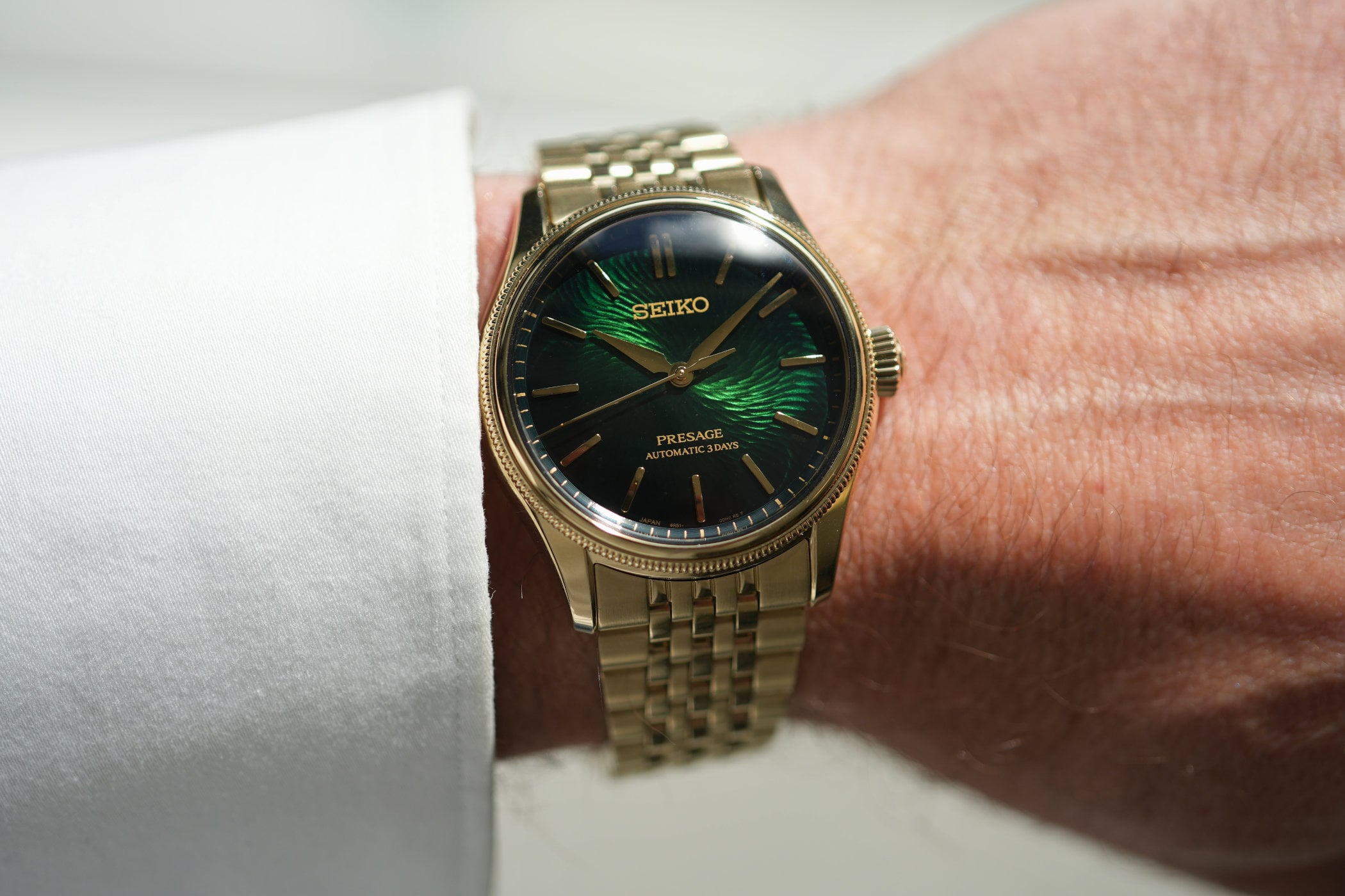
Since its international relaunch in 2016, the Seiko Presage collection, for decades available only to Japanese customers, has become the brand’s showcase of the country’s traditional aesthetics and craftsmanship, offering enamel, porcelain, and urushi-lacquer dials. The recently introduced Presage Classic Series comprise vintage-inspired everyday watches, and the new Seiko Presage Classic is created with Tradman’s […]
 Monochrome
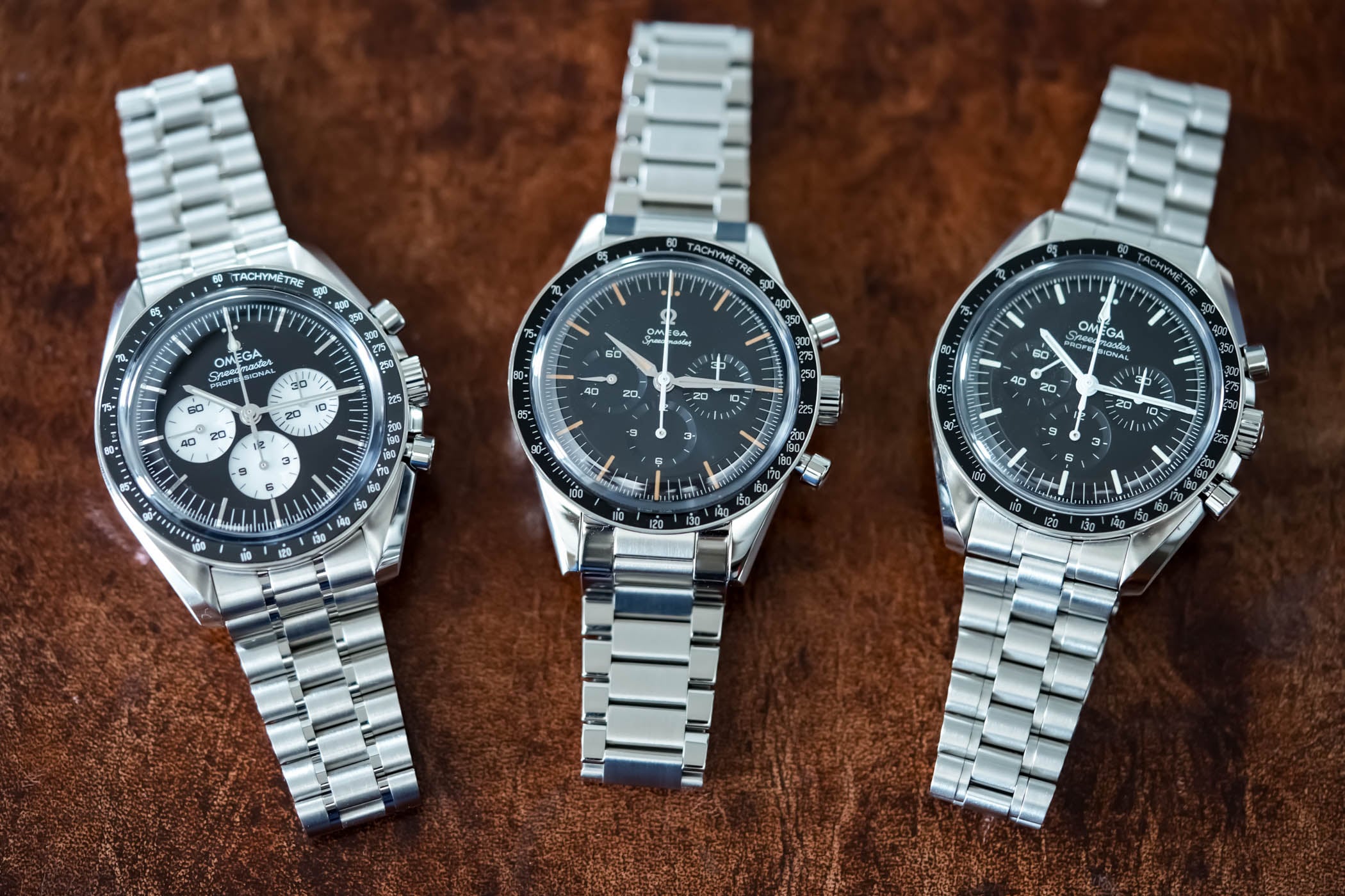
Some, from day-1, know what their favourite version of the all-time iconic Omega Speedmaster is. Whether it is the classic Moonwatch, a modern automatic version, a retro-inspired straight lugs or even a specific vintage model, their search was a short journey. It was not the case for me. I have always loved and respected the […]
 Monochrome
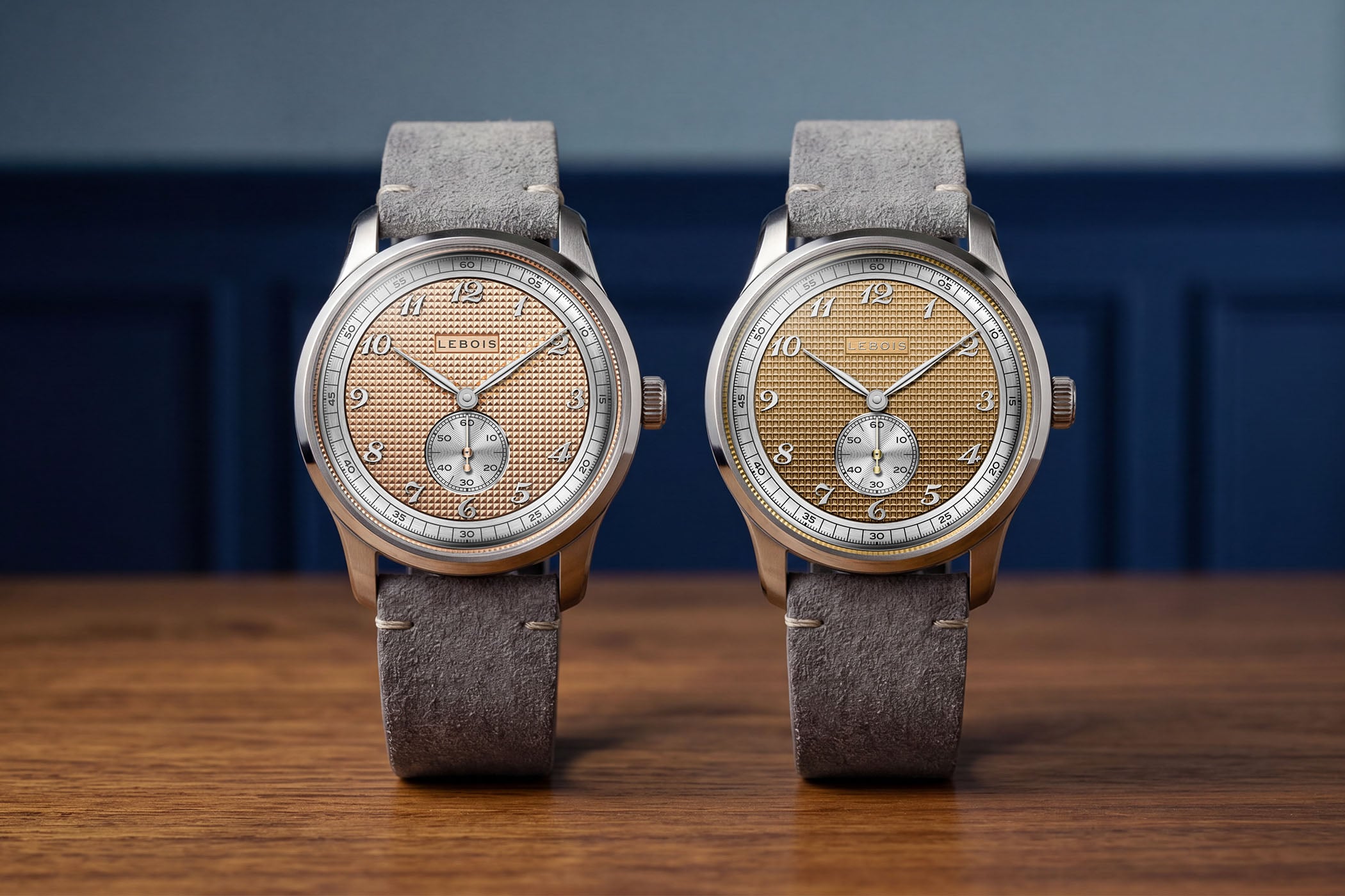
Lebois & Co, an old name revived by Tom van Wijlick, a Dutch native, has steadily built a collection of classically styled, vintage-character watches. Last year’s Heritage Small Seconds introduced a compact dress watch series inspired by the brand’s mid-century archives. Now, two new references are launching the Heritage Atelier collection: the Small Seconds Clous […]
 Hodinkee
This week on The Business of Watches, a breaking news story, of sorts. Our friends at Worn & Wound have acquired Lorier Watches. It's a story of success for the New York-based boutique brand that started way back in 2017 with a mission to make vintage-inspired watches, designed to be worn every day, at an approachable price. In a way, it's a tale of too much success. Lorier co-founders, the husband and wife team Lauren Ortega and Lorenzo Ortega, struggled with the rapid growth of the small company, and the inability to meet demand for their products took a toll on the two-person operation. They considered winding up the brand, as it were, but a talk with Blake Malin, the co-founder of the well-established content, retail, and watch event company Worn & Wound, also based in New York, set them on a different path. Lorier founders Lorenzo Ortega (right) and Lauren Ortega (left). Worn & Wound co-founder and CEO Blake Malin. The acquisition of Lorier is the first time Worn & Wound has acquired a watch brand. Malin and Lorenzo Ortega join us to talk about how the deal came about and what's next for both Lorier and Worn & Wound. Though Ortega spent his formative years in Geneva until he was about 18, it's a decidedly American business story in the watch industry. There's plenty of watch business and strategy to discuss, and we hope you enjoy the conversation. Be sure to leave any thoughts or questions in the comments section, and we'll do our best to respond. Want to subscribe so...
 Fratello
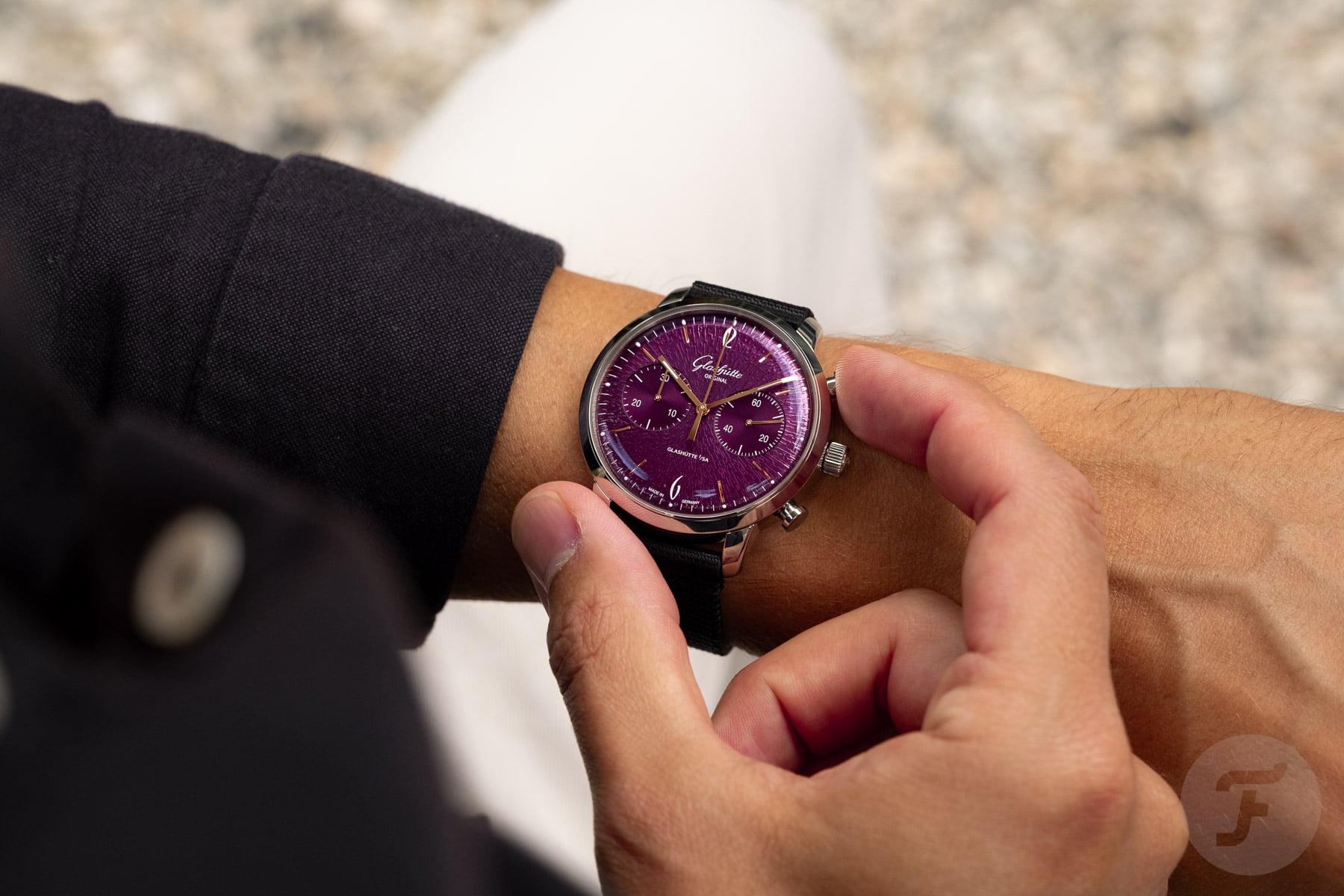
I always thought of Glashütte Original as a modest watch brand. However, the German watchmaker does indeed use its Vintage Collection to experiment with more than the usual black, silver, and blue dials. This is where the new Glashütte Original Sixties Chronograph Annual Edition comes in with its groovy purple dial. I even got to […] Visit Get Your Groove On With The Grape-Dial Glashütte Original Sixties Chronograph to read the full article.
 WatchRider
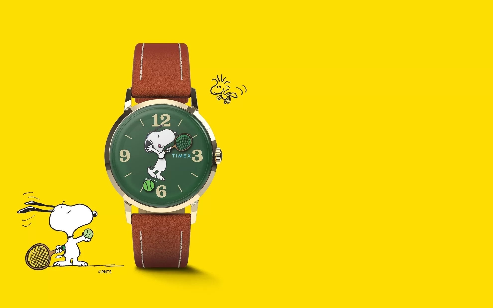
Finding the perfect gift for a tennis enthusiast can be tricky. Do you buy more balls? A new grip? While those are practical, they don’t quite capture the love of the sport. If you’re looking for something that combines sentimental charm, horological history, and a touch of playful elegance, look no further than the Peanuts x Timex Marlin Hand-Wound Snoopy Tennis watch. Vintage Country Club Aesthetics Timex nailed the retro styling with the cool Snoopy watch. The rich, grass-green dial paired with a gold-tone stainless steel case instantly evokes the classic color palettes of Wimbledon or a heritage country club. It comes on a supple brown natural leather strap with contrast stitching, making it versatile enough to wear with a suit or a casual polo after a Saturday morning match. Timex creatively integrated Snoopy into the time-telling mechanics: The Hands Snoopy’s arms act as the watch’s hands, with his racket arm pointing to the minutes and his empty hand tracking the hours. The Sweep-Second Instead of a traditional seconds hand, a tiny, rotating tennis ball endlessly floats around the outer edge of the dial, keeping the match going all day long. It’s an incredibly charming animation that adds a playful splash of personality to the wrist, guaranteed to make them smile every time they check the time. Vintage Sizing for Modern Wrists At 34mm, this watch stays true to classic vintage proportions. While many modern men’s watches push 40mm and beyond, a...
Question, suggestion, or just want to say hi? Drop a note.