 SJX Watches
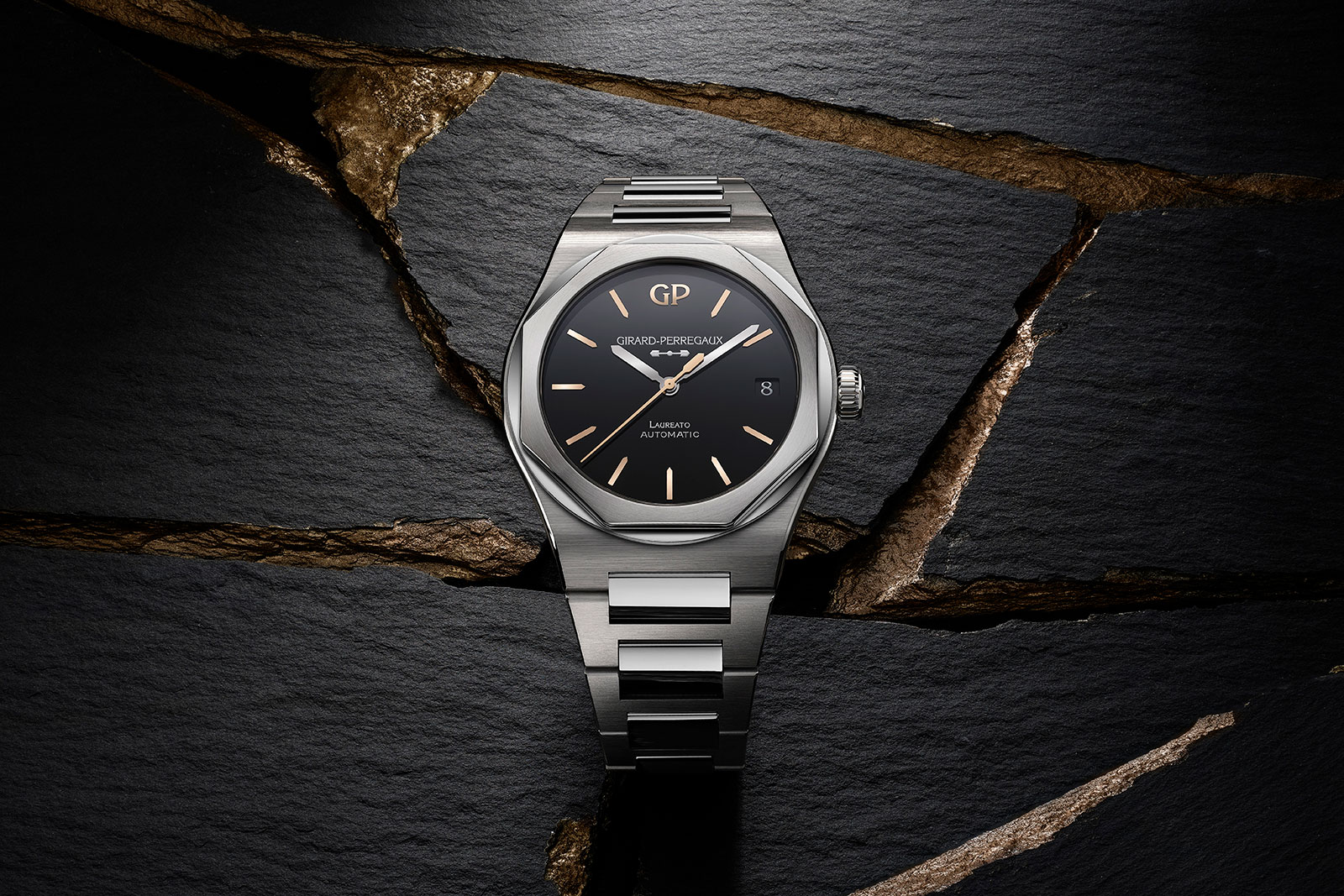
Girard-Perregaux Introduces the Laureato Infinity Edition
Typically offered with a familiar guilloche dial, Girard-Perregaux’s luxury-sports watch has been facelifted with a polished, mineral stone dial. Equipped with glossy, black onyx dial featuring pink-gold hour markers, the Laureato Infinity Edition is a limited edition in two case sizes for men and women respectively. Initial thoughts The luxury-sports watch category is populated by many similar watches, driven by the popularity of the Gerald Genta-designed segment leaders, which are arguably the definitive sports watches with integrated bracelets and blue dials. Few watches manage to differentiate themselves; even the standard Laureato blends in. The Laureato Infinity Edition manages to be different without trying too hard, while also being priced reasonably. The combination isn’t imaginative but it works well. The dial is a glossy black, matched with contrasting hour markers in pink gold, and markings in powdered-silver print – a combination that is clean, classic, but also different from its peers. The only odd element of the design are the rhodium-plated hands, which are probably highly legible, but don’t match the colour of the hour markers. Arguably the only weakness are the in-house movements. Both are robust, reliable calibres that have been around for decades, but they lack many of the upgrades found in newer movements, most notably a longer power reserve. The standard Laureato is already a well priced watch. The Infinity Edition sticks to that formula ...