 Time+Tide
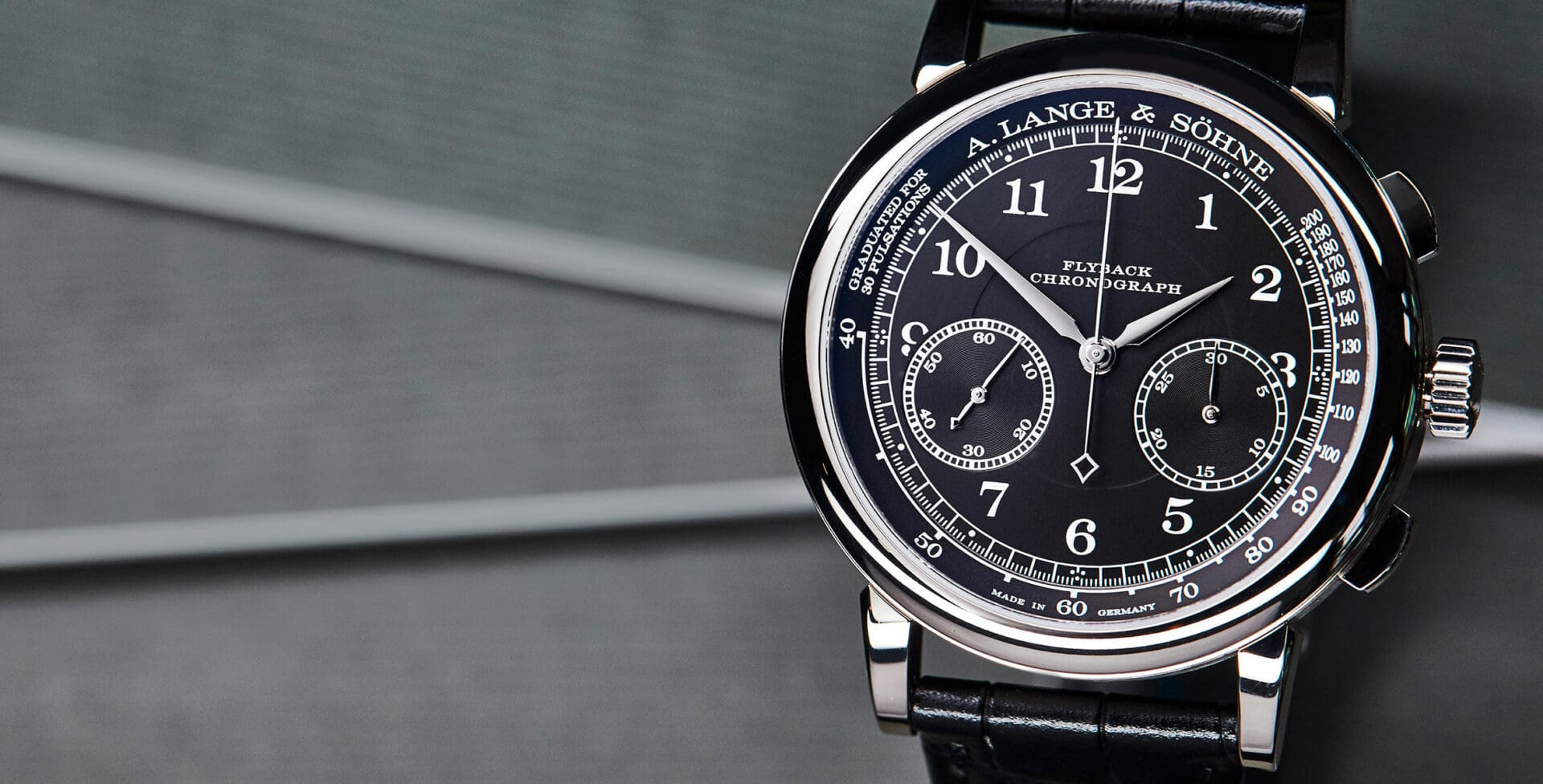
INSIGHT: Designing A. Lange & Söhne – part 3, the tone of type
Typography matters. The choice of font or type is a more complicated matter than merely the arrangement of letters used and the order in which they appear. It’s something designers and branding specialists know only too well: the sub-textual information communicated through the subtle language of serif, weight and kerning. Take the word ‘apple’, for … ContinuedThe post INSIGHT: Designing A. Lange & Söhne – part 3, the tone of type appeared first on Time+Tide Watches.