Watch brandsWatch wikiWatch videosVariousWatch calendarSaved articles
PopularRolexOmegaPatek PhilippeAudemars PiguetTudorGrand SeikoCartierSeikoIWCTAG HeuerBreitlingJaeger-LeCoultreA. Lange & SohneZenith

Results for A. Lange & Söhne Odysseus

829 articles · 17 videos found · page 12 of 29

View A. Lange & Sohne brand page
A. Lange & Söhne Introduces the Grand Lange 1 “25th Anniversary” SJX Watches
A. Lange & Sohne Jul 24, 2019

A. Lange & Söhne Introduces the Grand Lange 1 “25th Anniversary”

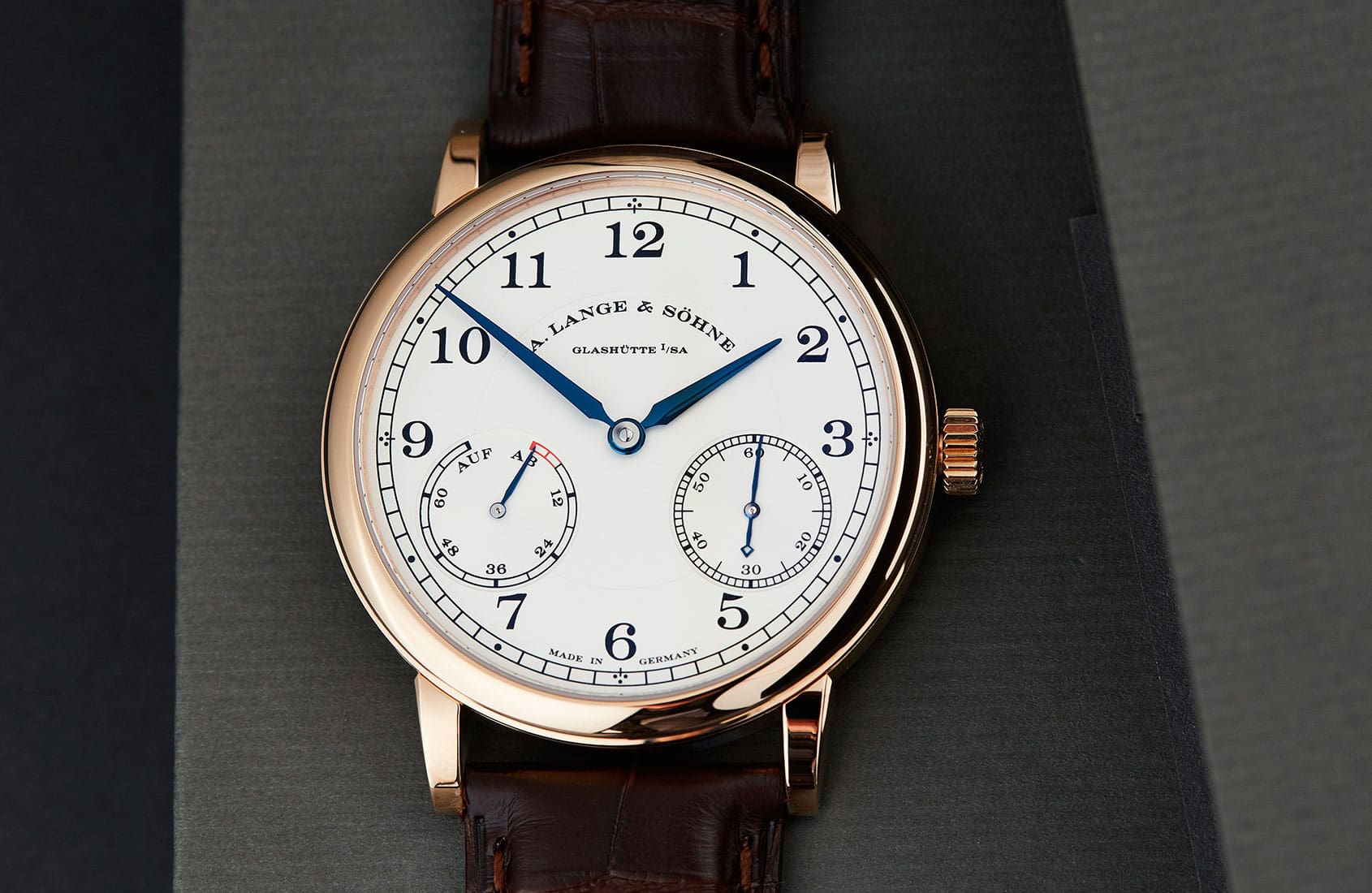
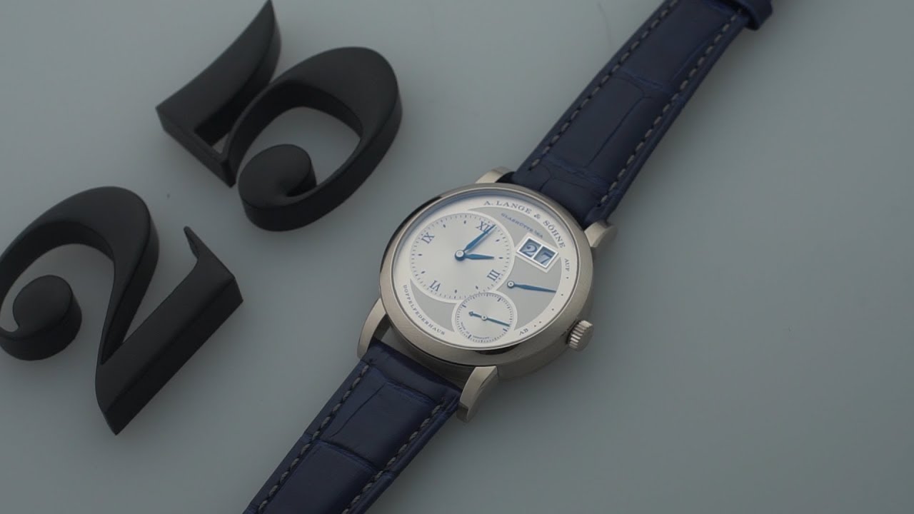
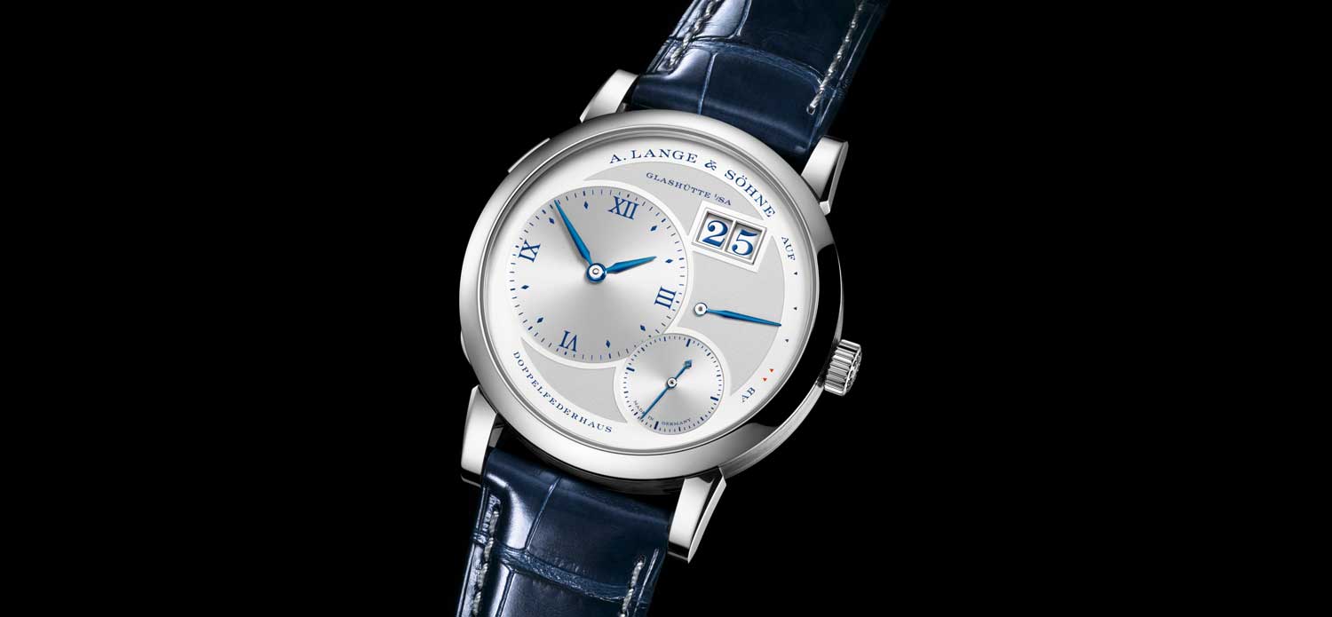
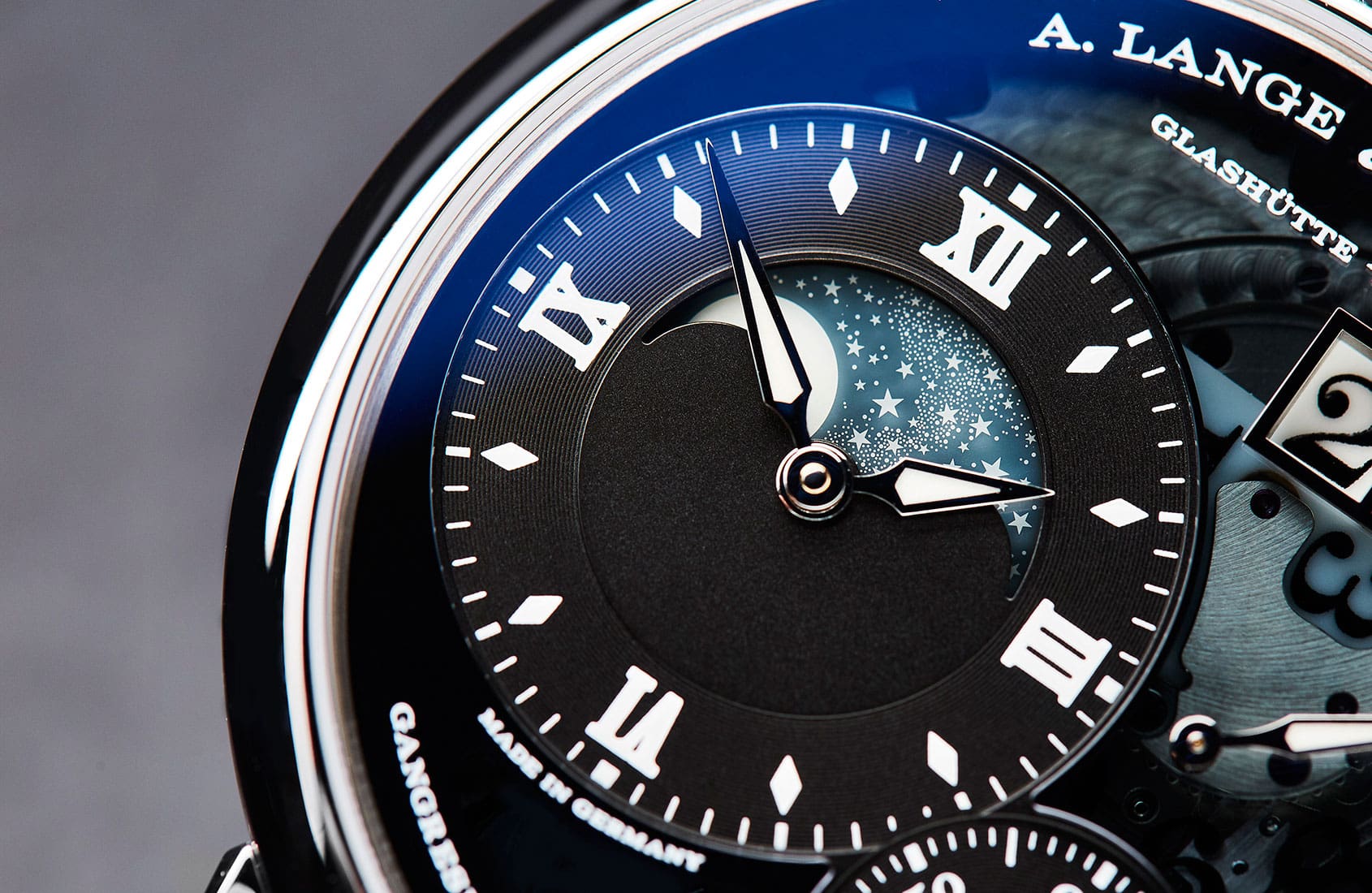
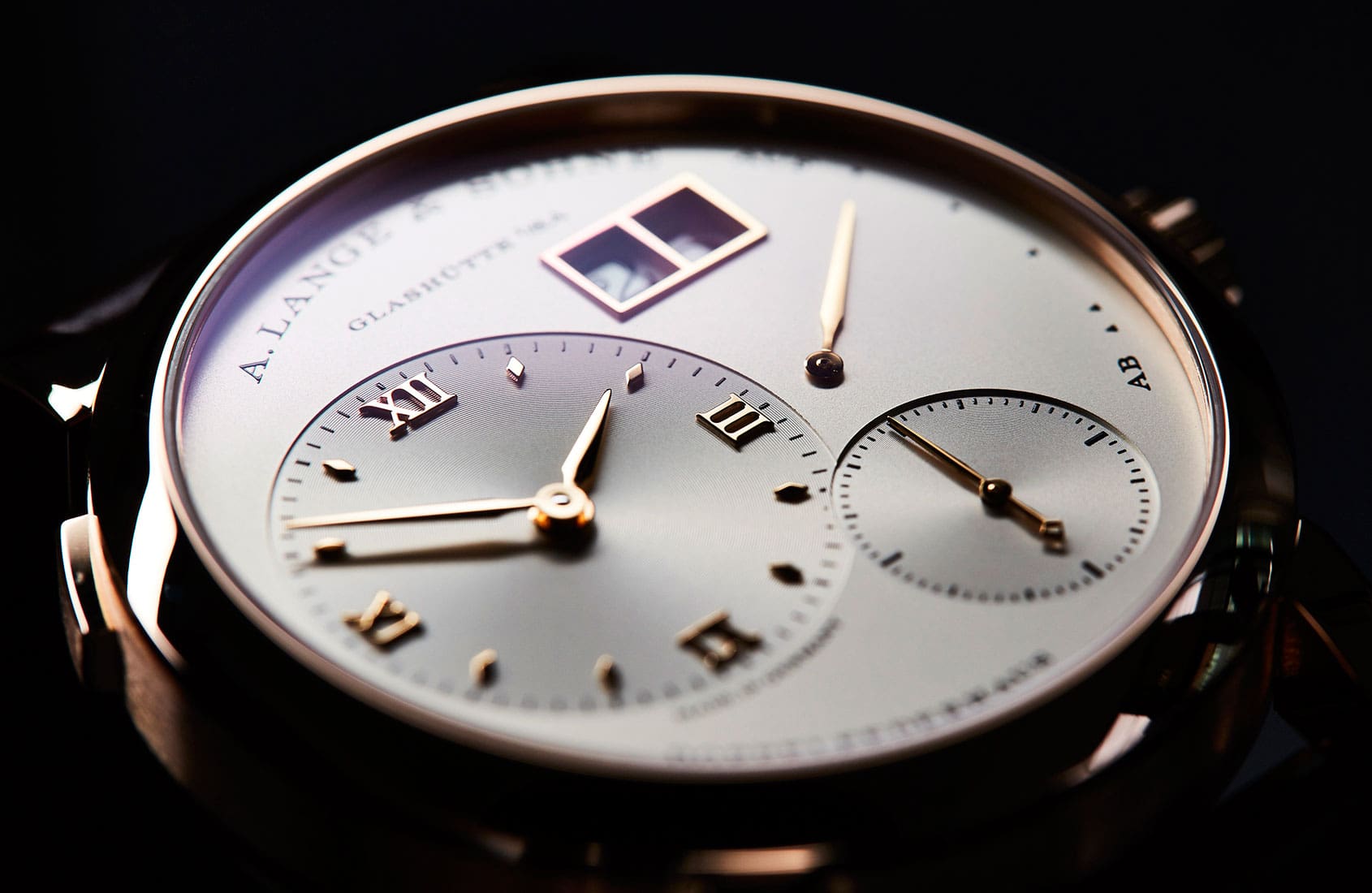
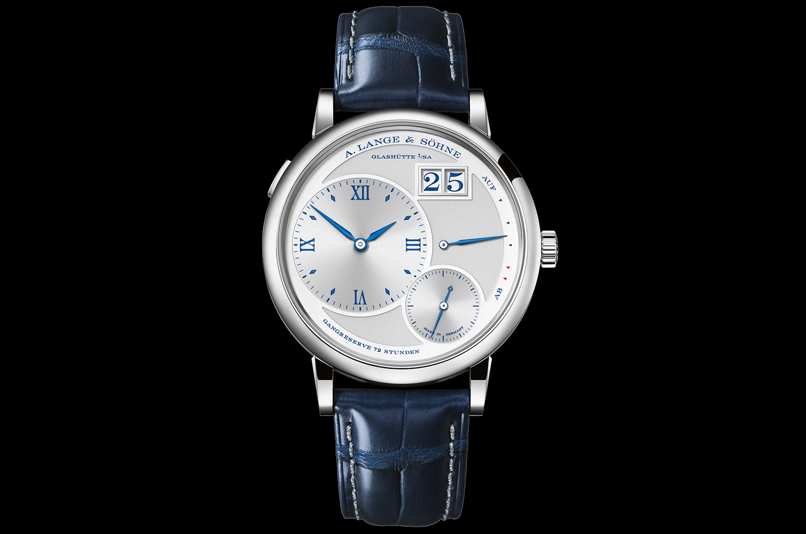
The story of the A. Lange & Söhne 25th anniversary set is now well known: slated for October launch, the set will comprise 10 different Lange 1 watches, all clad in the same blue and silver livery. One watch has been announced a month since the start of the year, and the latest addition is the Grand Lange 1 “25th Anniversary”. First introduced in 2003, the Grand Lange 1 was initially criticised for meddling with an iconic design. It has since matured well, helped by several redesigns as well as a movement conceived specifically for the watch. Grand Lange 1 25th Anniversary Bigger and better It’s the larger brother of the Lange 1, with a case diameter that’s 2.5mm larger; making it 41mm compared to 38.5mm for the classic Lange 1. But because the movement inside was designed to fit the watch, it scales up the design while adhering strictly to the proportions and geometry of the original Lange 1. The new movement was required to accommodate the signature, off-centre displays of the Lange 1, which sit on a neat grid. The cal. L095.1 is 34.1mm, compared to the 30.4mm of the first generation Lange 1 movement, the L901.0. An upside of the larger movement is the consolidation of the twin barrels of the smaller Lange 1 into a single, larger barrel, while still maintaining the 72-hour power reserve. That leads to a small but crucial difference on the dial of the Grand Lange 1: the lettering at seven o’clock reads “Gangreserve 72 Stunden”, German for ...

No downsides to the A. Lange & Söhne 1815 Up/Down Time+Tide
A. Lange & Sohne Jul 20, 2019

No downsides to the A. Lange & Söhne 1815 Up/Down

Editor’s note: The other day I caught up with someone who’d recently picked up an A. Lange & Söhne 1815 Up/Down, and holding it in my hand - by golly gosh, those German guys at ALS know their way around a watch. This piece might not be their most complicated or most hyped, but it’s … ContinuedThe post No downsides to the A. Lange & Söhne 1815 Up/Down appeared first on Time+Tide Watches.

VIDEO: 6 exceptional A. Lange & Söhne watches from SIHH 2018 Time+Tide
A. Lange & Sohne Mar 4, 2018

VIDEO: 6 exceptional A. Lange & Söhne watches from SIHH 2018

A. Lange & Söhne is a serious watchmaking brand. Everything they do is deliberate, and relentlessly on message. It would be easy to assume - based on this and the generally traditional nature of their timepieces - that the German brand is sober to the point of dullness, but the reality is exactly the opposite. Not … ContinuedThe post VIDEO: 6 exceptional A. Lange & Söhne watches from SIHH 2018 appeared first on Time+Tide Watches.

INSIGHT: Designing A. Lange & Söhne – part 4, colour, material and finish Time+Tide
A. Lange & Sohne Feb 6, 2018

INSIGHT: Designing A. Lange & Söhne – part 4, colour, material and finish

Think of Lange’s colour palette and the word ‘sober’ probably springs to mind. Or restrained. Limited. Calm. Muted. Subdued. Discreet. Anything but vivid and daring. Now, let’s for a moment think not of A. Lange & Söhne but only of the colours: white, black, grey (dials); black again, brown, (straps); pink gold, white gold (platinum … ContinuedThe post INSIGHT: Designing A. Lange & Söhne – part 4, colour, material and finish appeared first on Time+Tide Watches.

INSIGHT: Designing A. Lange & Söhne – part 3, the tone of type Time+Tide
A. Lange & Sohne Feb 4, 2018

INSIGHT: Designing A. Lange & Söhne – part 3, the tone of type

Typography matters. The choice of font or type is a more complicated matter than merely the arrangement of letters used and the order in which they appear. It’s something designers and branding specialists know only too well: the sub-textual information communicated through the subtle language of serif, weight and kerning. Take the word ‘apple’, for … ContinuedThe post INSIGHT: Designing A. Lange & Söhne – part 3, the tone of type appeared first on Time+Tide Watches.

INSIGHT: Designing A. Lange & Söhne – part 2, the detail in the dial Time+Tide
A. Lange & Sohne Feb 2, 2018

INSIGHT: Designing A. Lange & Söhne – part 2, the detail in the dial

There are few dials as instantly recognisable in the world of modern watchmaking as that of the Lange 1. This circular watch, with its off-centre hours and minutes dial, subsidiary seconds, power reserve and that instantly recognisable big date. In the opinion of Caragh McKay, watches and jewellery director at Wallpaper* (and founder of McKay … ContinuedThe post INSIGHT: Designing A. Lange & Söhne – part 2, the detail in the dial appeared first on Time+Tide Watches.