Watch brandsWatch wikiWatch videosVariousWatch calendarSaved articles
PopularRolexOmegaPatek PhilippeAudemars PiguetTudorGrand SeikoCartierSeikoIWCTAG HeuerBreitlingJaeger-LeCoultreA. Lange & SohneZenith

Results for Lange Datograph

1,025 articles · 139 videos found · page 19 of 39

View A. Lange & Sohne brand page

Related pages

Icon · Guide
Datograph A. Lange & Söhne

The 1999 flyback chronograph from A. Lange & Söhne with the in-house Cal. L951.1 movement.

VIDEO: 6 exceptional A. Lange & Söhne watches from SIHH 2018 Time+Tide
A. Lange & Sohne Mar 4, 2018

VIDEO: 6 exceptional A. Lange & Söhne watches from SIHH 2018

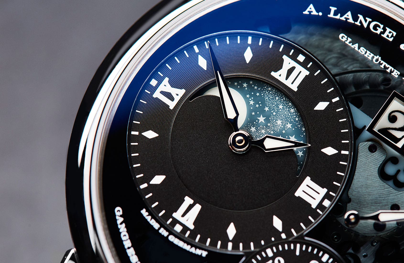
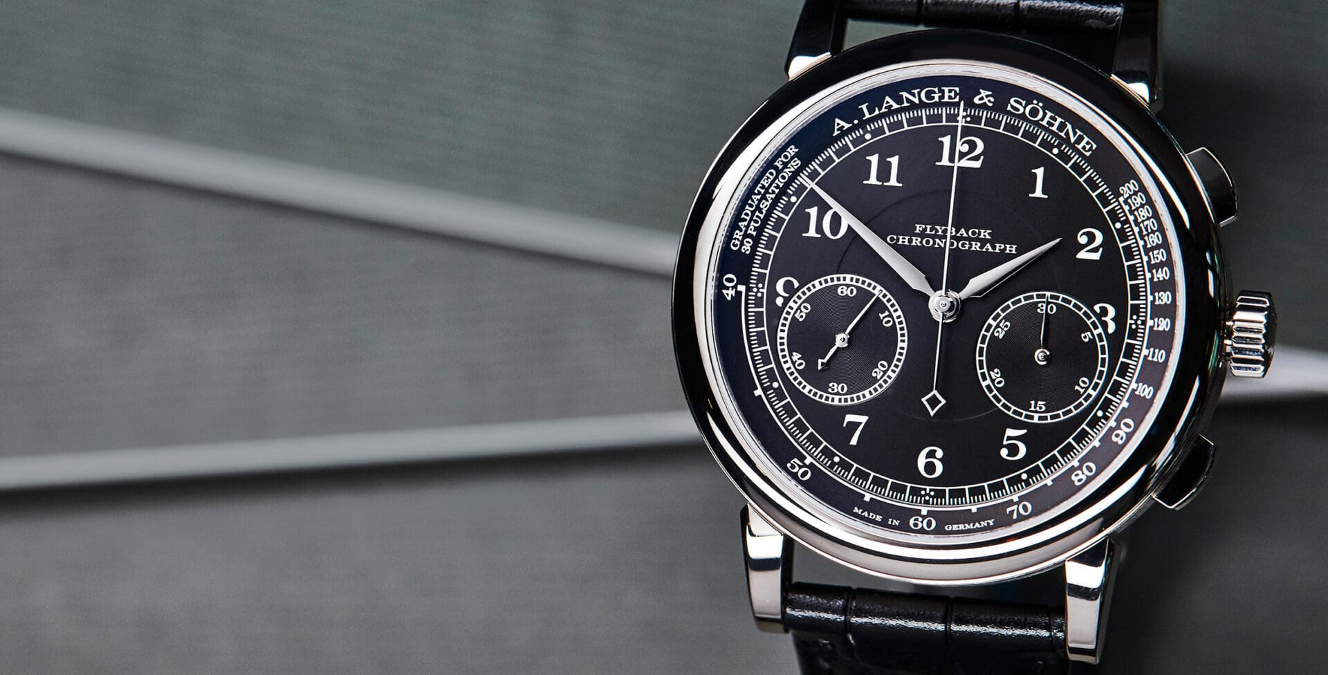
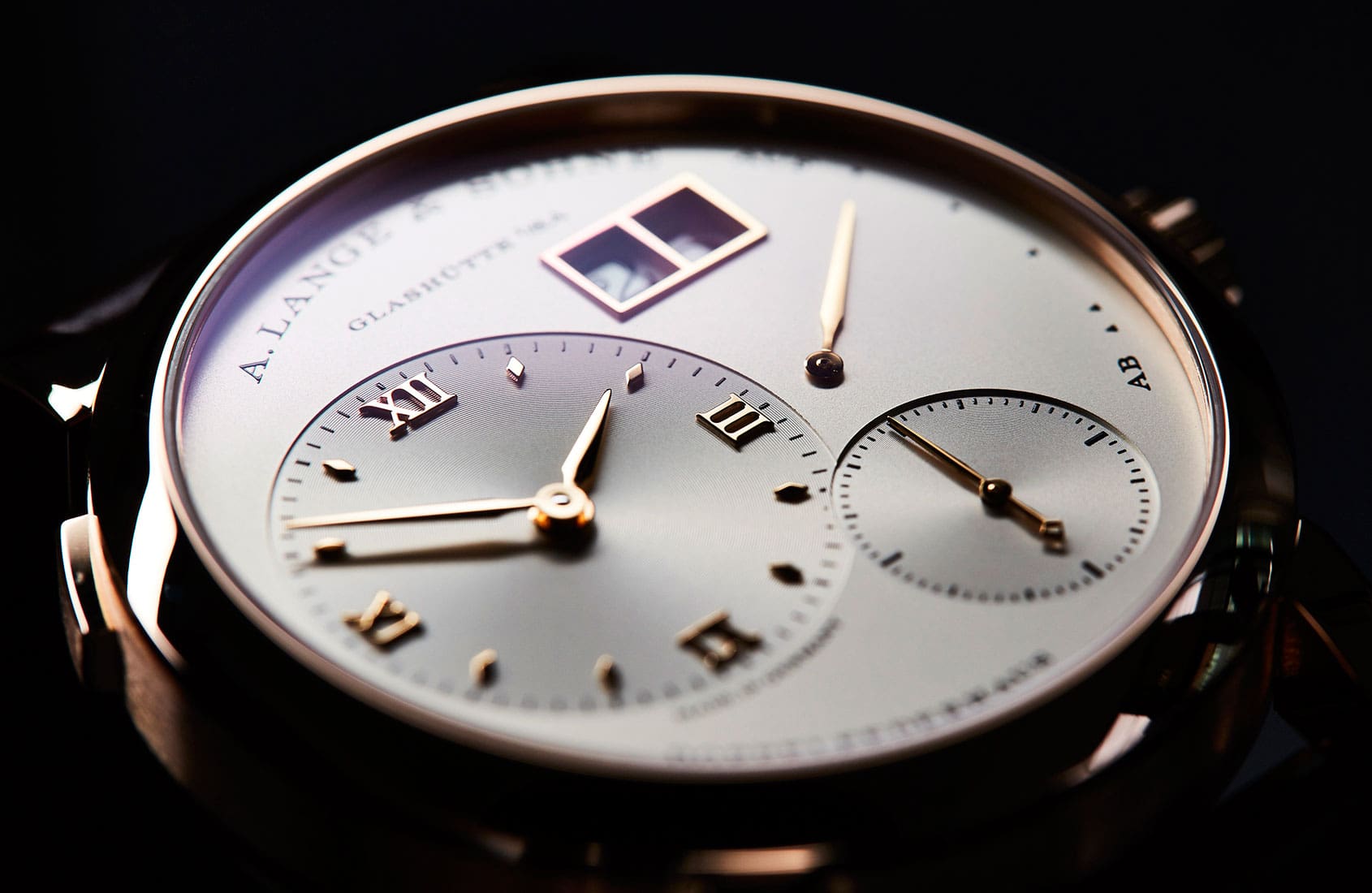
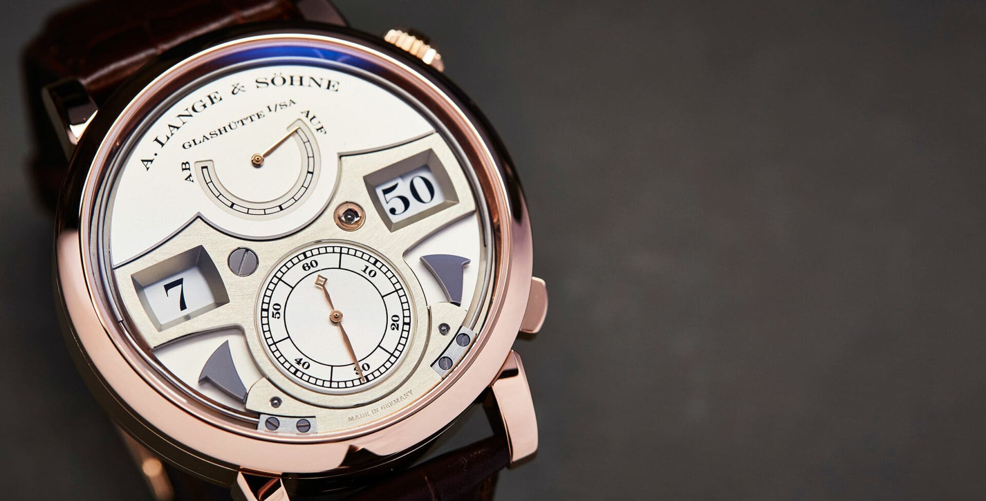
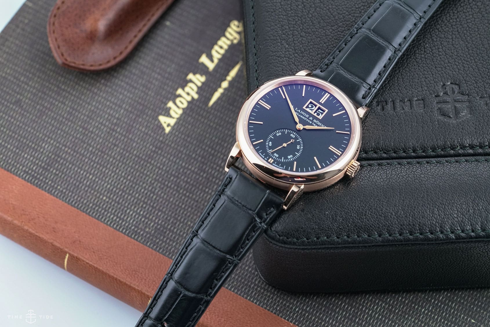
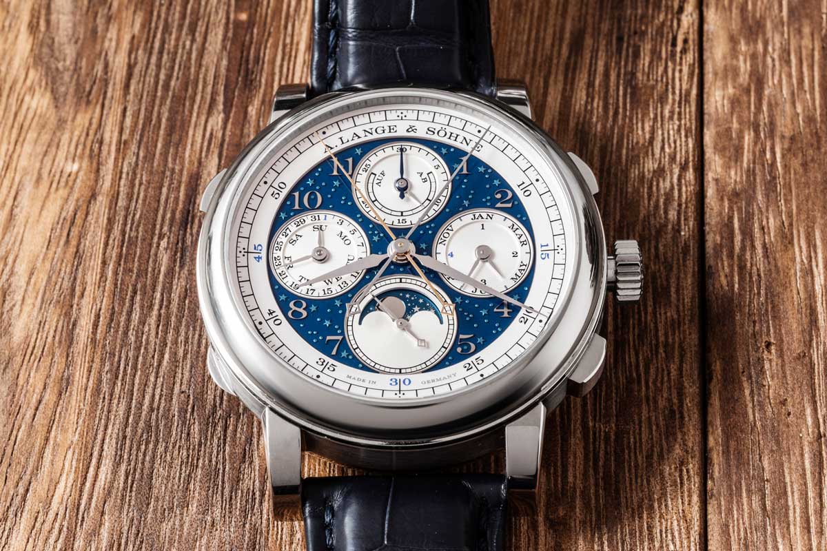
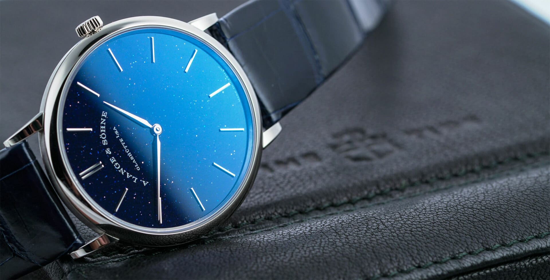
A. Lange & Söhne is a serious watchmaking brand. Everything they do is deliberate, and relentlessly on message. It would be easy to assume - based on this and the generally traditional nature of their timepieces - that the German brand is sober to the point of dullness, but the reality is exactly the opposite. Not … ContinuedThe post VIDEO: 6 exceptional A. Lange & Söhne watches from SIHH 2018 appeared first on Time+Tide Watches.

INSIGHT: Designing A. Lange & Söhne – part 4, colour, material and finish Time+Tide
A. Lange & Sohne Feb 6, 2018

INSIGHT: Designing A. Lange & Söhne – part 4, colour, material and finish

Think of Lange’s colour palette and the word ‘sober’ probably springs to mind. Or restrained. Limited. Calm. Muted. Subdued. Discreet. Anything but vivid and daring. Now, let’s for a moment think not of A. Lange & Söhne but only of the colours: white, black, grey (dials); black again, brown, (straps); pink gold, white gold (platinum … ContinuedThe post INSIGHT: Designing A. Lange & Söhne – part 4, colour, material and finish appeared first on Time+Tide Watches.

INSIGHT: Designing A. Lange & Söhne – part 3, the tone of type Time+Tide
A. Lange & Sohne Feb 4, 2018

INSIGHT: Designing A. Lange & Söhne – part 3, the tone of type

Typography matters. The choice of font or type is a more complicated matter than merely the arrangement of letters used and the order in which they appear. It’s something designers and branding specialists know only too well: the sub-textual information communicated through the subtle language of serif, weight and kerning. Take the word ‘apple’, for … ContinuedThe post INSIGHT: Designing A. Lange & Söhne – part 3, the tone of type appeared first on Time+Tide Watches.

INSIGHT: Designing A. Lange & Söhne – part 2, the detail in the dial Time+Tide
A. Lange & Sohne Feb 2, 2018

INSIGHT: Designing A. Lange & Söhne – part 2, the detail in the dial

There are few dials as instantly recognisable in the world of modern watchmaking as that of the Lange 1. This circular watch, with its off-centre hours and minutes dial, subsidiary seconds, power reserve and that instantly recognisable big date. In the opinion of Caragh McKay, watches and jewellery director at Wallpaper* (and founder of McKay … ContinuedThe post INSIGHT: Designing A. Lange & Söhne – part 2, the detail in the dial appeared first on Time+Tide Watches.

HANDS-ON: The A. Lange & Söhne Saxonia Outsize Date Time+Tide
Casio ns are more relaxed Jan 23, 2018

HANDS-ON: The A. Lange & Söhne Saxonia Outsize Date

While the rules about how a man should dress for formal occasions are more relaxed than in the past, they are still governed by the principles of timelessness: elegance, discretion, refinement and restraint. Self-expression and individuality are all very well, but wearing a chunky, sporty watch with a dinner suit (or even a formal business … ContinuedThe post HANDS-ON: The A. Lange & Söhne Saxonia Outsize Date appeared first on Time+Tide Watches.