 Revolution
Results for Only Watch
21,718 articles · 216 videos found · page 295 of 732
Revolution
 Time+Tide
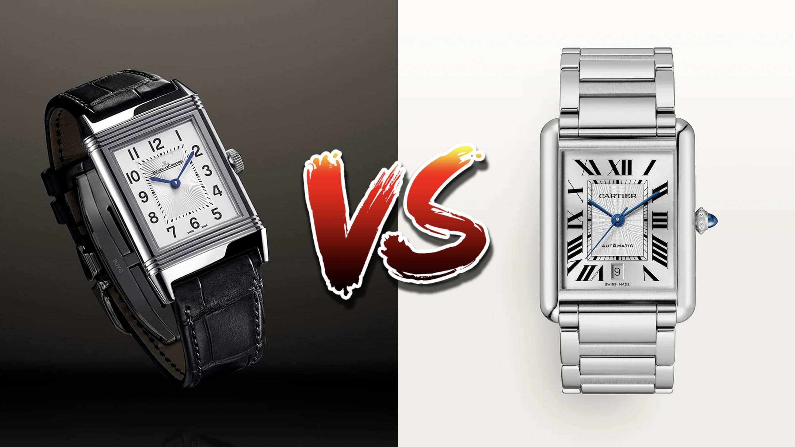
Jaeger-LeCoultre Reverso and Cartier Tank- how do the two icons stack up?
When it comes to rectangular watches, there are pretty much only two titans. Brands which release their own will inevitably be compared to them, and for good reason. For nearly a century, these two watches have been at the forefront of fashion whether it’s formal, casual, or even sporty. They are the Cartier Tank and … ContinuedThe post Jaeger-LeCoultre Reverso and Cartier Tank- how do the two icons stack up? appeared first on Time+Tide Watches.
 Worn & Wound
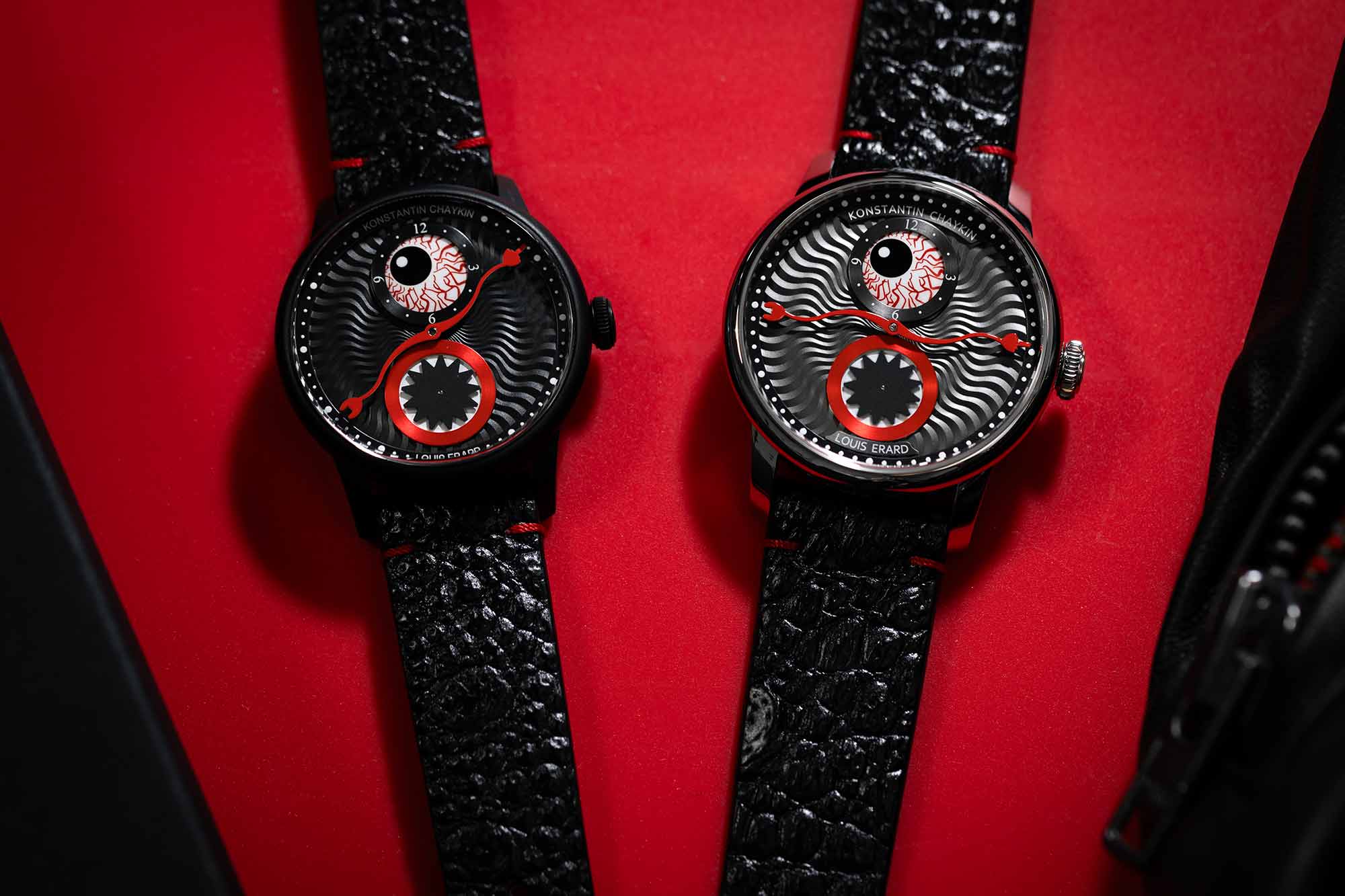
Louis Erard and Konstantin Chaykin Return to their Time Eater Concept with a Darker Sequel
It’s no surprise that after the successful launch of the Time Eater, the viral collaboration between Louis Erard and Konstantin Chaykin that launched in April, that the two would attempt a follow up. In fact, not only is it not a surprise, it was expected by anyone who paid close attention to the marketing materials we saw earlier this year, which teased another release to come. Well, like the horror movie franchises that this collaboration sometimes evokes, the sequel has come quickly. The Time Eater II: From Dusk to Dawn, is a pair of watches that use the same basic design as the original Time Eater, but in a darker (literally and figuratively) execution. I don’t know if a “Halloween watch” is actually a thing, but given the aesthetic of the new Time Eater and the season we find ourselves in, it makes a strong case. Like the first drop, this release sees two different versions of the watch in two different case sizes, released alongside one another. Instead of the silvery white dials of the first pair, here we have black (for the 39mm watch) and anthracite (on the larger 42mm version). Both have bright red minute hands that match the major aesthetic shift on these new Time Eaters: a truly gross bloodshot eye hour register. It’s paired with the same sawtooth seconds register at 6:00, and when everything is put together it certainly gives off a spookier vibe, making the original watches with hints of purple and green seem downright playful by comparison. The ...
 Deployant
New: TAG Heuer Monaco Chronograph Night Driver
Tag Heuer releases a new Monaco Chronograph dubbed the Night Driver in time for the Singapore Grand Prix, the only race in F1 which is at night.
 Hodinkee
Photo Report: MoonSwatch Déjà Vu: Lines Form In NYC For The Launch Of The Blancpain X Swatch Scuba Fifty Fathoms
The new automatic Bioceramic collab still had people turning out in droves, and we were on the scene in Times Square.
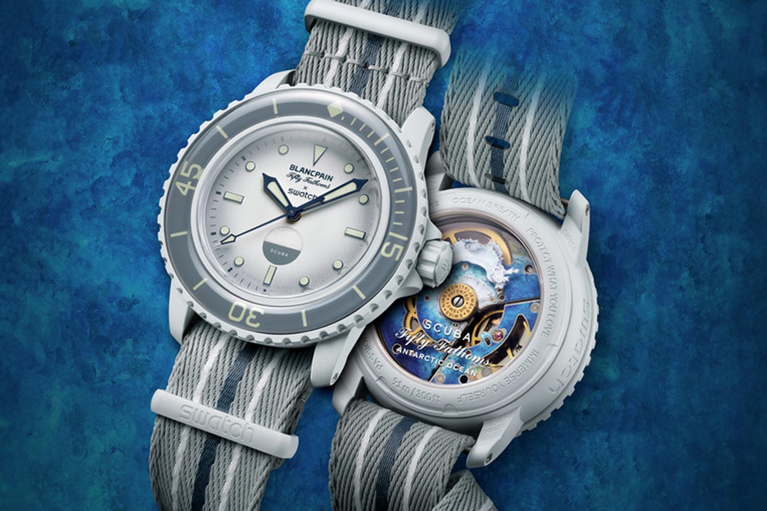
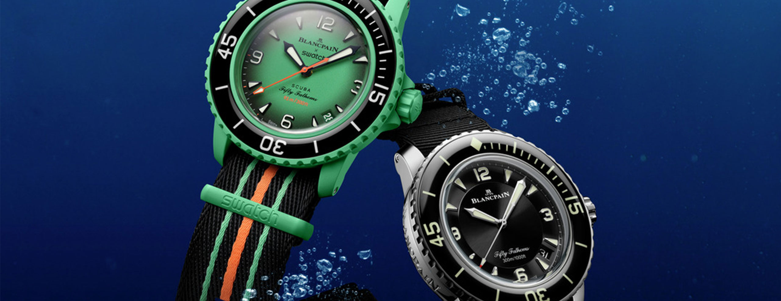 Revolution
Blancpain and Swatch Launch the Bioceramic Scuba Fifty Fathoms Collection
 Worn & Wound
Hands-On: The Eucalyptus Green Ressence Type 3 EE
The Ressence Type 3 collection welcomes a new member this week with the introduction of the serene Type 3 EE. The brand continues to work in subtle and interesting green hues, following up on the sage Type 8S (reviewed here) with this rich eucalyptus green dial. It’s a slightly unconventional execution within the more dramatic Type 3 collection, which we’ve only seen rendered in black and soft white up to this point. In person, the green is a perfect companion to the Type 3’s primary accent colors and rotating dial sets. Given the case it’s set within, that green is given an oil filled canvas for maximum impact. The Type 3 is one of two oil filled Ressence watches, along with the “world-proof” dive watch, the Type 5. The effect is remarkable in person, and one that I’ve always found core to the Ressence experience. The Type 3 EE features the eucalyptus green on both the font and back panel of the watch (hence the EE), and comes through brilliantly, as though it were painted directly on the crystal, thanks to the oil filled dial. The color is subtle but rich, somehow, and the colors used for the various displays have been desaturated enough to hit the same value scale as the green itself, so as not to create a distracting level of contrast. The Type 3 is on the maximalist side of Ressence, boasting the oil temperature gauge, a dial for the day of the week, and the date itself, on top of the hours, minutes, and seconds, of course. It all leads to a rather dra...
 Time+Tide
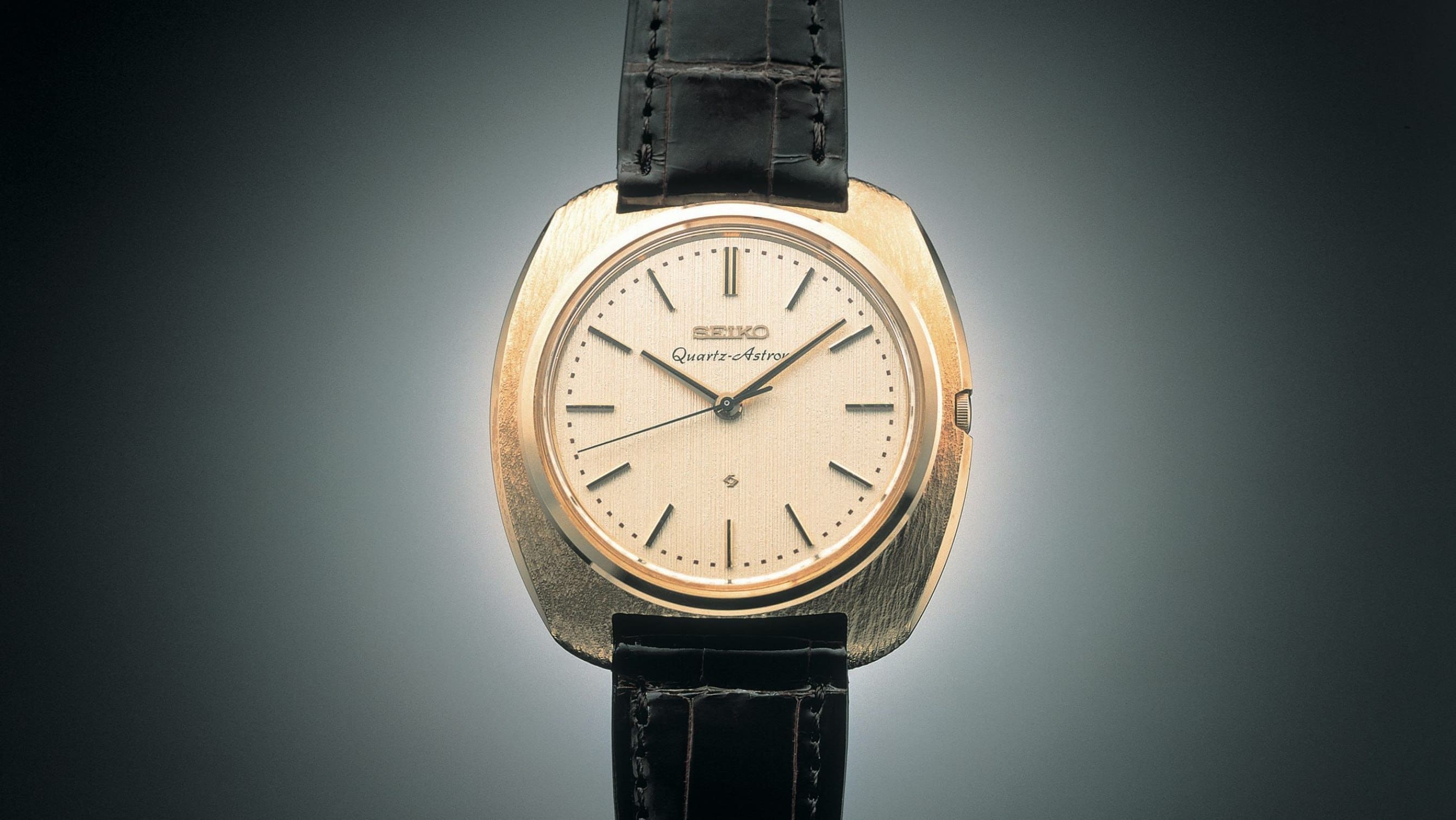
WHAT IF… The quartz crisis never happened?
Likely the most significant horological event of the previous century, the quartz crisis (or revolution, depending on which side you stood), not only signalled the beginning of the end for many smaller watch manufactures, but also influenced the way we look at watches to this very day. Quartz is often looked down upon, and incorrectly … ContinuedThe post WHAT IF… The quartz crisis never happened? appeared first on Time+Tide Watches.
 Worn & Wound
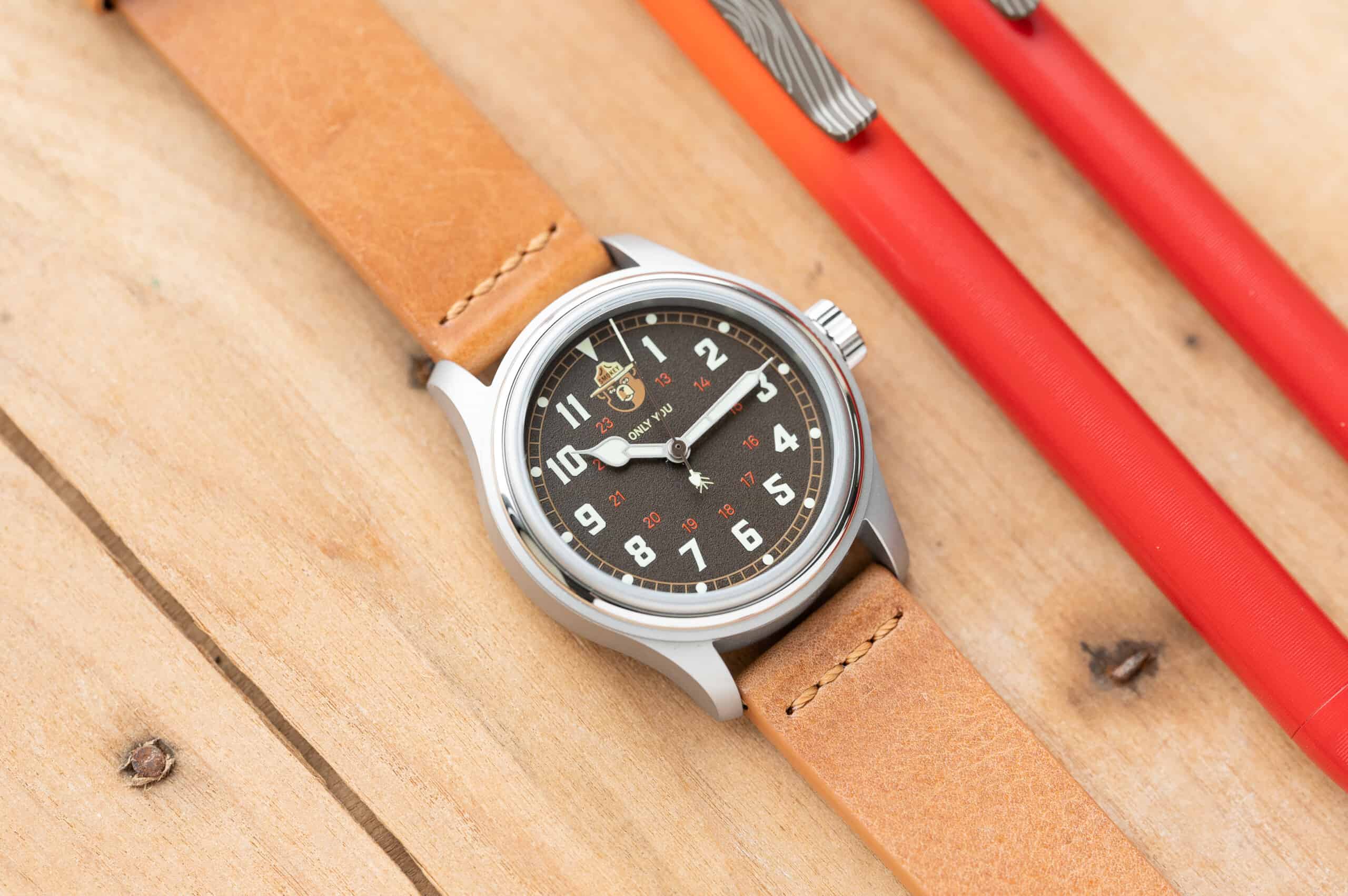
Hands-On: the Vero Smokey ’44
Just a few short weeks ago, Vero introduced their officially-licensed Smokey the Bear watches that were inspired not only by the bear himself, but the era in which he came into existence. Today, we’re taking a look at the Smokey ’44. It’s inspired by the military watches of the 1940s, blended with a wildfire-themed color palette and a depiction of the friendly-but-stern bear right at 12 o’clock on the dial. This officially-licensed piece of Smokey swag is a great representation of both Vero as a brand and what Smokey the Bear stands for. Vero isn’t all talk either, being that 10% of all sales go directly back to the US Forest Service for conservation efforts. Let’s take a closer look, and remember - only you can prevent wildfires. $450 Hands-On: the Vero Smokey ’44 Case Stainless steel Movement Seiko NH38A automatic Dial Black, textured Lume Green SuperLuminova Lens Sapphire Strap Leather + canvas Water Resistance 120 meters Dimensions 38 x 46mm Thickness 12mm Lug Width 20mm Crown Screw down Warranty 10 years Price $450 Case Clocking in at a comfortable 38mm, the case of the ’44 wears really well on my 6.75” wrist. There’s nothing overly notable about the case, and I say that in a good way. It’s a straightforward field watch with a sturdy case that inspires confidence that it’ll stand up to whatever you want to throw at it. With 120m of water resistance, the ’44 has more than enough protection from H2O for a swim and then some. I like how Vero c...
 Time+Tide
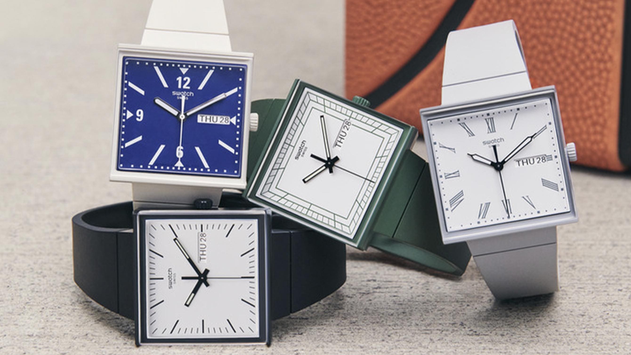
The new Swatch Bioceramic What If? collection reimagines their round 1983 debut as square
The new Swatch Bioceramic What If? collection imagines their 1983 debut was square instead of round. It merges ‘80s style with modern eco-friendly materials such as bioceramic. Four watches are available in green, black, grey and beige. The exploration of alternate and parallel universes has definitely become one of the most interesting pop culture trends … ContinuedThe post The new Swatch Bioceramic What If? collection reimagines their round 1983 debut as square appeared first on Time+Tide Watches.
 Deployant
New: Swatch BIOCERAMIC WHAT IF? in square case
Swatch release four new references in Bioceramic in a square case in black, gray, green and beige (blue dial). Introducing the BIOCERAMIC WHAT IF?
 Quill & Pad
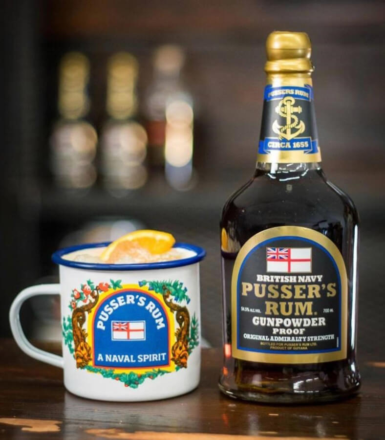
Splice the Mainbrace! Pusser’s Rum: July 31st is Black Tot Day, and the End of a Royal Navy Tradition – Reprise
The first Black Tot Day was in 1970, the last day on which sailors in the United Kingdom’s Royal Navy were issued their daily rum rations (“tots”). Pusser's has taken the exact recipe used by the Royal Navy when it discontinued the daily ration on July 31, 1970 and used it to make its rums, the only producer in the world to do so. Here, Ken Gargett fills us in on everything tot - he luckily doesn't go "sipping the admiral," though.
 Time+Tide
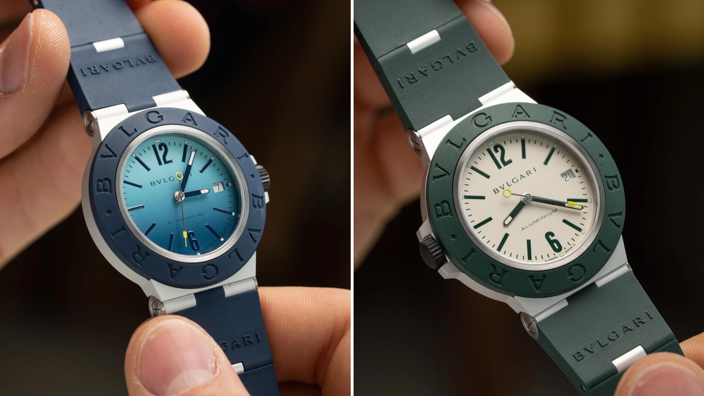
VIDEO: Bulgari’s new Aluminium Capri and Match Point get a splash of summer-ready colour
Despite being launched during the 2023 edition of Watches & Wonders, Bulgari’s summer-ready intentions were clear with their latest Aluminium limited edition duo. Named the Capri and Match Point, both seem perfectly capable companions for any holiday adventure, whether it be dipping into the azure waters off the Italian coast, or playing three points of … ContinuedThe post VIDEO: Bulgari’s new Aluminium Capri and Match Point get a splash of summer-ready colour appeared first on Time+Tide Watches.
 Time+Tide
Remember when Blue Mountain State roasted lacrosse players with a Patek joke?
I am always watching the latest hit television shows, but every now and again I will find comfort in enjoying a classic I have already seen. A show which ran for three seasons, across only a year or so, Blue Mountain State became a cult-classic, at least in America, as one of the last television … ContinuedThe post Remember when Blue Mountain State roasted lacrosse players with a Patek joke? appeared first on Time+Tide Watches.
 Time+Tide
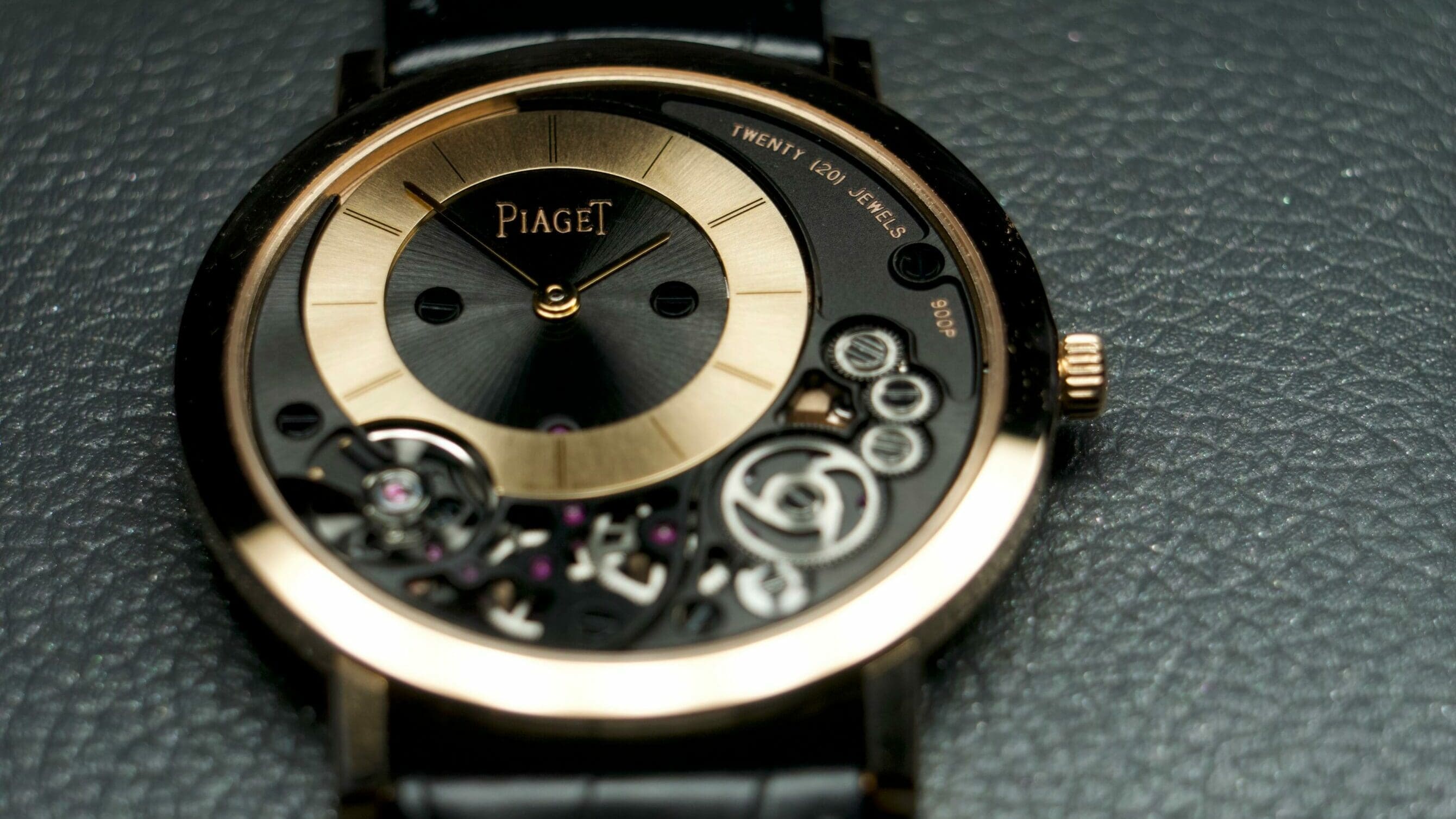
TRADING FACES: Why I just gave up five Kurono watches for this one Piaget
It’s Trading Faces time! For those tuning in for the first time, Trading Faces is a column in which I break down genuine watch trades I have made in my collection. I love writing this column, not only because it means there is a new and exciting, at least for me, watch in my collection, but also because it … ContinuedThe post TRADING FACES: Why I just gave up five Kurono watches for this one Piaget appeared first on Time+Tide Watches.
 Worn & Wound
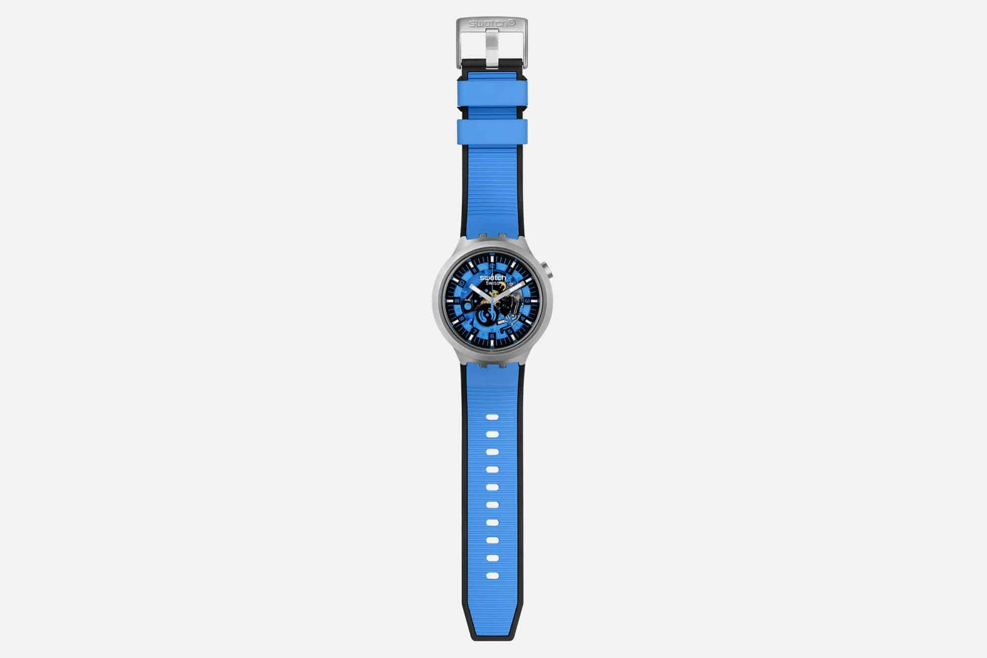
Swatch Debuts the Big Bold Irony Collection, Combining Steel and Bioceramic
Summer is in full swing, cool and casual is the name of the game, and for Swatch that means bigger and bolder watches. Big Bold Irony, that is. For the first time, the brand is bringing its Irony treatment to the Big Bold lineup in the form of five new watches. The Irony collection was originally conceived in the 1990s as a premium offering featuring cases made from metal, and indeed, the new Big Bold Irony watches are fitted with stainless steel cases. They are also the first to combine steel with Swatch’s proprietary Bioceramic. There’s no getting around the fact that these watches truly live up to their namesake. At 47mm wide, they undoubtedly make a statement. Swatch has cleverly shaped the lugs, which start towards the underside of the case and curve sharply downwards, resulting in a case length of just 44.8mm. This is identical to the current Big Bold collection and is remarkably wearable for a wide audience. In fact, the only difference in dimension between these and the standard Big Bolds is thickness: the new Irony watches are 13.3mm thick as opposed to 11.75mm in plastic. Swatch’s design choice of keeping the crown at 2 o-clock ensures it will never dig into your wrist, and at 108 grams (with a quartz movement), these watches can easily be worn all day, every day, which is kind of the point. With five options of summery colors – Dark Irony (Black), Azure Blue Daze, Red Juicy, Mint Trim, and Bolden Yellow – you will have no trouble finding one that match...
 Deployant
New: Swatch Big Bold Irony
The popular Swatch Big Bold family of watches gets the stainless steel case and joins the Irony family with 5 novelties available now, and 5 more in Sept.
 Time+Tide
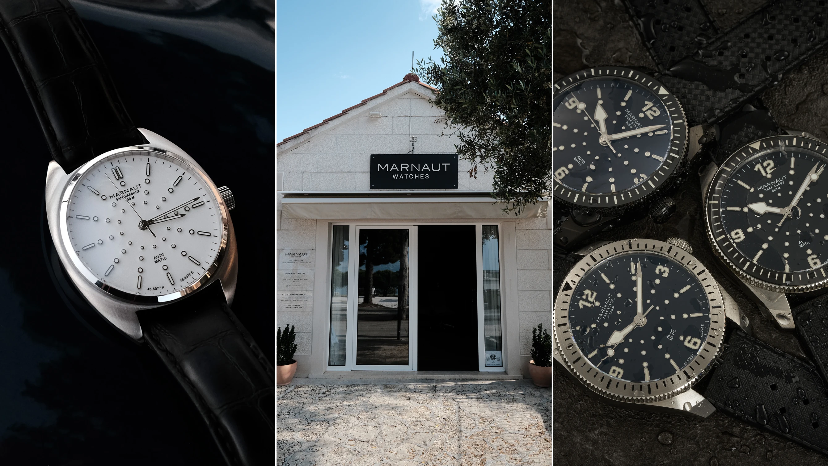
Marnaut opens a new chapter with a Croatian boutique, Swiss movements and German manufacturing
A common feature of any independent brand, micro or otherwise, is the brave undertaking of “cutting out the middleman”. Even though this phrase has become overused, and in some cases, rightfully ridiculed, the success of many independent brands lies in online-only availability, which is often one of the main driving forces behind affordable prices. Yet … ContinuedThe post Marnaut opens a new chapter with a Croatian boutique, Swiss movements and German manufacturing appeared first on Time+Tide Watches.
 Time+Tide
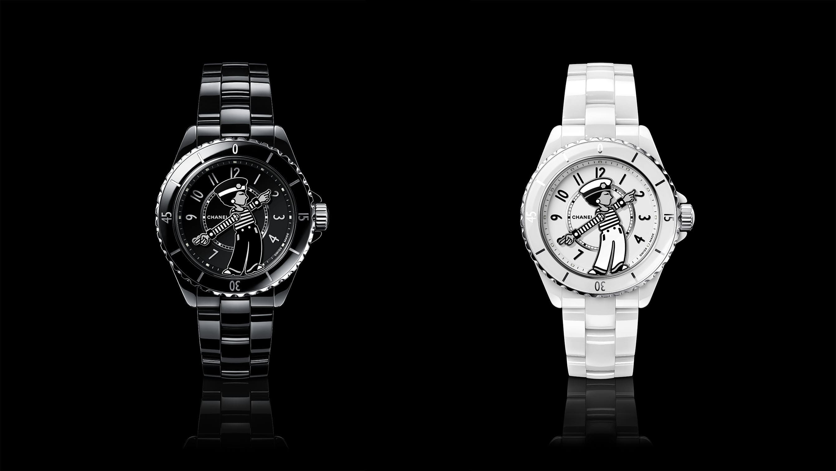
The Chanel Mademoiselle J12 La Pausa is a playful tribute to Coco Chanel
The latest ode to Coco Chanel is the Chanel Mademoiselle J12 La Pausa. It shows Coco Chanel in a more androgynous style which she paved the way for in women’s fashion. The image is inspired from a photo at her La Pausa villa in 1930. As the only fashion designer to be named in Time … ContinuedThe post The Chanel Mademoiselle J12 La Pausa is a playful tribute to Coco Chanel appeared first on Time+Tide Watches.
 Time+Tide
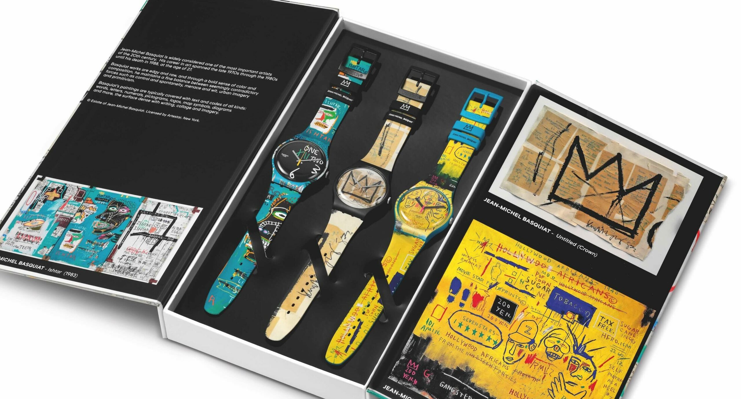
Swatch wraps up their 2023 Art Journey with new Jean-Michel Basquiat triptych
The Swatch x Jean-Michel Basquiat collection marks the final collaboration of the Art Journey project Previous collaborations were with MoMA, Magritte, Louvre Abu Dhabi, and Le Gallerie Degli Uffizi The triptych includes three quartz-driven pieces inspired by Basquiat’s ‘Ishtar’, ‘Untitled’, and ‘Hollywood Africans’ artworks Swatch as a brand, not the conglomerate group, is widely credited … ContinuedThe post Swatch wraps up their 2023 Art Journey with new Jean-Michel Basquiat triptych appeared first on Time+Tide Watches.
 Hodinkee
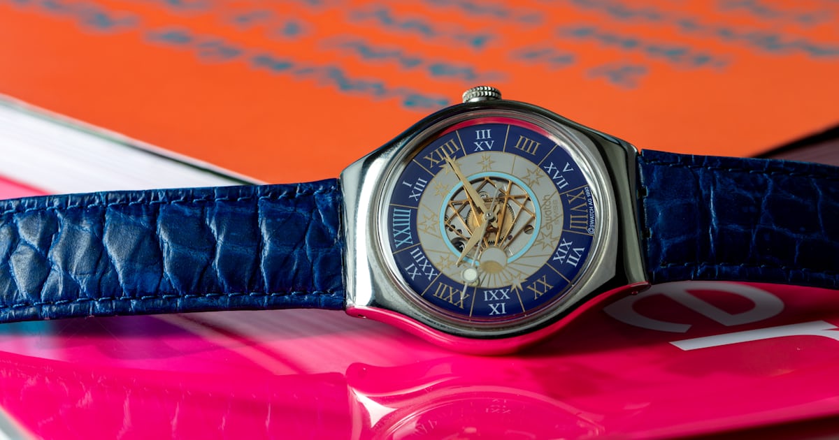
Hands-On: Who Needs A MoonSwatch When You Can Have A Platinum Swatch From 1993?
Exploring the unforgettable extravagance that is the Swatch Tresor Magique, nearly 30 years after its precious-metal debut.
 Worn & Wound
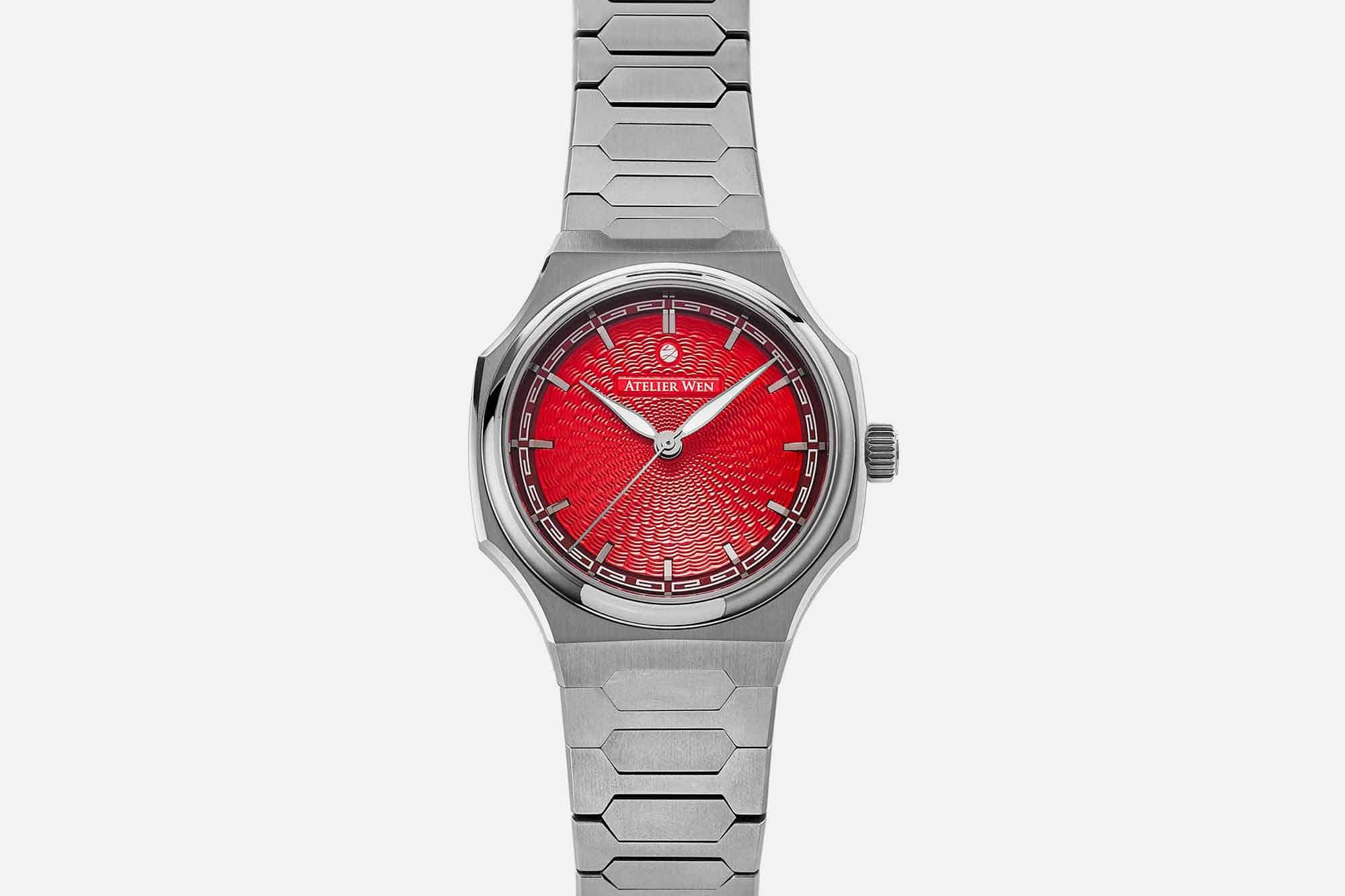
Atelier Wen and Revolution Collaborate on a Limited Edition Perception with a Bright Red Dial and Hand Applied Guilloche Pattern
If your particular collecting focus is centered on rising microbrands making affordable integrated bracelet sports watches with dramatic red dials, you have been spoiled for choice recently. It was just yesterday that we brought you news of the Fratello x Straum collaboration, which features a red dial that is literally inspired by volcanic lava, and is about as red as it gets. And today, in what can only be described as a Deep Impact/Armageddon style confluence of good ideas having their moment, we get the new Atelier Wen x Revolution Perception “Xi,” the latest version of the upstart brand’s impressive integrated bracelet sports watch that mixes a familiar platform with traditional Chinese craft techniques. If you haven’t experienced or heard much about the Perception, be sure to check out our prior coverage, which includes a hands on review by Brad Homes here, and a story about a limited edition made in partnership with Wristcheck here. To cut to the chase, though, we’re pretty big fans of the Perception around here. The integrated bracelet sports watch is very close to being completely played out, but Atelier Wen’s late entry into the genre actually feels fresh, and incorporates a unique design language based on Chinese pagodas, in a package that’s lightweight, wearable, and affordable. As well executed as the Perception’s case is, it’s always the dials that seem to generate the most interest when a new Perception is launched, and that’s certain...
 Quill & Pad
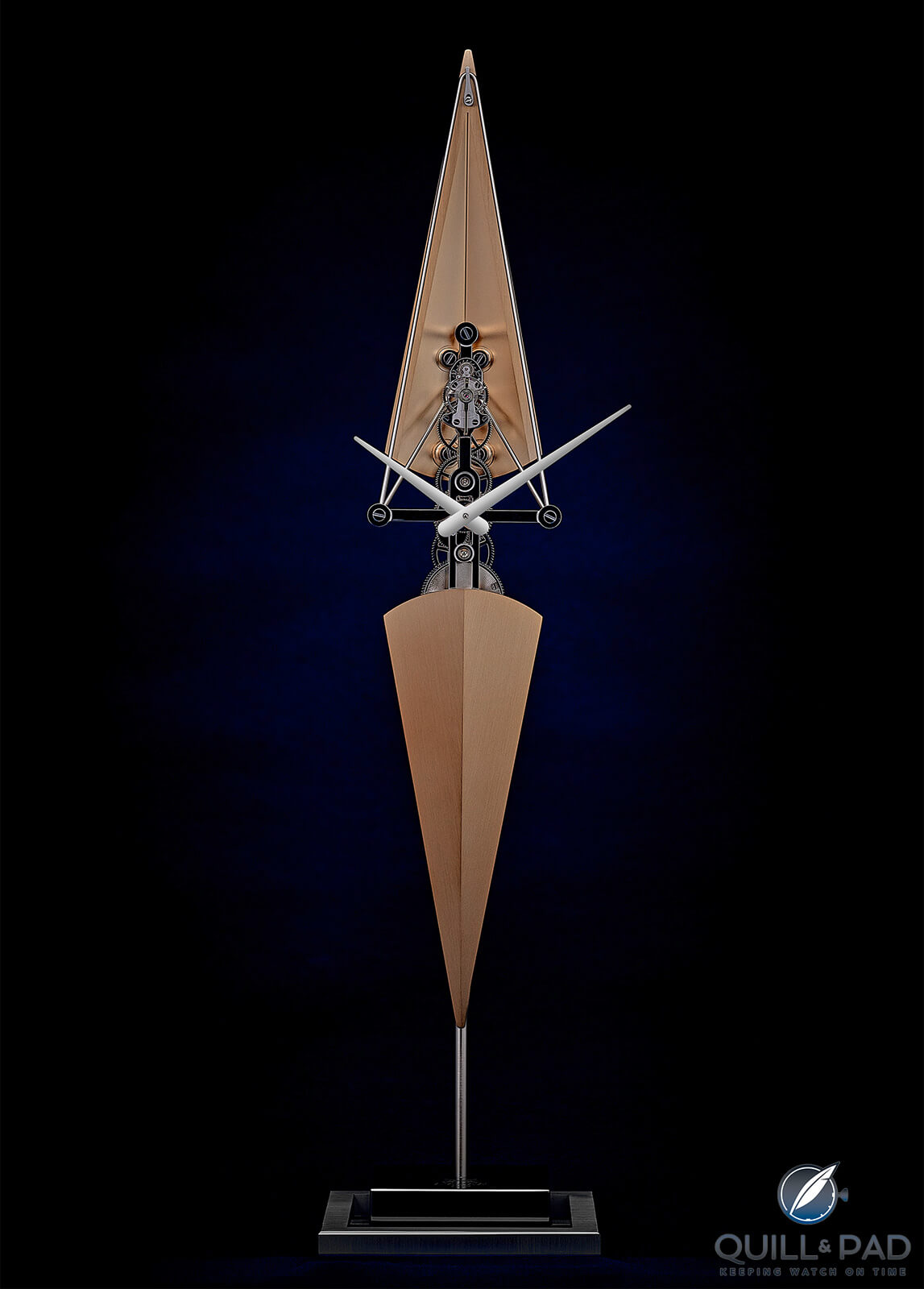
La Regatta by l’Epée Table Clock: Nautical Grace on Land (and Desk)
For La Regatta, L'Epée drew inspiration from the noble sport of sculling, in which the most beautiful crafts cut through the water like a razor-sharp knife. They are not only very fast but also barely have a wake, so they hardly disturb the water around them. L'Epee used the distinct shape of the boat and made the clock leaving all the mechanical parts visible as well.
 Worn & Wound
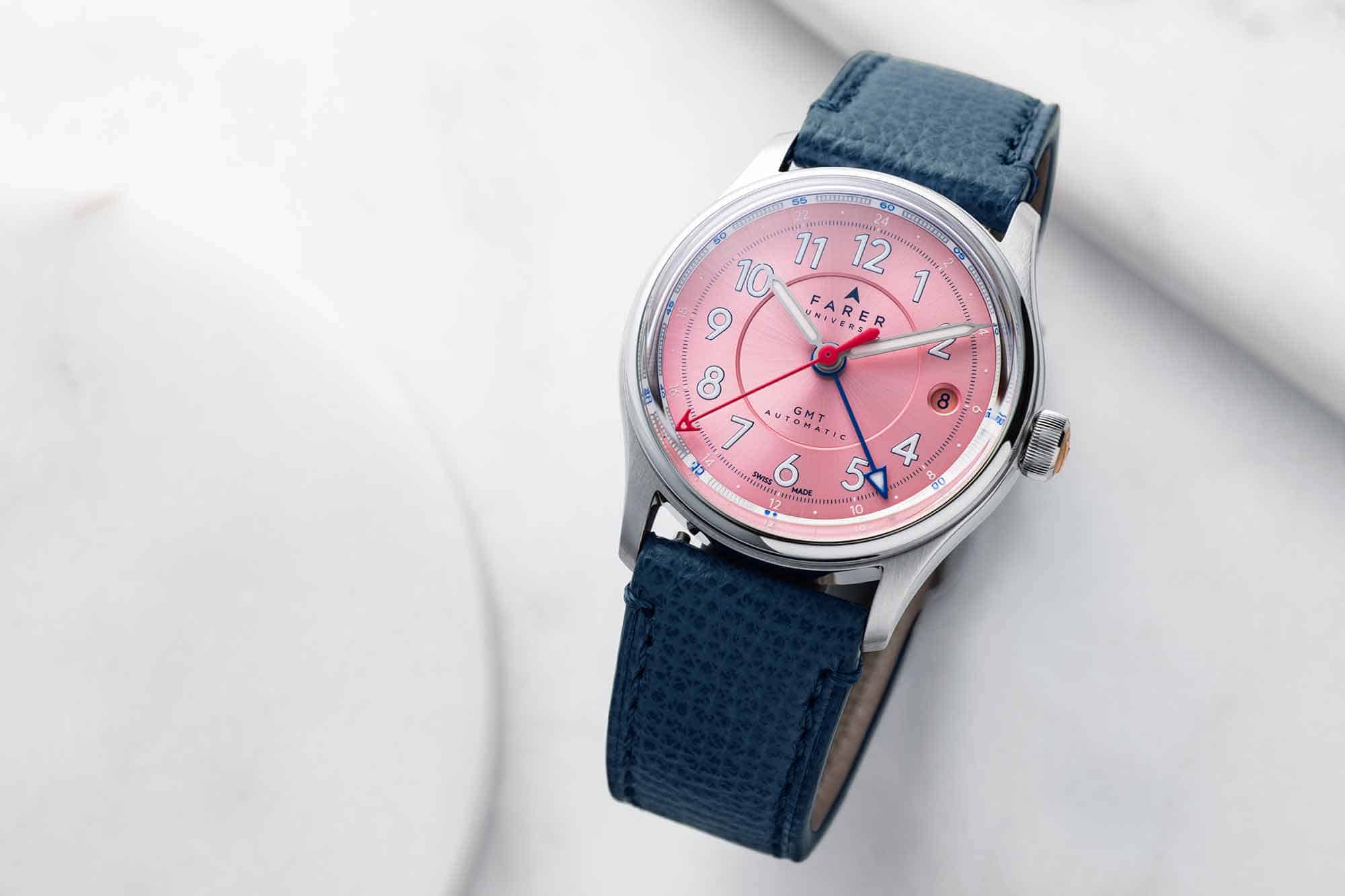
Farer Adds a Trio of New 36mm GMTs to the Lander Family
If you’ve been interested in Farer’s Lander GMT (which they tell us is their most popular watch…ever) but felt it was just a bit too big, you’ll want to check out the brand’s latest release. The new 36mm GMT collection takes the Lander aesthetic and shrinks it, making for some of the most compact automatic GMTs on the market. It was only a few months ago that the Lorca GMT had us wondering why there weren’t more smaller GMT equipped watches on the market, and now we have a sudden influx. It’s a good time to be a GMT fan, and now there are a selection of colorful options from across the pond. The premise here is fairly simple. These new watches share the same basic design as the Lander, with a trio of distinct colorways. Unlike most Farer releases, which frequently have dramatic differences in hand-sets, hour markers, and dial textures within a single collection, these three watches are all very much “Landers” with the same numeral and hand design. The three colors include the much admired sea green, seen in what Farer is calling the Lander IV, or the Lander Classic, This watch has the same sunburst blue/green color that caught the attention of many watch enthusiasts in Farer’s early days, and set a tone for what to expect in terms of creative color combinations. The sea green dial is offset with a bright red GMT hand and an orange seconds hand, along with a white outer minute track. The next color in the new collection is Sea Coast, with a dial th...
 Worn & Wound
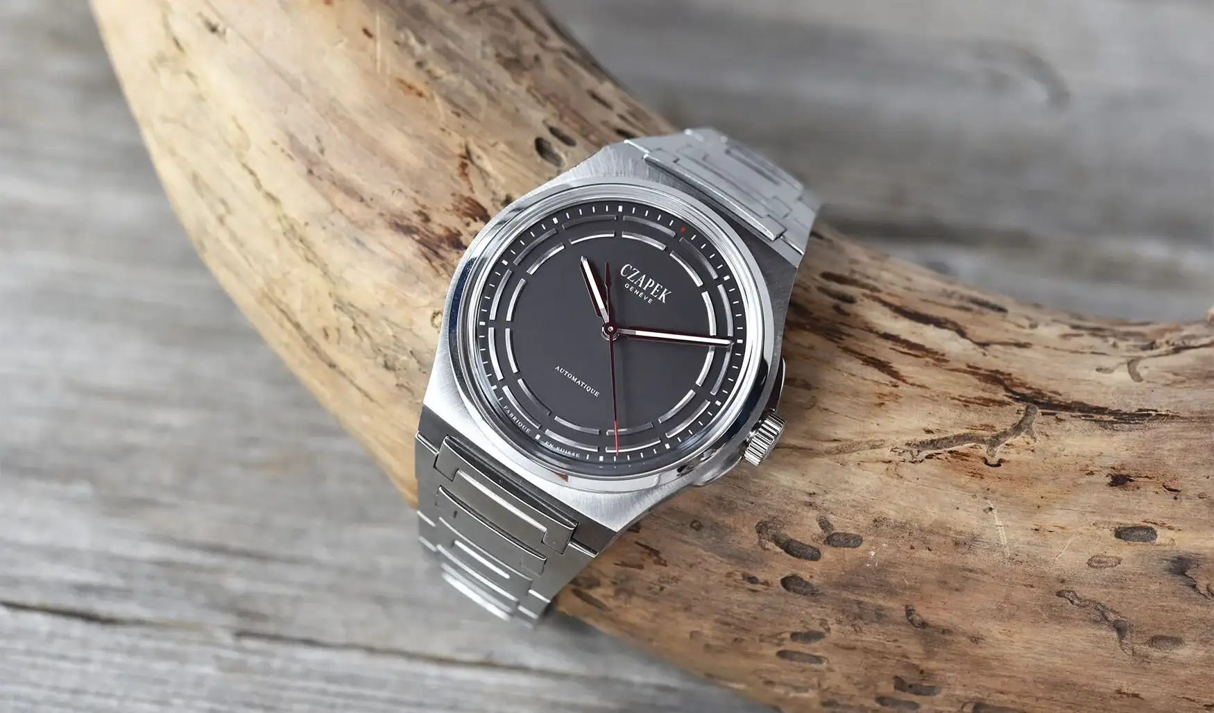
Czapek Embraces Titanium in New Dark Sector Antarctique
One of our favorite high-end independent brands of late has been Czapek, and their Antarctique collection, which has a seemingly endless range, from their remarkable openworked Rattrapante Chronograph, to the serene time-only Frozen Star. This week, the collection welcomes a new addition, in a new material, it’s the Titanium Dark Sector. This is a slightly different expression of the Antarctique design language that we’ve seen in the likes of the Passage De Drake, bringing a slate like appearance to the monotone frame with enough small details to capture your attention. It’s still a modern integrated design and houses the brand’s own showstopper movement, so if you’re a fan of the Antarctique but prefer toned down symmetry, this watch is likely to check all the boxes for you. The Titanium Dark Sector features an integrated case and bracelet design that’s rendered fully in titanium, which should make the 40.5mm diameter and 10.5mm thickness all the more svelte on the wrist. The bracelet integrates to the case via articulating central link that fits into the center of the case, allowing for an even flow around the wrist. Unlike the 38.5mm case Antarctique, this titanium bracelet will not feature chamfers on the final production model. Additionally, there will not be customization options on this watch other than a trio of strap options. The flat gray dial of the Dark Sector is sparse, with all the action happening toward the dial’s perimeter. Applied sections o...
 Deployant
New: Swatch’s latest novelties in the Art Journey Collection
Swatch releases new watches in the next chapter of their Art Journey Collection featuring famous and important works from selected galleries.
 SJX Watches
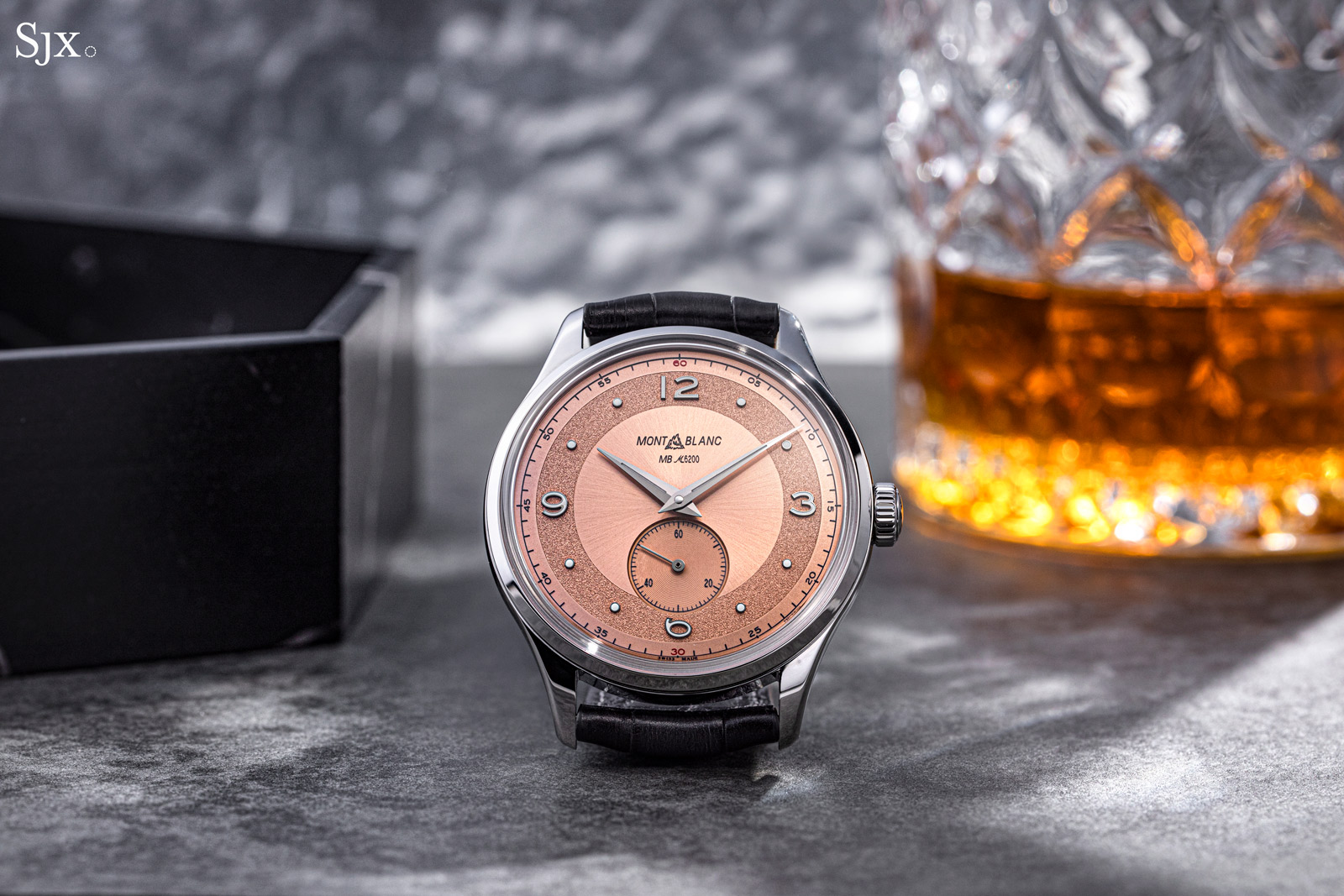
Up Close: Montblanc Heritage Small Second Limited Edition 38
For over a decade now, Montblanc has been attempting to become a serious watchmaker, an endeavour that started after its acquisition of Minerva. Despite having found only modest success there, the pen maker-turned-luxury-goods-house has produced a good number of proper haute horlogerie watches – mostly chronographs and some with surprisingly accessible prices – many of which have gone under appreciated due to the brand name. A perfect example of the Minerva mechanical excellence and sharp pricing is Heritage Small Second Limited Edition 38 that was introduced in 2019. The Heritage Small Second is all about the movement, specifically a new-old-stock Minerva calibre from the early 2000s finished to an impressive, artisanal standard. Despite the exceptional movement, the watch never really gained much recognition (much like Montblanc’s other Minerva offerings), but it is certainly worth a revisit. Initial thoughts With its retro, two-tone dial in faddish “salmon”, the Heritage Small Second looks like one of the many vintage-inspired watches that has been (re)produced to excess by many brands in various price segments. But this stands out for the impressive degree of detail in the movement, which is finished to a degree comparable to that of artisanal independent watchmakers. The hand-wound MB M62.00 inside is the star. According to Montblanc, it’s an “untouched” calibre from the attic made during a period when Minerva’s then-owners were dedicated to eleva...
 Time+Tide
The Swatch x Omega MoonSwatch Moonshine FAQ is not a joke. Here’s proof
Ok. So we just published a story on the new Swatch x Omega MoonSwatch Moonshine, honing in on the reactions we compiled upon its unveiling. In the story, Zach touched upon a cheeky FAQ list we shared on Instagram. Interestingly, while we disclosed this was genuinely a Swatch-supplied frequently asked questions list, its rather playful … ContinuedThe post The Swatch x Omega MoonSwatch Moonshine FAQ is not a joke. Here’s proof appeared first on Time+Tide Watches.
 Worn & Wound
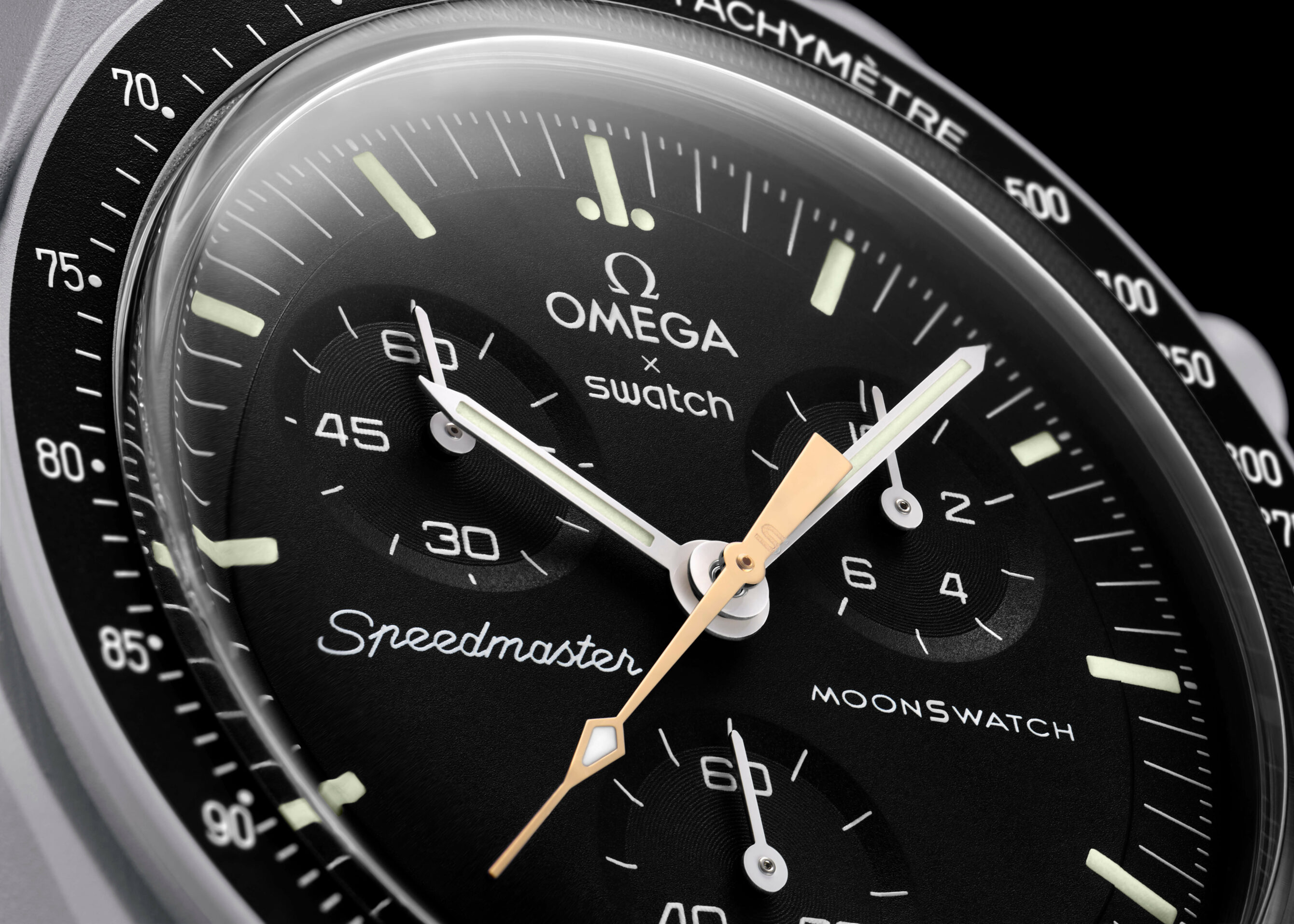
The MoonSwatch Goes Gold With New Mission To Moonshine
The tumultuous story of the SWATCH x Omega MoonSwatch Speedmaster gets a new chapter today with the release of the MoonSwatch Mission To Moonshine Gold. If you were hoping a second release within this collection would offer greater availability after lessons learned with the initial launch, you’re in for a surprise. This special edition MoonSwatch, which makes use of Omega’s Moonshine gold in the timing seconds hand, will only be available for purchase today, and only in the cities of London, Milan, Zürich and Tokyo. Get ready for more crazy tik-tok videos circulating the internet. At a glance, the latest MoonSwatch appears to closely resemble the existing Mission to the Moon, and indeed that appears to be the base at work here, even depicting the moon on the caseback. There is one striking difference, however, and that is the use of Omega’s proprietary Moonshine gold in a specific component. Moonshine gold is a rather unique alloy, consisting of silver, copper and palladium to achieve a slightly desaturated appearance compared with regular yellow gold, and it’s worked beautifully in some of our favorite high-end Speedmaster releases in recent years. Here, the material is relegated to the timing seconds hand of the chronograph. Making a subtle but noticeable impact on the overall appearance. Use of this material lends not only to the name, Mission to Moonshine Gold, but is also relevant to the cities that were selected to host sales of the watch. Each has a conn...
 Hodinkee
Business News: Swatch Sold One Million MoonSwatches in '22, Leading A Record Year For Swiss Watches
But can it last?