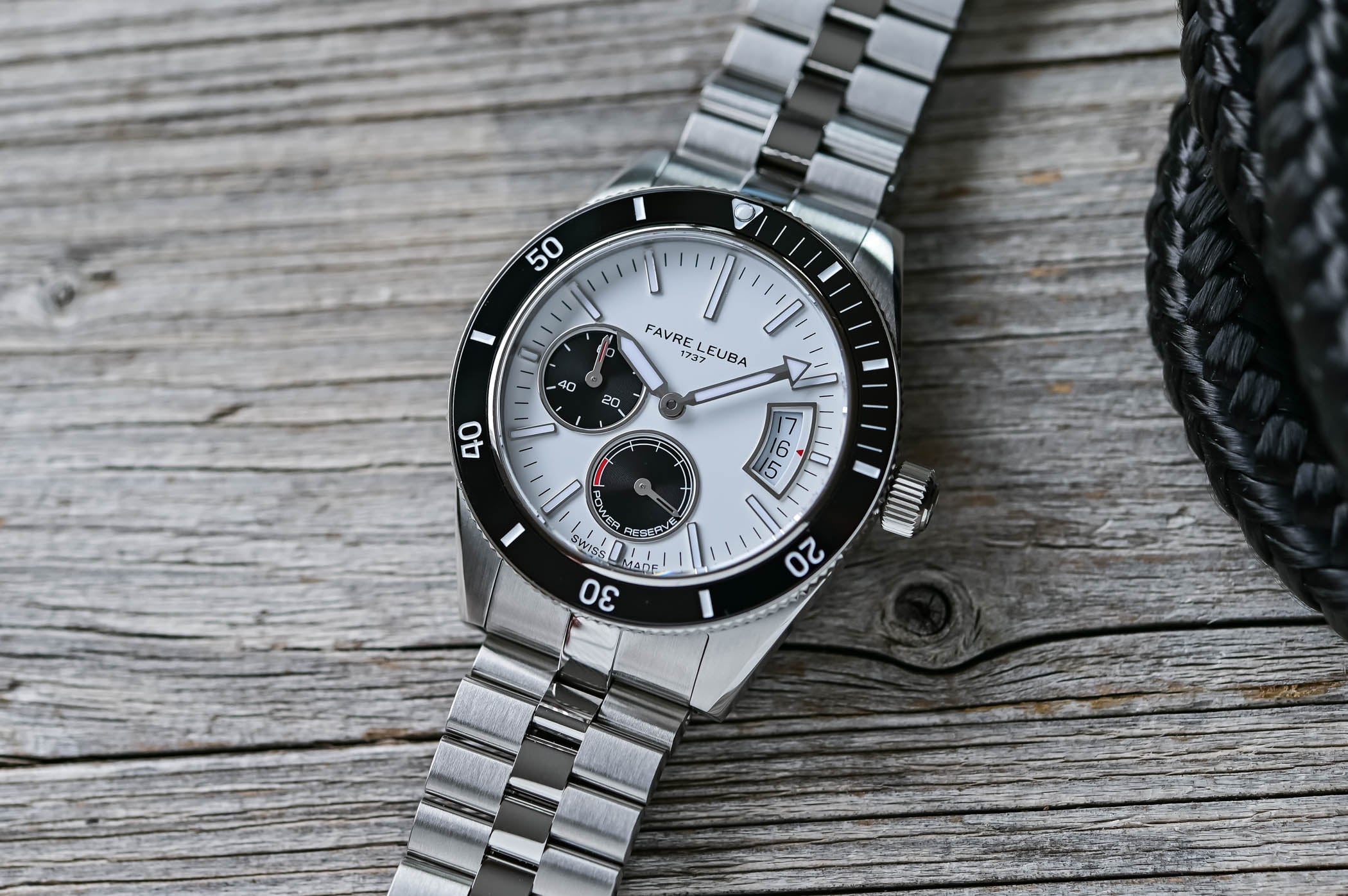
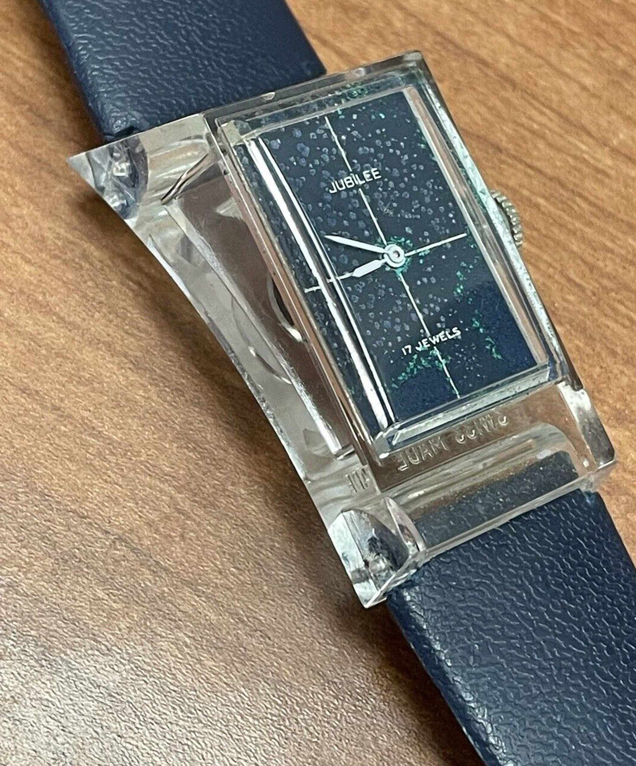
A crosshair dial is a watch dial with two thin perpendicular lines printed across the dial face: one running vertically from 12 o'clock to 6 o'clock, one running horizontally from 9 to 3 o'clock. The lines cross at the dial centre (under the centre pivot), dividing the dial visually into four equal quadrants. The lines are typically very thin (~0.1-0.3 mm thick), printed in either black, silver, or matching contrast colour. The format adds visual structure to an otherwise simple dial without crowding the indices.
The crosshair dial was widely used in mid-century European watchmaking, with peak production in the 1950s-1970s. The most-cited application is the Rolex Datejust, where crosshair dials appeared on a substantial fraction of ref. 1601 (1959-1977) and 1603 (1959-1977) production through the 1960s. The dial was paired with applied indices, the standard Rolex date window at 3, and either a smooth, fluted, or engine-turned bezel. The crosshair was generally on champagne or silver dials, not on the brighter coloured Datejust dials.
"A crosshair on a 1965 Datejust adds 30% to the price. The same crosshair on a 1985 Datejust subtracts 30%, because by 1985 it should not have been there."- Vintage Rolex collector forum aphorism, WatchUSeek
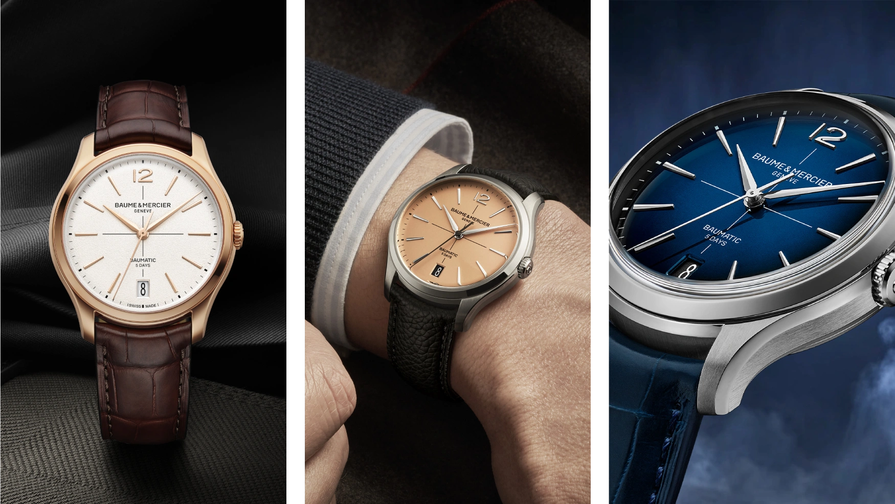
Beyond Rolex, the format appeared on Omega Constellation selected references (paired with the pie pan dial in some 1960s configurations), Universal Genève Polerouter (the iconic 1957 Gerald Genta-designed reference), Longines Conquest, Tudor Date+Day, and various Movado, Vacheron, and IWC dress watches of the period. The crosshair was a generic mid-century European dress-watch cue rather than a brand-specific signature, which is why it appeared so widely.
Production: the crosshair was applied as a final dial-finishing step. After the dial blank was printed with indices and brand markings, the two perpendicular lines were applied as a final printing pass, typically using a custom screen-printing rig calibrated to the exact line width and centre-alignment specifications. The lines had to cross precisely at dial centre; a mis-aligned crosshair is one of the recognisable signs of a poorly-made aftermarket replacement dial. The colour was selected to provide subtle visual contrast: black lines on a silver or champagne dial, silver lines on a dark grey or blue dial.
Production declined through the late 1970s and 1980s as design fashion shifted to cleaner, less-decorated dial layouts; the rise of quartz watches with simpler dial graphics also reduced the crosshair. By the 1990s the format had almost disappeared from new production except for occasional heritage references. From the early 2010s onward, vintage-revival modern watches have brought back the crosshair as a deliberate period cue: Tudor Heritage chronograph and Date references, Longines Heritage Diver, Hamilton Khaki Field Mechanical selected variants, and various microbrand divers and field watches.
In modern collector vocabulary, an original-period crosshair dial is a vintage-authenticity signal that adds modest collector premium (typically 10-30% over equivalent non-crosshair examples on the same reference, depending on rarity). For watches like the 1965 Datejust 1601, where crosshair was a standard option, the crosshair is part of period correctness; for references where it was rare, it can add substantial premium. Authentication of a vintage crosshair dial typically requires UV inspection (paint formulations differ between era and aftermarket) and cross-referencing against known-period photographs.

Comments 2