Watch brandsWatch wikiWatch videosVariousWatch calendarSaved articles
PopularRolexOmegaPatek PhilippeAudemars PiguetTudorGrand SeikoCartierSeiko

Moonphase Watches · Page 15

Frederique Constant Celebrates their 35th Anniversary and their Signature Complication with a New Highlife Worldtimer Manufacture Worn & Wound
Feb 16, 2023

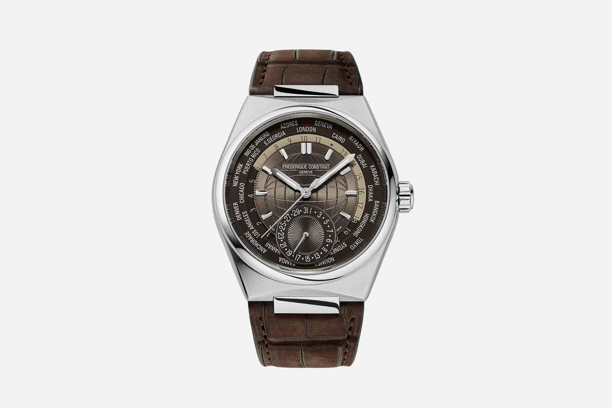
Frederique Constant Celebrates their 35th Anniversary and their Signature Complication with a New Highlife Worldtimer Manufacture

It’s hard to believe, but Frederique Constant celebrates their 35th anniversary this year. This is a brand that’s truly part of the old guard when it comes to the contemporary, affordable watch scene. Making the “nice Swiss watch” accessible to the masses was a big part of why the brand was founded, and over the course of their history the entire watch industry has changed multiple times over, currently finding itself in a healthy spot where more and better watches are finding their way onto the wrists of enthusiasts at a pace that couldn’t have have been imagined three decades ago. The line between “luxury” and “affordable” continues to shift, and there’s no doubt that Frederique Constant has played a role in those changes.  Specifically, Frederique Constant has broken new ground when it comes to making complicated watchmaking affordable. We all know about their excellent perpetual calendar, which they are still able to sell for a little less than $10,000 several years after its debut. But they also dabble in other historically significant and tech forward complications. Over the years we’ve seen everything from flyback chronographs to moon phases equipped watches, and of course their Slimline Monolithic with an ultra high frequency oscillator. But it could be argued that their signature complication, the one that the brand has leaned into the hardest and gained the most acclaim for, is the worldtimer. So it makes sense that for Frederique Constant...

The Independedit: Felipe Pikullik Mondphase 1 Time+Tide
Jan 21, 2023

The Independedit: Felipe Pikullik Mondphase 1

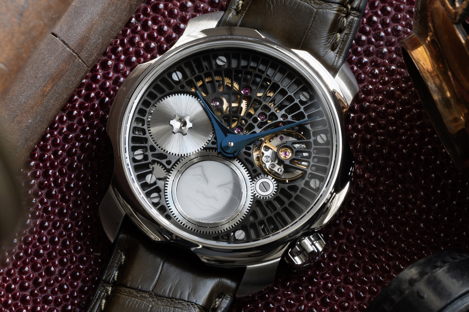
The Glashütte-trained watchmaker presents his first in-house complication A minimalist, modern take on a moonphase complication Heavily modified and extensively hand-decorated Unitas movement  Felipe Pikullik launched his eponymous brand in 2017, upon completion of his studies in Germany’s cradle of watchmaking – Glashütte. In that short period, Mr Pikullik has already introduced four different collections, … ContinuedThe post The Independedit: Felipe Pikullik Mondphase 1 appeared first on Time+Tide Watches.

De Rijke Returns to Miffy Collaboration One Year Later with New Dial Colors Worn & Wound
Jan 16, 2023

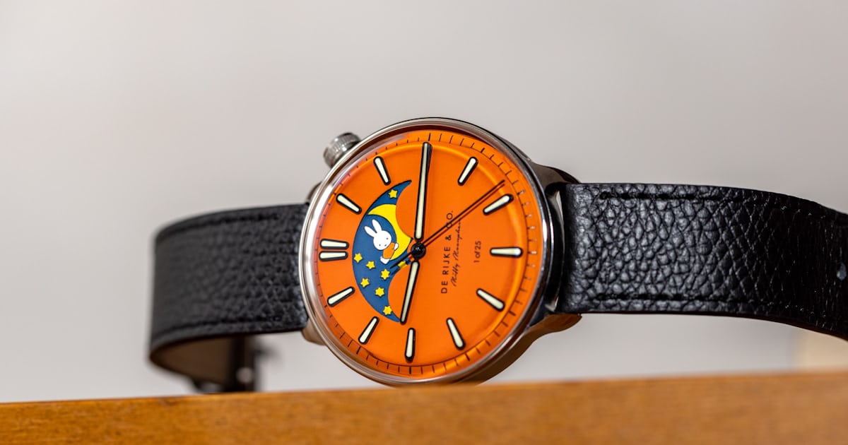
De Rijke Returns to Miffy Collaboration One Year Later with New Dial Colors

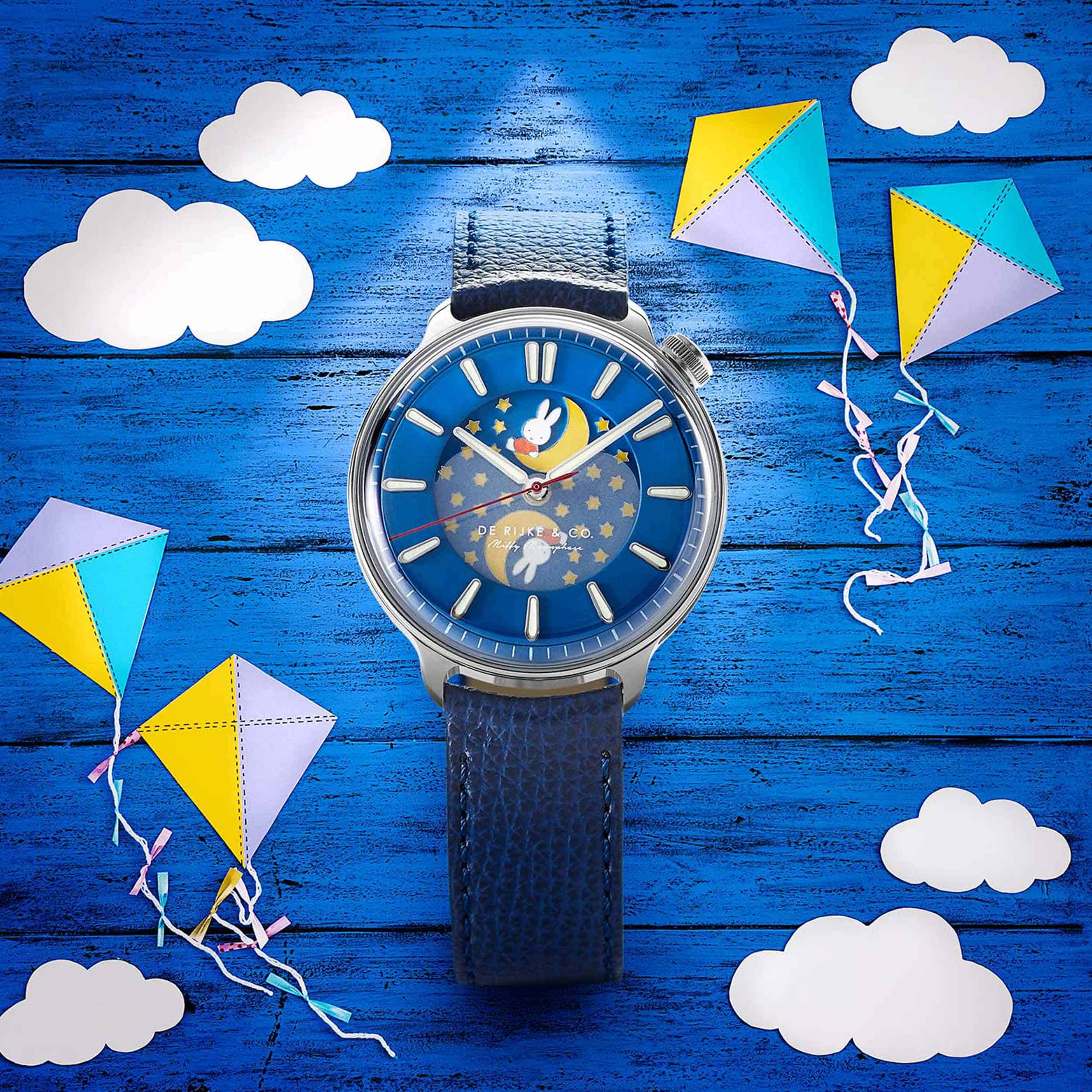
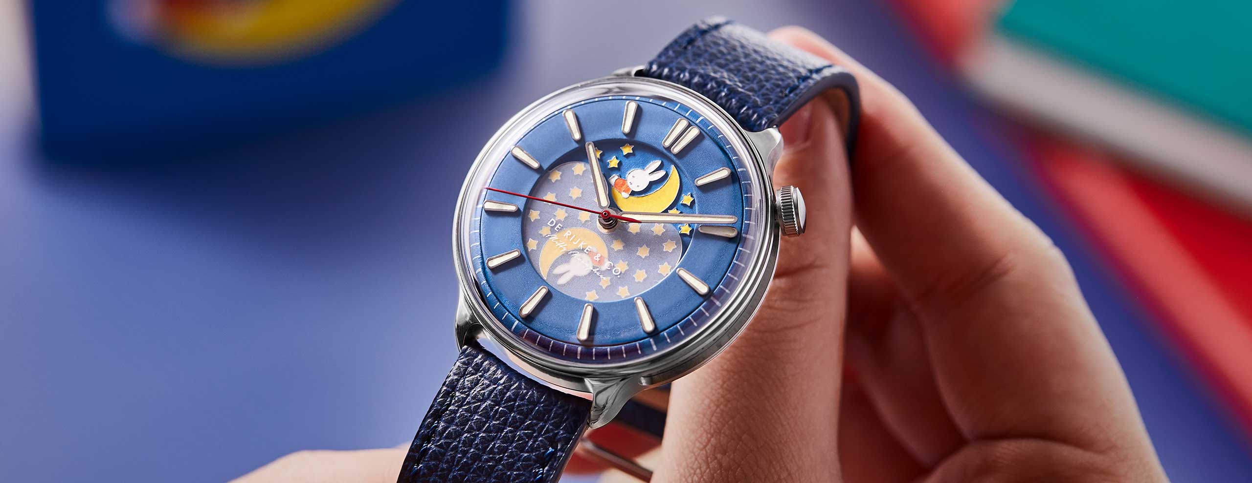
One year ago we showed you the delightful De Rijke Miffy Moonphase, a playful take on De Rijke’s distinctive design language honoring the iconic Dutch cartoon character created by Dick Bruna, Miffy. We remarked then about the watch’s universal appeal beyond the character thanks to the exquisite execution of the character etched into a brass plate alongside the moonphase display. This year, De Rijke returns to the concept with three new dial colors that once again breathe new life into Bruna’s uniquely Dutch creation.  The Miffy character has been incorporated into the design of the moonphase disc rotating underneath the dial, which is visible through an oversized aperture that dominates the top half of the dial. The character, which is a bunny, appears within the moon itself, with a slew of stars trailing. The entire design has been laser etched out of brass, polished and black rhodium plated. The recesses are then filled with different colors of lume, creating not only a vibrant illustration, but also an impressive sight in the dark. We’ve talked about our feelings on cartoon characters within the confines of watches before in this editorial, and sadly I neglected to mention the original De Rijke x Miffy as an example that works. According to Laurens de Rijke, the brand’s founder, it’s a reminder that we needn’t always take ourselves too seriously, explaining: “ For me though, it makes a lot of sense, the world of watches is one that is often very serious...

INTRODUCING: The Vacheron Constantin Égérie Moon Phase stuns with its diamond-studded designs Time+Tide
Dec 9, 2022

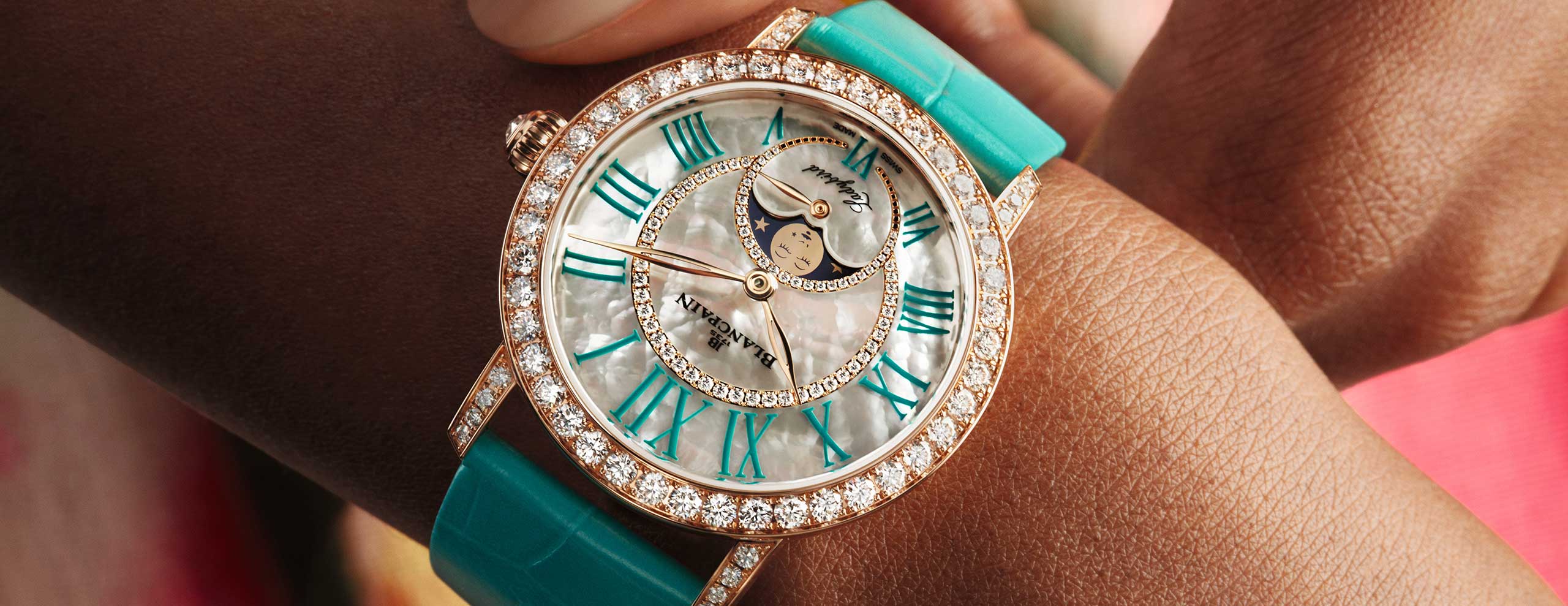
INTRODUCING: The Vacheron Constantin Égérie Moon Phase stuns with its diamond-studded designs

This trio of novelties from the Vacheron Constantin Égérie Moon Phase collection encompasses the brand’s incredible attention to detail and gem-setting savoir-faire. The first is a more simple, possibly even everyday, piece with a brand new bracelet, touted to fit like a second skin. The other two share a case and dial covered in diamonds, … ContinuedThe post INTRODUCING: The Vacheron Constantin Égérie Moon Phase stuns with its diamond-studded designs appeared first on Time+Tide Watches.

MICRO MONDAYS: The Funder Måne delivers a modular moonphase collection in a single watch Time+Tide
Dec 5, 2022

MICRO MONDAYS: The Funder Måne delivers a modular moonphase collection in a single watch

What is great about the independent watch market is that there is more room to do things differently. By offering more value for less money or by making unique watches. Or by making both things available at the same time. And it seems that some of the best watches come from single-owner brands that are backed by the … ContinuedThe post MICRO MONDAYS: The Funder Måne delivers a modular moonphase collection in a single watch appeared first on Time+Tide Watches.

Hands On: IWC Portofino Perpetual Calendar SJX Watches
Nov 30, 2022

Hands On: IWC Portofino Perpetual Calendar

IWC has a suite of instantly recognisable models synonymous with the brand, namely the Pilot’s Watches and of course, the Portugieser. But one collection does get as much recognition as its peers, despite being almost 40 years old. Named after the famous seaside city in Italy, the Portofino was introduced in 1984 (though the inaugural model didn’t yet have the Portofino name at the time) as an oversized pocket watch-style wristwatch, something of a clarion call to persist with mechanical watchmaking after the Quartz Crisis. Now the brand has revived one of the classics from the line with the Portofino Perpetual Calendar. At 40 mm in diameter, it’s the most compact of IWC’s perpetual calendars and is equipped with an in-house movement from the 82000 family. Initial thoughts The perpetual calendar is a sought-after complication for its utility but also its aesthetics, especially when it includes a moon phase, which adds a touch of romanticism to the design. IWC’s latest take on the complication is straightforward, practical, and priced reasonably enough. In fact, it’s essentially a visually-simplified version of the Portugieser Perpetual Calendar 42, which uses the same movement but inside a larger case. While not revolutionary in technical terms, the Portofino Perpetual Calendar is a solid performer with a concise design. It retains all the features that made the 1990s original appealing but adds a few contemporary touches in both design and the in-house base m...

Konstantin Chaykin Introduces the Wristmons Calavera SJX Watches
Oct 19, 2022

Konstantin Chaykin Introduces the Wristmons Calavera

Konstantin Chaykin returns with another variation of his signature Wristmon “rolling eye” wristwatch, this time inspired by El Día de Muertos. Translating as “Day of the Dead”, the Mexican festival celebrates the departed and has served as inspiration for watchmakers as diverse as Chopard and Swatch. Modelled on the sugar skull candy known as calavera made for the festival, the latest from the Russian watchmaker is the Calavera. Like the other Wristmons, it has an exuberant face with the typical features of a Wristmon – time is indicated by the eyes while the mouth is a moon phase display. Initial thoughts Konstantin Chaykin has created many Wristmon variants – the most recent was inspired by the titular yellow characters of Minions – which makes it seem like a great many have been produced. But in reality each edition is a small run of 20 or less watches, which means the aggregate number of watches is modest. Still, the appeal of the various Wristmon editions vary; because of their similar complications, the models tend to converge on each other. The Calavera, however, stands out. With its bright colours and curlicues, the striking face easily evokes the Mexican festival, while being distinct from other Wristmons. Familiar dimensions As is typical for a Wristmon, the dial is fairly complex. Here it’s comprised of 12 components, with the base featuring a stamped radial-wave guilloche and finished in a bright silver meant to resemble powdered sugar of ...

Panerai Introduces the Luminor Moon Phase for Ladies SJX Watches
Sep 19, 2022

Panerai Introduces the Luminor Moon Phase for Ladies

A compact take on the signature Panerai watch that made its debut in 2016, the Luminor Due is essentially a scaled-down version of the military-inspired original, which allows it to wear easily on smaller wrists. To date, the Luminor Due has remained minimalist, making do without complications save for a date display. But now Panerai gone for something slightly more elaborate with the Luminor Due Luna that has a small seconds and moon phase display featuring a solid-gold moon disc. Initial thoughts I like the compact size of the Due, as well as its more formal styling that allows it to double as a dress watch. Although the original, full-size Luminor is a clean, almost elegant design, its massive size and stark aesthetics means it can only be a military-style watch. The Due, on the other hand, manages to preserve the outline of the original Luminor while being modestly elegant. For that reason, the new Luna is an appealing watch. At just 38 mm wide, it is clearly more wearable, while the engraved, solid-gold moon gives it a bit of sparkle. And the all-gold model comes along with a mother of pearl dial, making it even more luxe. Interestingly, the Luminor Due is largely targeted at female clientele, but models have a masculine aesthetic. That continues with the Luna, which is available in steel with a metallic blue dial, a combination leaves it looking very much like a conventional men’s watch. The dial design is largely classical Panerai, although the proportions seem a...

Rune Bakkendorff Introduces the Moonwork Pendulum Clock SJX Watches
Jul 15, 2022

Rune Bakkendorff Introduces the Moonwork Pendulum Clock

The result of a collaboration between a Danish clockmaker and design studio , the Moonwork is a tall, sculptural clock that stands almost two meters high. It’s an old-school pendulum clock in function but entirely contemporary in expression, from the thin, minimalist frame to the clever time display without hands. Danish clockmaker Rune Bakkendorff worked together with fellow Danes of design studio Ahm&Lund to create the clock, which made its debut late last year at the Cabinetmakers Autumn Exhibit 2021, a Scandinavian furniture fair that took place in Copenhagen. The Moonwork at the furniture exhibition. Photo – Scandinaviandesign.com Initial thoughts A thoughtfully designed object, the Moonwork is attractive on several levels. At first glance, it is slender, simplistic, and hardly resembling a clock save for the pendulum. But paradoxically it is a clock, making the featureless time display is immediately intriguing. It is a clock, but not quite. The Moonwork does away with the conventional telling of the time and instead displays the lunar cycle – the moon phase is projected onto the white porcelain dome that forms the dial. An impractical but beautiful solution, this makes the Moonwork more of a sculpture that indicates the passing of the time. Remove the white porcelain dome and the entirely mechanical workings of the clock are revealed, although moon phase projection relies hundreds of LED bulbs that are hidden behind a silver sphere that rotates slowly to ca...

Introducing: The Legacy Machine Perpetual From MB&F; Hodinkee
Jul 14, 2022

Introducing: The Legacy Machine Perpetual From MB&F;

Max Büsser and his cohorts at his horological think tank, MB&F, have, without question, created a bewildering variety of watches over the years that have used horology as a jumping off point for the exploration of a highly idiosyncratic vocabulary of watchmaking, in which mechanics put themselves at the service of an aesthetics that freely mingles everything from pop culture to science fiction to sometimes alarming arachnomorphism, and beyond. However, what MB&F thus far has largely not addressed itself to is the world of traditional complications – other than the tourbillon, used by MB&F for its aesthetic impact, you will look in vain for anything beyond a simple calendar or a moonphase. Now, however, MB&F and Büsser have gotten into the complications game in a big way: they’ve launched their own perpetual calendar, and, what’s more, they’ve done so with an in-house movement, with a variation on the perpetual calendar mechanism unlike anything we’ve seen so far.

Sarpaneva’s Latest is a Glow-in-the-Dark Fairytale Landscape SJX Watches
Jul 13, 2022

Sarpaneva’s Latest is a Glow-in-the-Dark Fairytale Landscape

Finnish independent watchmaker Stepan Sarpaneva has once again turned to a Finnish artist for the Nocturne, a wristwatch that combines the technicolour luminosity of the brand’s Moomin editions with its trademark complication. Starkly monochromatic during the day, the multi-part dial comes to life at night, thanks to the nine colours of luminous paint that fill the hundreds of tiny apertures all precisely cut by laser. And sitting in the an window that occupies a third of the dial is a huge moon “face” that instantly marks this out as a Sarpaneva. Initial thoughts Though the Nocturne looks quite different from the brand’s past watches yet quintessentially Sarpaneva in style and execution. Although it relies on a similar decorative technique as the earlier Moomin edition, the Nocturne is far more distinct. And the slightly gothic style suits the Sarpaneva aesthetic perfectly. I like the design and being familiar with Sarpaneva’s other watches, I expect the quality of the dial to be excellent. In all tangible terms the watch is winner. But then there’s the price, which is substantial. The Nocturne costs €19,000. That’s within the ballpark for the brand’s moon-phase models, with the premium justified by the fancy dial. And compared to the broader market – especially with the current hype around independent watchmaking regardless of quality or provenance – it’s still a reasonable proposition. But it is pricey compared to Sarpaneva’s earlier offering...

HYT reinterpret the classic moonphase with their futuristic Moon Runner Supernova Blue Time+Tide
Jun 19, 2022

HYT reinterpret the classic moonphase with their futuristic Moon Runner Supernova Blue

Watchmaking is a traditional art form, and its heritage often generates a strong connection between client and manufacturer. But we’re in the 21st century now, so to only create designs that are evocative of what we have traditionally seen over the last century would be a disservice. We need pioneers to revisit what it means … ContinuedThe post HYT reinterpret the classic moonphase with their futuristic Moon Runner Supernova Blue appeared first on Time+Tide Watches.

Hands-On: A. Lange & Söhne Little Lange 1 Moon Phase “Gold Flux” Dial SJX Watches
May 12, 2022

Hands-On: A. Lange & Söhne Little Lange 1 Moon Phase “Gold Flux” Dial

Launched in 2021, the Little Lange 1 Moon Phase was one of the simpler models in last year’s lineup but easily appealing. It is the first Lange 1 to have a dial made of aventurine glass, or “gold flux” as Lange labels it, a material rarely found on the brand’s watches but always popular when it makes an appearance. Conceived as a mens’ watch in 1998 – the average dress watch was still about 35 mm then – the Little Lange 1 has since evolved into a feminine watch. It’s basically the Lange 1 for ladies and the base model for a variety of female watches, often in pastel colours accented with mother-of-pearl or diamonds. The new Little Lange 1 continues the theme with its sparkly dial, but it stands apart from recent models in several ways; it feels different, perhaps even masculine. We take a close look at the Little Lange 1 to weight its appeal. Initial thoughts Thanks to off-centred yet logical displays, the Lange 1 is one of the most distinctive offerings from the German watchmaker. And the starry, aventurine glass dial, along with the moon phase, create a charming, slightly whimsical appeal that isn’t present on the standard models, which are formal and serious looking. Despite the shimmering, reflective dial, the new model is understated on the wrist, thanks to its dark colours and white metal case. These tone down the sparkle of the dial, which comes from the metallic inclusions in the glass. More appealing but equally understated are the star-shaped ...

Jaeger-LeCoultre Introduces the Master Control in Blue SJX Watches
Apr 29, 2022

Jaeger-LeCoultre Introduces the Master Control in Blue

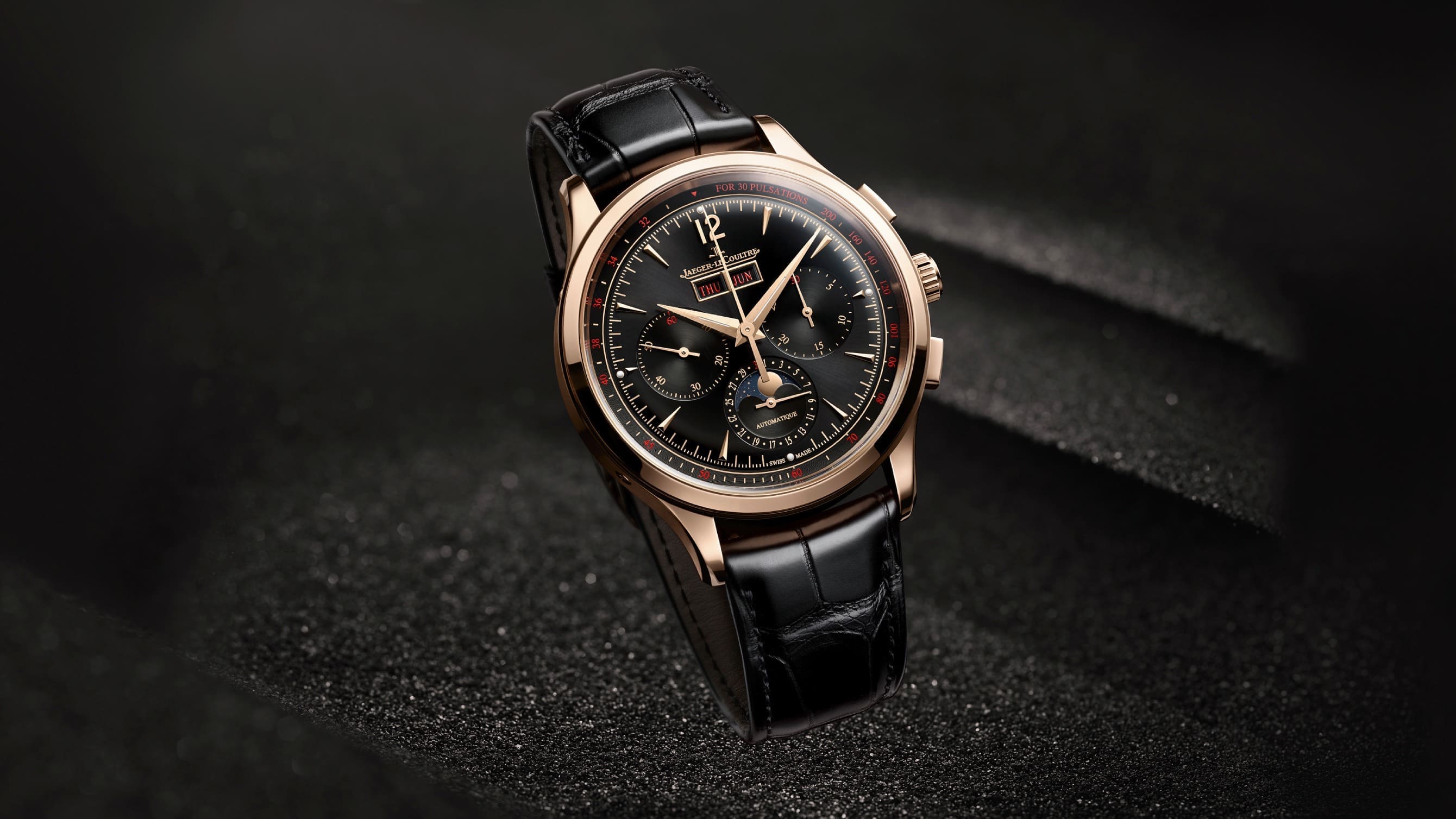
The Master Control was first conceived in 1992 as Jaeger-LeCoultre’s best offering in terms of accuracy and reliability, with every watch undergoing a 1,000-hour, in-house quality control test. While the rigorous testing was fairly novel at the time, it has since become the norm for all Jaeger-LeCoultre (JLC) watches. But the Master Control line has lived on. Facelifted in 2020, the Master Control watches have grown moderately in size to suit contemporary states but they retain the restrained design that characterised the original range. Most of the models sport a muted silver dial, but for the 30th anniversary of the collection, JLC has introduced the Master Control Date and Master Control Calendar with tri-tone blue dials. The simpler of the duo – the Master Control Date Initial thoughts My first impression of the watches is positive. Blue is a contemporary colour that nudges the aesthetic towards a more casual style, as opposed to the retro-formal look of the standard, silver-dial models. Notably, the limited-edition pair are ore than a change of colour. The thoughtful design is evident through the details, especially with the tri-tone finish of the dial. While blue can be found practically everywhere in watchmaking, tri-tone blue is unusual and attractive. And the calendar windows reveal discs that are in blue to match the dial. The red accents as well as the starry background of the moon phase are details that make the dial more interesting Both watches are othe...

VIDEO: Elegance meets complication in the Longines Master Collection moonphase Time+Tide
Dec 28, 2021

VIDEO: Elegance meets complication in the Longines Master Collection moonphase

Every watch brand has their range through which they get to brag. Finishing, design and movements are all aspects where a watchmaker can shine, and Longines choose to represent their best with the Master Collection - a range of classically styled wristwatches that emulate some of their complicated timepieces from the infancy of the brand, … ContinuedThe post VIDEO: Elegance meets complication in the Longines Master Collection moonphase appeared first on Time+Tide Watches.

Comments 1

  1. Tomek
    Moonphase is nice, but also impractical. You look at dial, not moon in sky. Still, classical Patek and Lange pieces have soul that modern watches sometimes miss.

Leave a comment

All comments are reviewed before they go live. Email is for our records only - it's never published.