 Time+Tide
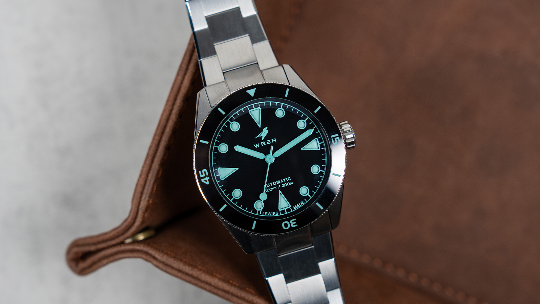
Into the abyss: Wren takes the Diver One to its darkest depths yet
Wren's 41mm Diver One returns with a clear DLC coated stainless steel case, and a dial so black, not even light can escape its pull.
Tool watches built for descent. Unidirectional bezels, deep luminous indices, screwed-down crowns, and ISO 6425 compliance for any reference that wants to wear the name.

Photo: Teddy Baldassarre · 2 days ago
A dive watch is the most populated category in modern sports watchmaking, dominated by the Rolex Submariner (1953), Blancpain Fifty Fathoms (1953), Omega Seamaster family, Doxa Sub 300, and Tudor Black Bay. The category is defined by ISO 6425 compliance: minimum 100m water resistance, an external unidirectional rotating bezel for elapsed-time tracking, luminous markers visible at 25cm in darkness, and saltwater / shock resistance verified by independent test.
Dive watches were born from a real industrial need: the post-war recreational and professional diving boom, the French Navy combat-swimmer commission that produced the Fifty Fathoms, and the Royal Navy / US Navy approval programmes that pulled Rolex and Tudor into the category. Through the 1950s-60s the form factor settled: 38-42mm steel cushion or round case, screwed crown, rotating timing bezel, sword or Mercedes hands, large applied indices.
The modern luxury market has elevated the dive watch from professional tool into the default sports-watch silhouette. The Submariner remains the genre-defining reference; the Seamaster Diver 300M is the volume Master Chronometer entry; the Black Bay 58 is the 38mm vintage-spec answer; the Doxa Sub 300 is the orange-dial saturation-diver counterpoint. Every major Swiss brand now fields at least one ISO-grade diver.
Beyond the standards: the helium escape valve is the high-spec saturation-diving feature first patented by Rolex / Doxa in the 1960s; the no-decompression bezel is the Doxa Sub 300's signature dive-time table; the Master Chronometer 15,000-gauss anti-magnetism is the modern Omega differentiator. See also: water resistance, ISO 22810 (the general-purpose water-resistance standard).
Time+Tide
Wren's 41mm Diver One returns with a clear DLC coated stainless steel case, and a dial so black, not even light can escape its pull.
 Deployant
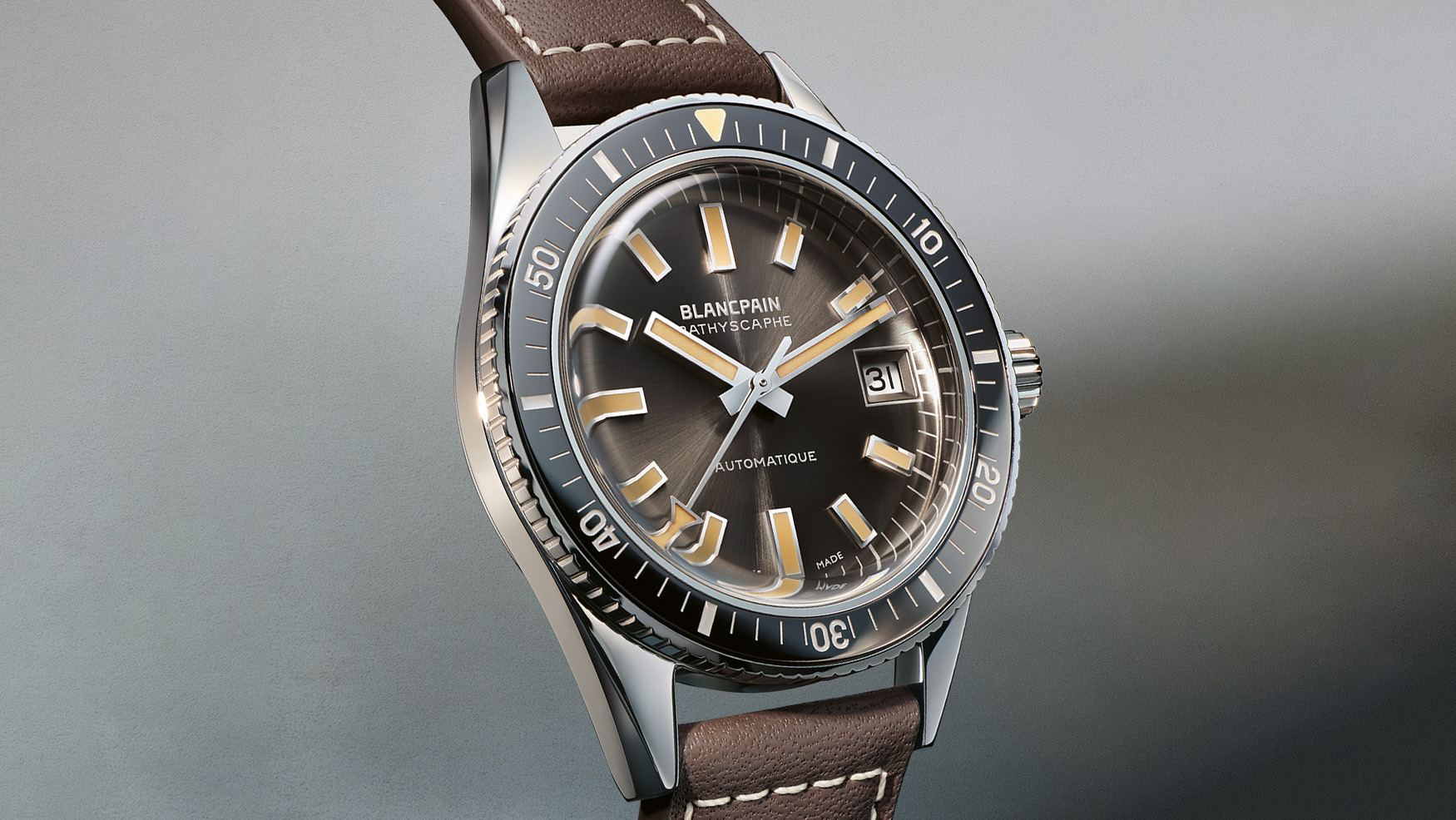
Blancpain celebrates 70 years of dive watch heritage with the Bathyscaphe 70th Anniversary Limited Edition, a recreation of the classic 1968 version.
 SJX Watches
Blancpain is marking the 70th anniversary of its lesser-known dive watch with the 1960s-inspired Fifty Fathoms Bathyscaphe. With a faithful 37.4 mm steel case and high-end movement, the Bathyscaphe will likely be welcomed by collectors who have been waiting for a more compact Fifty Fathoms. Initial thoughts Blancpain has an unusually rich history of producing dive watches — the Fifty Fathoms dates to 1953 and introduced the now-ubiquitous rotating dive bezel at roughly the same time as the Rolex Submariner. Blancpain’s early divers were commercial products aimed at military customers — then the only sizable market for such watches. That changed in 1956, when growing consumer interest in diving led to the release of the Bathyscaphe. This historic name was reborn in 2013, but the contemporary interpretation of the line was a significant aesthetic departure from the look of the original 1950s and 1960s models. Somewhat confusingly, Blancpain is marking the 70th anniversary of the Bathyscaphe with an homage to a 1968 model. Timeline aside, the anniversary edition features a period-correct 37.4 mm case and beige Super-LumiNova to capture the aged look of surviving originals. The arrow-tipped running seconds hand is another charming detail that reproduces the original look to good effect. During the 1950s and 1960s, Blancpain waffled between serif and sans-serif wordmarks, and the brand has opted for the latter for the anniversary edition. To my eye it strikes just the rig...
Teddy Baldassarre
Marking the major milestone, the Blancpain Fifty Fathoms Bathyscaphe 70th Anniversary Edition delivers a period-accurate case size with modern specs.
 Two Broke Watch Snobs
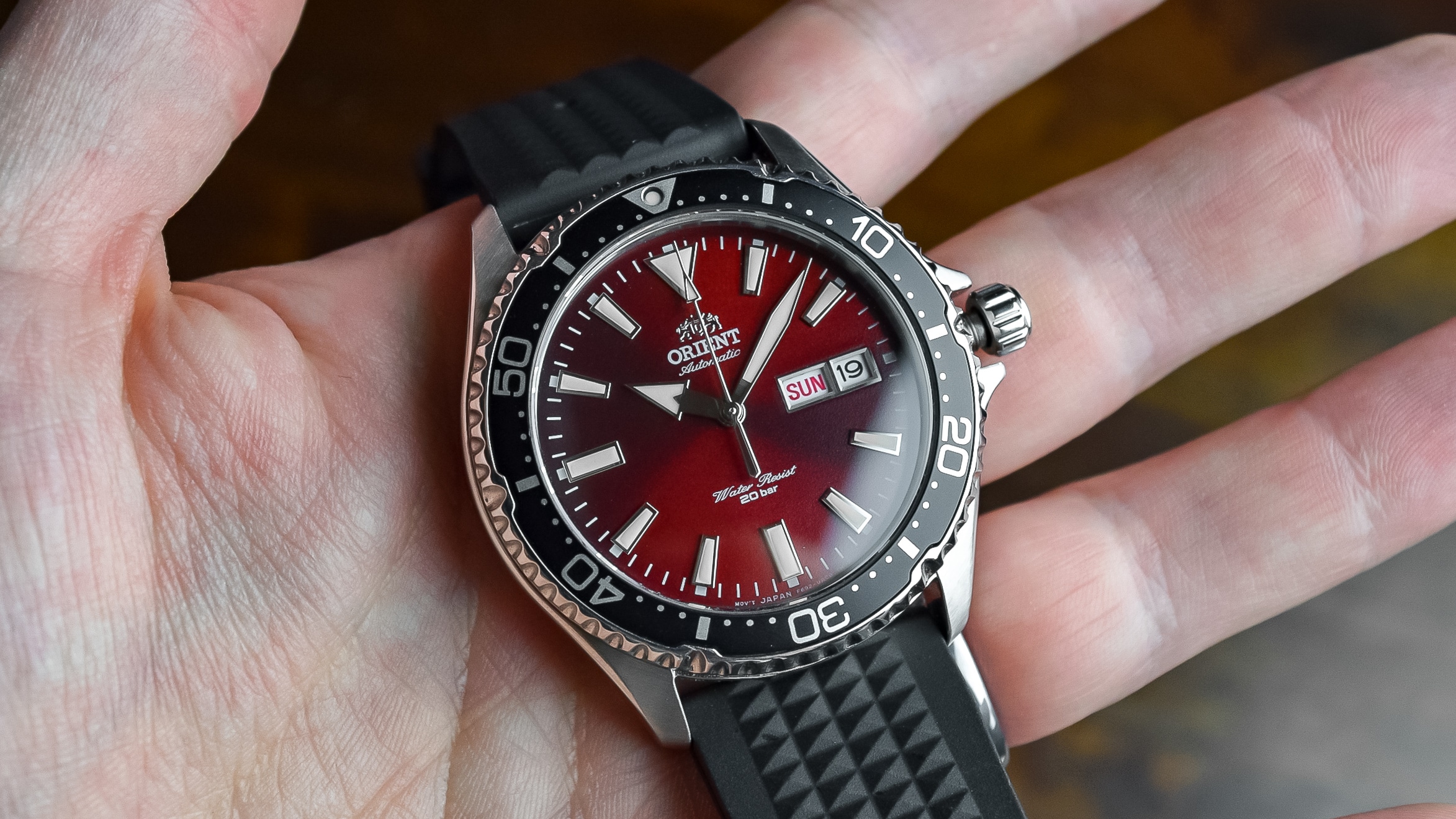
Orient Mako II vs Kamasu: two near-identical Japanese divers, one classic and one sharper. Here's which affordable automatic diver to buy and why.
 Time+Tide
Blancpain revives a 1968 Bathyscaphe for its 70th anniversary, with a 37.4mm case, vintage-inspired details and a 100-hour movement.
 Hodinkee
What We Know The 1950s were big years for Blancpain—first in 1953 with the introduction of the Fifty Fathoms, then a few short years later in 1956, when the Bathyscaphe arrived as a "civilian counterpart" as diving gained popularity. Revived in 2013, it's remained a core part of the modern Fifty Fathoms lineup ever since. We're not strangers to the Bathyscaphe here at Hodinkee, either—we teamed up with Blancpain on our own limited edition back in 2019. Today, to mark the Bathyscaphe's 70th anniversary, Blancpain is releasing a 300-piece limited edition that takes inspiration from the 1968 reference and updates it in all the right ways. The homage to the '68 piece is evident at a quick glance; the first thing I noticed was the vintage Blancpain logo, which sets the tone for what the brand is trying to do here. The sunburst meteor grey dial is lifted straight from the 1968 piece as well, as are the baton hands and indexes in 18k white gold, both filled with a vintage-colored Super-LumiNova that gives the lume a warmer, aged look straight out of the box. The steel bezel extends into a ring at the base of the box crystal—another detail pulled directly from the '68 watch—and its ceramic insert with lacquered numerals swaps out the original's black hesalite. That same fidelity carries through to the case. At 37.4mm in stainless steel, it's sized to match the 1968 piece on which it draws inspiration, rather than the smaller 35mm case Blancpain used on the original 1956 Ba...
 Hodinkee
What We Know Today, Glashütte Original introduces two new flyback chronographs, replacing the Senator Chronograph Panorama Date models currently in the collection. While both models fall under the brand's Senator line, the new Senator Chronograph and Senator Chronograph Navigator could not be more opposed in aesthetics and spirit. First is the new Senator Chronograph Navigator, which departs significantly from the Senator line's overarching classical design language. With only a few exceptions, you're most likely expecting to see at least a few Roman numerals on any Senator dial. But the Navigator takes the chronograph down a much more utilitarian route, with what I believe is the brand's only conventional tool-watch design outside the SeaQ dive watch lineup. The matte black dial features three-dimensional, solid, luminescent applied Arabic hour numerals, while the rest of the dial text is printed in white to provide sharp contrast and improve legibility. The large subdials for the running seconds and elapsed minutes are snailed in texture, while a recessed faceting frames the oversized Panorama Date at six o'clock. The sword hands here are filled with a generous proportion of Super-LumiNova, and the remaining hands are all finished in white lacquer. The Senator Chronograph, sans Navigator, streamlines the layout of the outgoing Senator Chronograph Panorama Date for a more conventional look while still feeling familiar. A galvanic silver dial in soft white holds solid-gol...
 Fratello
Over the past few years, we have seen great changes within the Blancpain Fifty Fathoms lineup. The brand celebrated the 70th anniversary of its iconic diver in multiple “acts.” On top of that, Blancpain created a full collection of Fifty Fathoms models in different sizes, offering something for everyone and addressing an issue many enthusiasts […] Visit A Nice Vintage-Inspired Surprise: The Blancpain Fifty Fathoms Bathyscaphe 70th Anniversary to read the full article.
 Monochrome
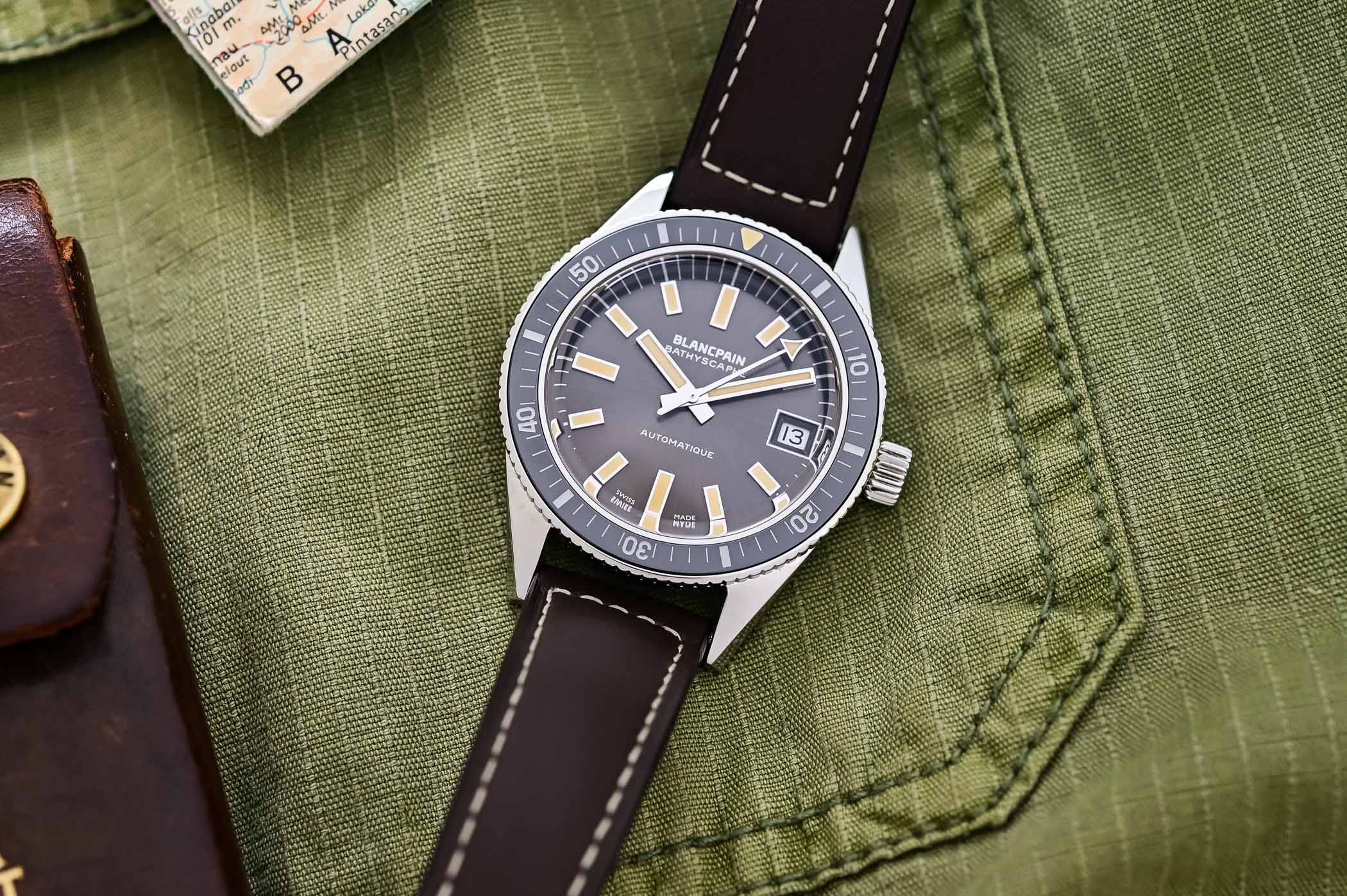
While the fact that the Blancpain Fifty Fathoms was one of the earliest dive watches on the market is now well-known, this professional, mostly military-issued model wasn’t the only one produced by the brand. There is another watch in the collection that was created back in 1956, as the civilian counterpart to the Fifty Fathoms […]
 Worn & Wound
Don’t look now, but Longines is having an uncommonly strong year. The release of the reworked HydroConquest dive watch in March remains one of the most discussed new releases of the year from a major brand, and their quiet but smart update of the Master Collection in June was also well received. Last month, they launched a new version of one of the more curious watches to be plucked from their archives in recent years, and while it’s certainly more of a niche product than the diver or the classically styled pieces in the Master Collection, it shows that the brand is still considering the enthusiast in spite of what is clearly a larger, big tent approach focusing on core models. The Longines Conquest Central Power Reserve in light blue is the third such watch following cream, anthracite and black dials introduced in 2024. These are incredibly charming watches in person, and lift from a design that originally debuted in 1959. It’s a fairly straightforward watch, with the central quirk (literally) being a power reserve indicator represented by a subdial in the dead center of the dial. The date appears at 12:00, and studying the dial reveals an idiosyncratic sector-like layout that is easily readable and visually interesting. The case of the Longines Conquest Central Power Reserve measures a tidy 38mm in diameter and 12.3mm thick. That is a tad taller than I’d typically like on a watch in this style, but I think it’s the price we pay for a modern, tech forward mo...
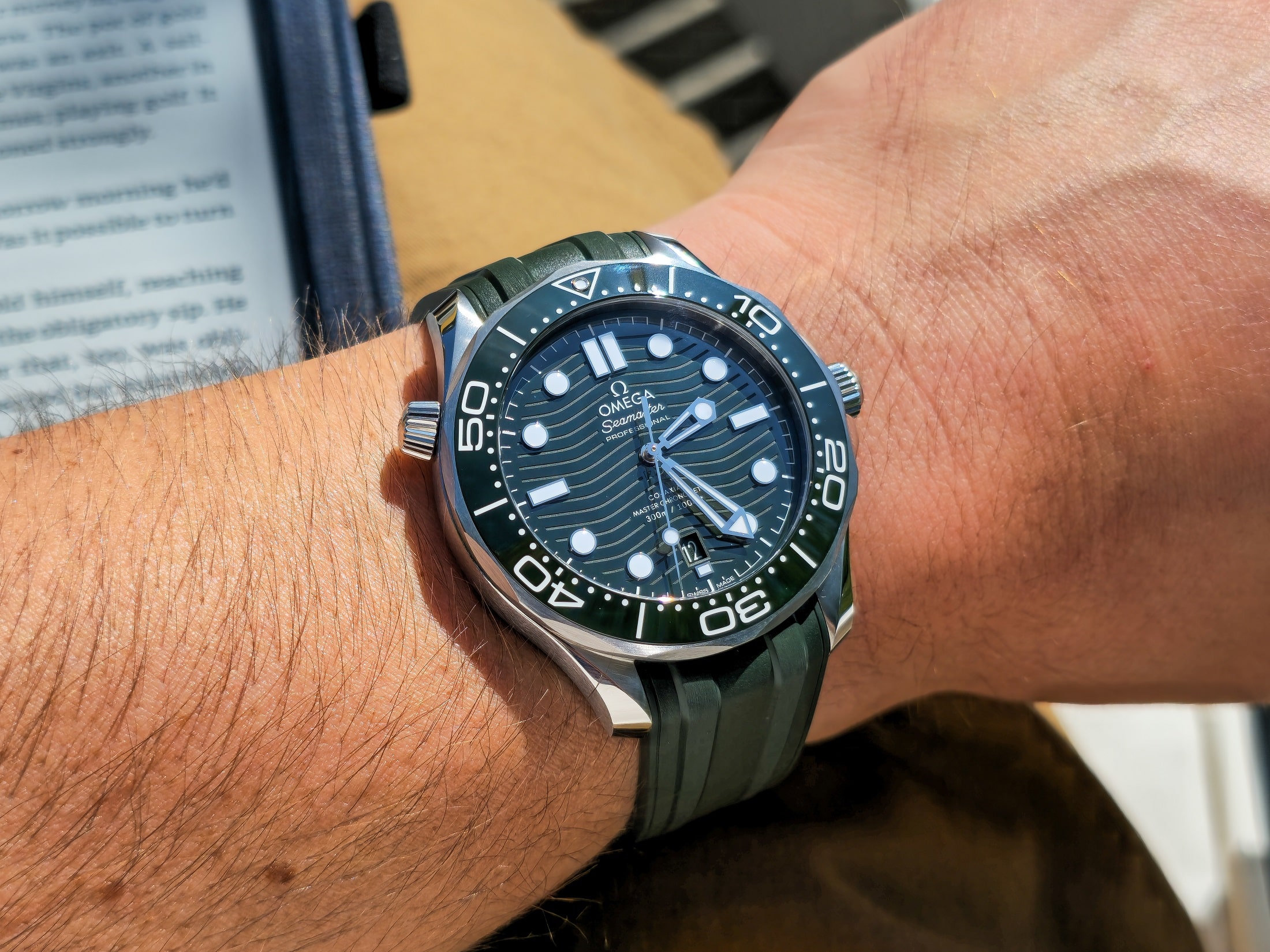 Two Broke Watch Snobs
Find out what our testing reveals about luxury dive watches, where the premium shows on the wrist, and how closely mid-price alternatives match the experience.
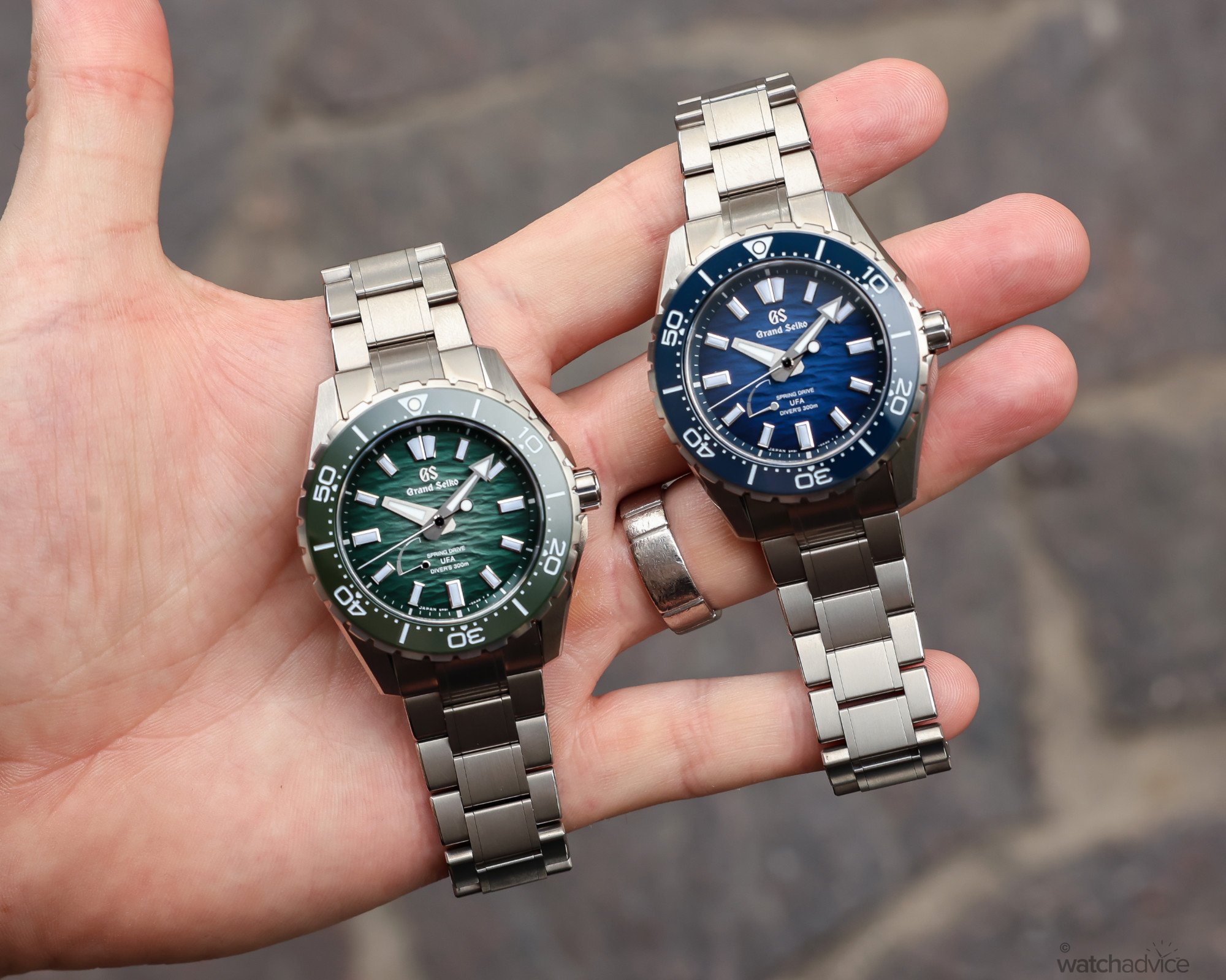 WatchAdvice
We go hands-on with the new Grand Seiko Spring Drive U.F.A. Ushio 300 Diver, and see why this is the watch Grand Seiko fans and watch enthusiasts have been wanting! What We Love The new case size and dimensions That dial, I mean, seriously?! The new bracelet and clasp design What We Don’t The lack of a date window The full titanium construction may not be to everyone’s liking The anti-magnetism could be increased to accommodate modern life Overall Rating: 8.75 / 10 Value For Money: 9/10 Design: 8.5/10 Wearability: 9/10 Build Quality: 8.5/10 This year, Grand Seiko upped the ante and took the fight to the swath of other luxury dive watches on the market with the release of its new Spring Drive U.F.A. Ushio 300 Diver, which was released at Watches & Wonders 2026. It was the dive watch Grand Seiko enthusiasts had been wanting and waiting for. A smaller, more wearable diver that was a little more contemporary than the models it replaced. With a raft of changes, including a smaller, better-proportioned case, a redesigned bracelet, new micro-adjustment and a more modern dial aesthetic, the new Ushio 300 Diver ticked so many boxes. Plus, Grand Seiko decided that steel was too heavy for a sports watch, so they made it from High-Intensity Titanium instead. The 2026 Grand Seiko Spring Drive U.F.A. Ushio 300 Diver models We had the privilege of previewing it before Watches & Wonders, and while the article I wrote up for the Grand Seiko Spring Drive U.F.A 300 Ushio Diver was a ...
 Teddy Baldassarre Videos
 Worn & Wound
Jacques Bianchi, the Marseille based brand specializing in dive watches, has released the first watch in what is expected to be an ongoing partnership with Olympique de Marseille, the city’s historic football club. This has been a big summer for soccer, of course, with the World Cup being held in North America right in the middle of summer, and if your individual case of football fever hasn’t exactly been cured yet, the new diver based on the brand’s popular JB200 platform might be of interest. And even if it’s not, it’s an interesting diversion from Jacques Bianchi that might point to some broader ambition from the brand as it relates to artistic craft, and chronometry. First, let me say that while I have no particular allegiance to Olympique de Marseille, I have a soft spot for soccer watches. The first watch I bought after writing about it for Worn & Wound was a Timex x Nigel Cabourn “Referee Watch,” which sits on my desk to this day, ticking away. Soccer of course has a unique approach to timing among the major team sports in that a clock counts up to the end of a 45 minute half, with the referee having a great deal of latitude to add time to the clock at his or discretion that takes into account the normal stoppages of play. This principle is further complicated by the fact that the referee solely holds this information – the clock counting up that players and spectators see in the stadium or on television is essentially always just an estimate. The ...
 Teddy Baldassarre
A look at the Tudor Black Bay Monochrome with original photos, analysis, and pricing for this METAS-certified dive watch.
 WatchRider
The upcoming Casio MTP-E740-4AV and MTP-E740-2A1V are vintage-inspired watches launching soon for just £85. Proving that budget-friendly watches don’t have to be boring, these new releases feature a stunning see-through dial design that punches well above its price bracket. A Striking Translucent Dial Design The standout feature of the new MTP-E740 series is undoubtedly its dial. Drawing heavy inspiration from the classic 1970s Seiko Time Sonar, Casio has incorporated a transparent face that reveals the mechanical day and date wheels underneath. Usually, entry-level Casio day-date models hide this calendar mechanism behind a solid face. By exposing it, Casio gives these models a playful, layered, and premium look that is rarely seen at this price point. The Standout Models: Orange and Navy While the collection features several colors, two models steal the show: MTP-E740-4AV (Orange): if you want a watch that immediately catches the eye, the MTP-E740-4AV is the undisputed star of the collection. The bright orange colorway perfectly complements the retro-futuristic transparent dial, giving the watch a summery, high-energy feel. Orange dials have historically been associated with dive watches and motorsport chronographs, but putting it on an everyday stainless steel piece gives it a remarkably fresh vibe. The bright, vibrant orange dial is an absolute head-turner. It provides a bold contrast against the stainless steel case and makes the exposed cal...
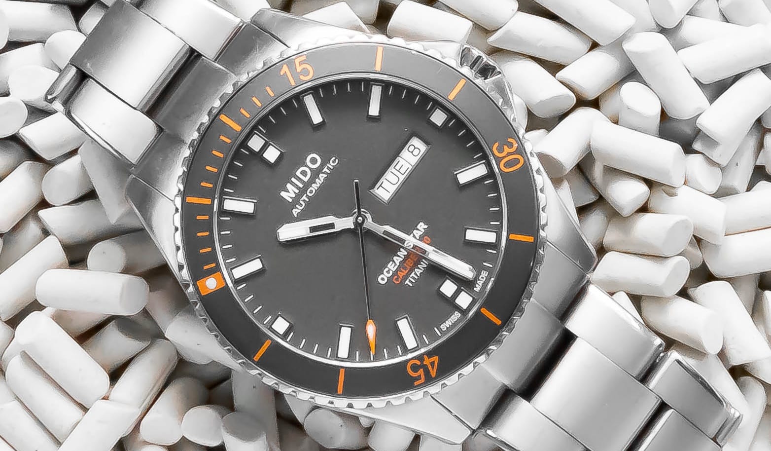 Two Broke Watch Snobs
A dive watch may be useful, but is it necessary? We use 12 hands-on tested watches to find out what your collection actually needs.
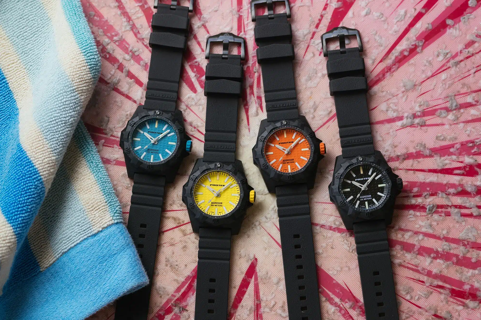 Two Broke Watch Snobs
ProTek's new Aggressor Series 4000 is a 45mm carbon diver with 25-year tritium tubes and 300m of water resistance, running a Miyota 2035.
 Two Broke Watch Snobs
We tested 12 dive watches that offer more than the usual starter picks, from distinctive microbrands to serious luxury divers worth upgrading to.
 Worn & Wound
Simple and sporty. That’s it. That’s the review. Well, sure, I can elaborate. Sinn likes to surprise us on occasion, and in the most Sinn way possible. Not by releasing something high-tech or with a ton of bells and whistles, though they occasionally do that, but rather by releasing something we didn’t realize we wanted as badly as we do. The U50 from 2020 is a great example of this. A simple concept, Sinn took their aggressive, modern dive watch design and shrunk it down to an easy-to-wear 41mm. It was a huge hit. Earlier this year, Sinn released the 544, a watch I don’t think any Sinn-head (not sure if that’s an expression) saw coming. Truly stripped down, the 544 is one of the cleanest expressions of Sinn’s no-nonsense, purpose-driven design philosophies. There is an expression I love that is attributed to Coco Chanel that goes like this: “Before you leave the house, look in the mirror and take one thing off.” It’s a great ethos not just for attire, but all things design. With the 544, Sinn has nothing left to take off, and that’s part of its charm. With that said, there are actually two versions of the watch (technically more if you include strap options): the straightforward 544 and the 544 RS, which replaces the white seconds hand with a fluorescent red/orange (they say red, I see orange). So, basically, the fully reduced model, and the model that kept one thing on. Well, I lacked the restraint to request the pure 544 as that hand looked sexy, so ...
![Photo Report: Watch Spotting At The Hodinkee Happy Hour At One Vanderbilt [August 2026]](https://hodinkee.imgix.net/uploads/images/2bf19d83-0e7b-4ee6-a8be-e807e2e8af3c/HHHVandyClub.jpg?ixlib=rails-1.1.0&fm=jpg&q=55&auto=format&usm=12&w=2000) Hodinkee
Hodinkee
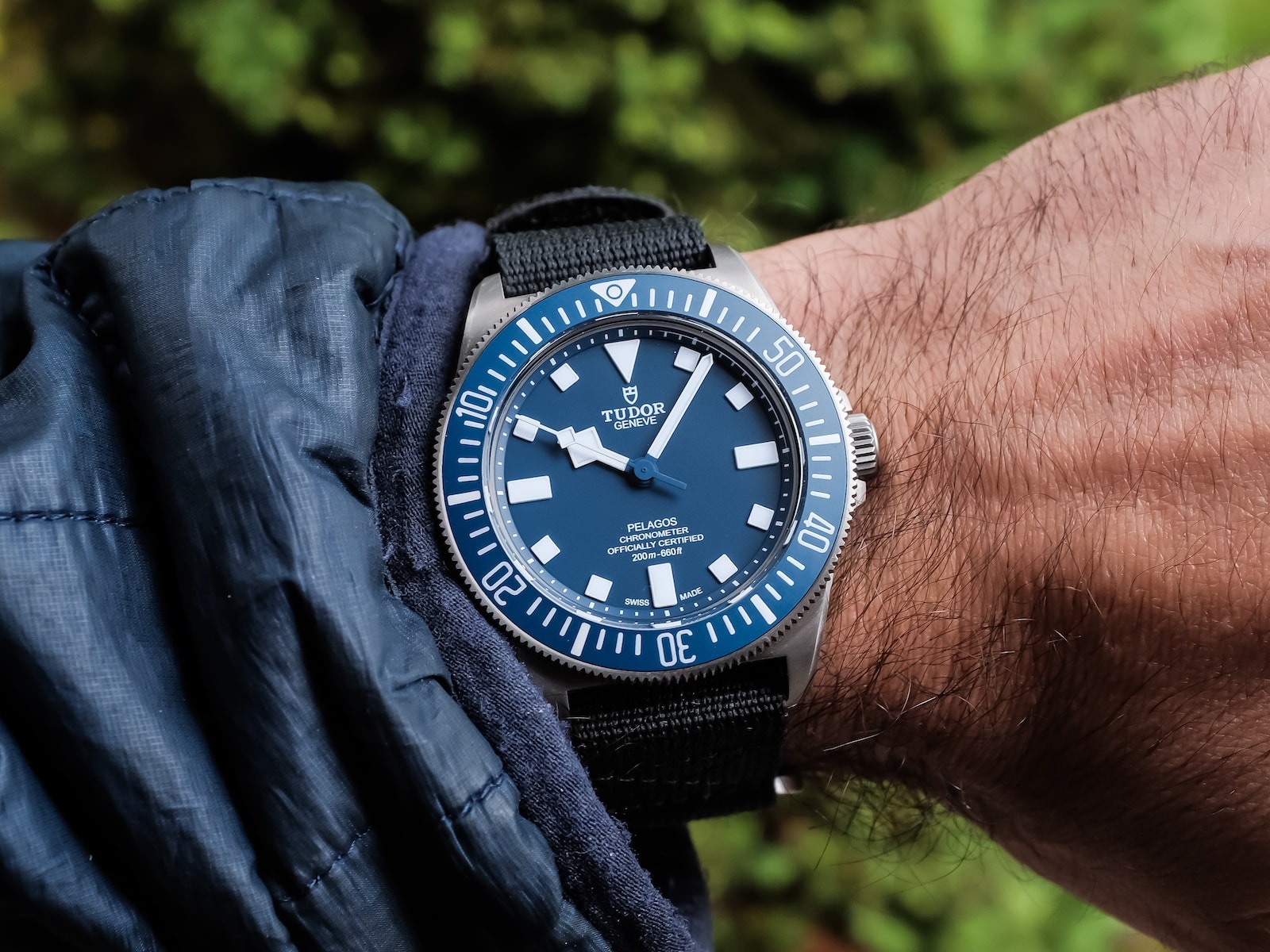
Earlier this week, we spiced things up a little by taking Hodinkee Happy Hour uptown to the Vandy Club. Before heading to the event space, guests arrived at the Watches of Switzerland One Vanderbilt showroom, where they were greeted by our Deputy Editor, Tim Jeffreys, and other members of the Hodinkee team. This gave several attendees the chance to be featured in a quick Wrist Check we filmed, which you can check out now on the Hodinkee Instagram. It was our first time hosting at One Vanderbilt, but the same energy and enthusiasm quickly filled the room (and outdoor terrace). Hors d'oeuvres—and plenty of watches—made the rounds as an evening of great conversation unfolded. Scroll through the photos below for a recap of the night. If you made it out, thanks for coming. For anyone who couldn't make it, be sure to keep an eye here on the site and on the Hodinkee Instagram for more information, as we will be announcing our next one soon! Left, Deputy Editor Tim Jeffreys admiring an attendee's 2002 Omega Seamaster Professional Chrono Diver. Zenith Chronometer Open 1969 Boutique Édition. A closer look. A 42mm Tudor Pelagos FXD Marine Nationale MN21 in titanium. A Rolex Oyster Precision Reference 6426. The Hermès H08 Limited Edition for Hodinkee. Left, Hodinkee Head of Video David Aujero chatting with chef Jayesh Kumar. From top to bottom: the Tudor Black Bay 58 Nike employee edition with a custom band and an Omega Speedmaster 50th Anniversary. A closer look at the Omega Sp...
 Worn & Wound
Last Thursday evening, the Windup Watch Shop Showroom filled up fast as we welcomed our friends from Islander for the worldwide debut of the brand-new Islander Saltaire Solar Diver. All evening, the room buzzed with the particular energy that only a first-look launch can bring—the chance to be among the very first people anywhere to see, handle, and try on a watch that, until that night, most of the enthusiast world had only seen in renderings. The Saltaire Solar Diver took center stage from the moment the doors opened. Displayed for the first time in the metal, the new release drew a steady crowd around the display trays, where attendees leaned in to study the dial textures, the case finishing, and the solar-powered movement that gives the watch its name. Being in the room for a debut like this is its own kind of experience; there’s a real difference between reading a spec sheet and feeling a watch land on your wrist for the first time, and the Showroom gave everyone the space to do exactly that. Adding to the occasion was the Islander Watch team themselves, on hand throughout the evening to talk through the new diver and answer every question the crowd could throw at them. Chief among them was the one and only Marc Frankel, whose brand leadership and enthusiasm for the community was on full display all night. Getting to hear directly from the people behind the watch, turned a launch into a genuine conversation between a brand and the enthusiasts who love it. Of co...
 Worn & Wound
It wouldn’t be summer without a proper skin diver or regatta timer, or how about both? Roughly one year ago, we got the latest reimagining from Albishorn, giving us a mash up of two seafaring classics with the brand’s signature vintage-inspired spin. The result was the Marinagraph, originally offered in two colors, one with a sunburst black dial with lume-filled applied silver indices called the “Classic Racing” and one with a bolder sunburst Paraíba tourmaline green dial with lume-filled black indices called the “Paraíba Racing.” The Classic Racing variant got its own pops of color with green accents on the bezel along with a red strap highlighting the red accents seen across both versions in the chronograph hand, tide indicator, regatta timer, and model name printed beneath the brand name in retro script. Needless to say, the debut duo of Marinagraph Classics offered an audacious combination of styling and functionality. This summer, Albishorn presents another pair of colors to join the collection, this time with a slightly more classic and sober design, aptly named the Classic Fume and simply the Classic. As a refresher, the foundation of the Marinagraph design draws inspiration from the America’s Cup crews, in particular those in the race’s renaissance. The 1958 edition marked the race’s return after a long hiatus post-war, and one of the standout vessels was Columbia, the American yacht representing the New York Yacht Club. This vessel notably feat...
Question, suggestion, or just want to say hi? Drop a note.
Comments 1