
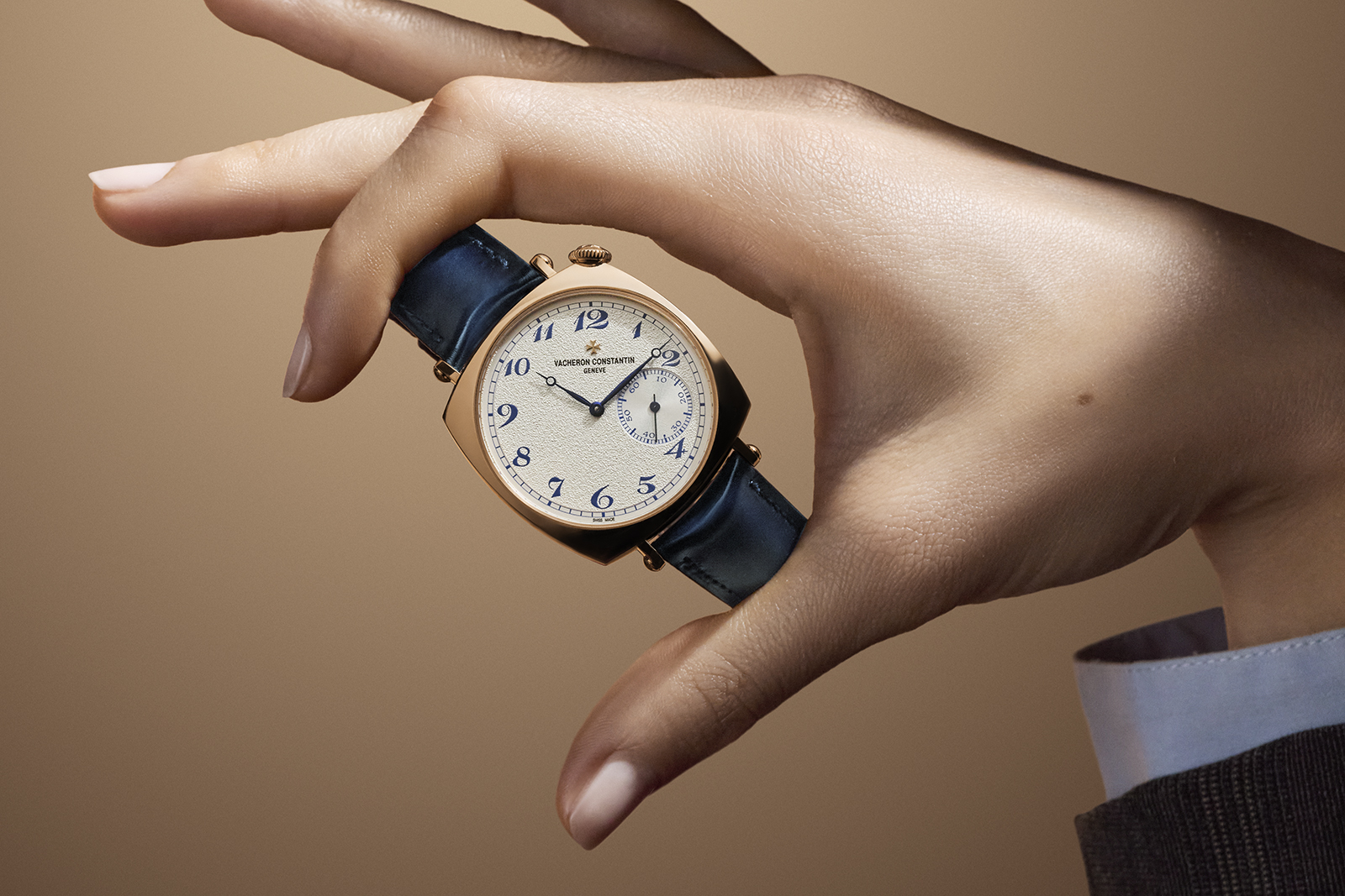
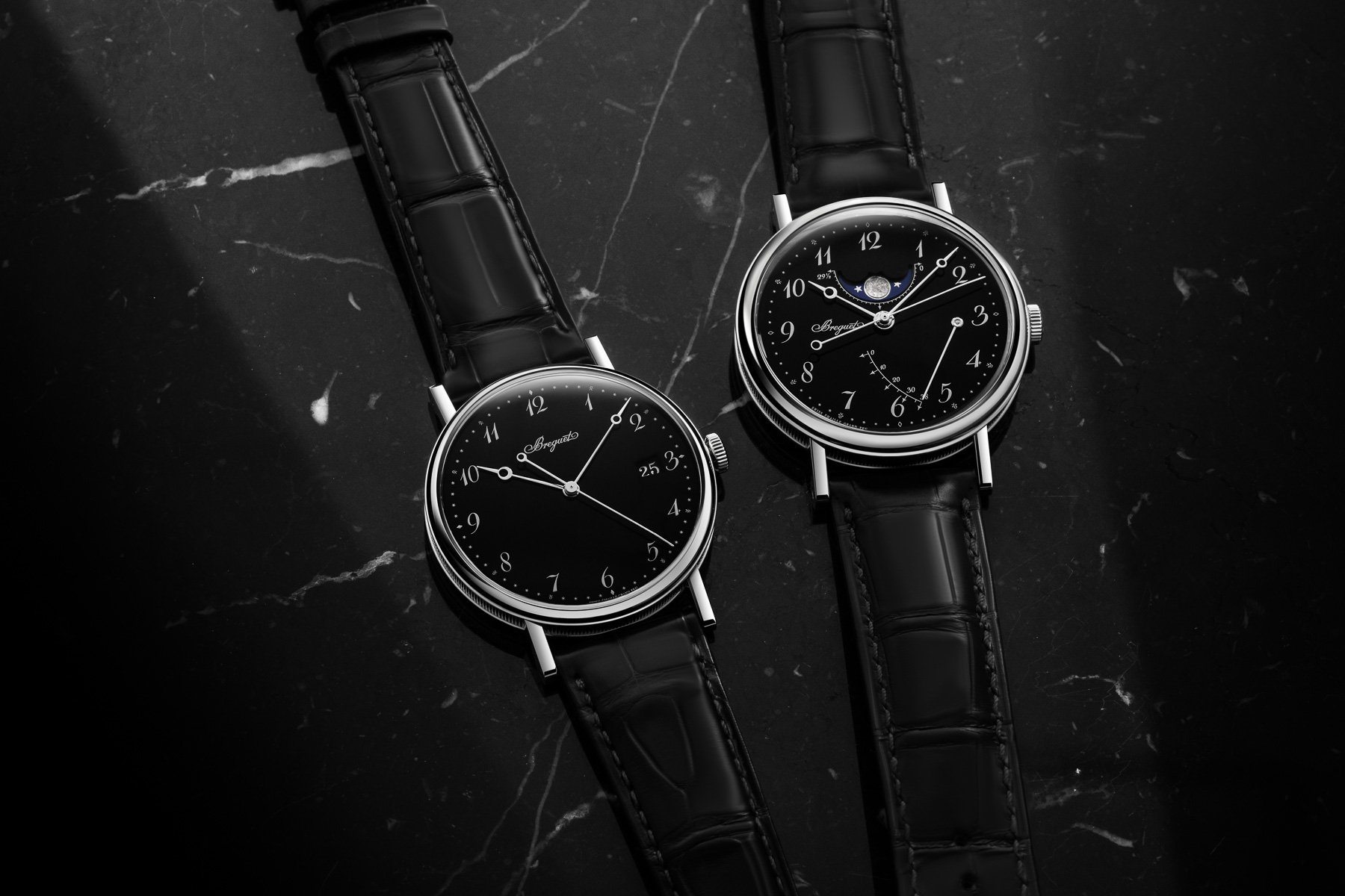
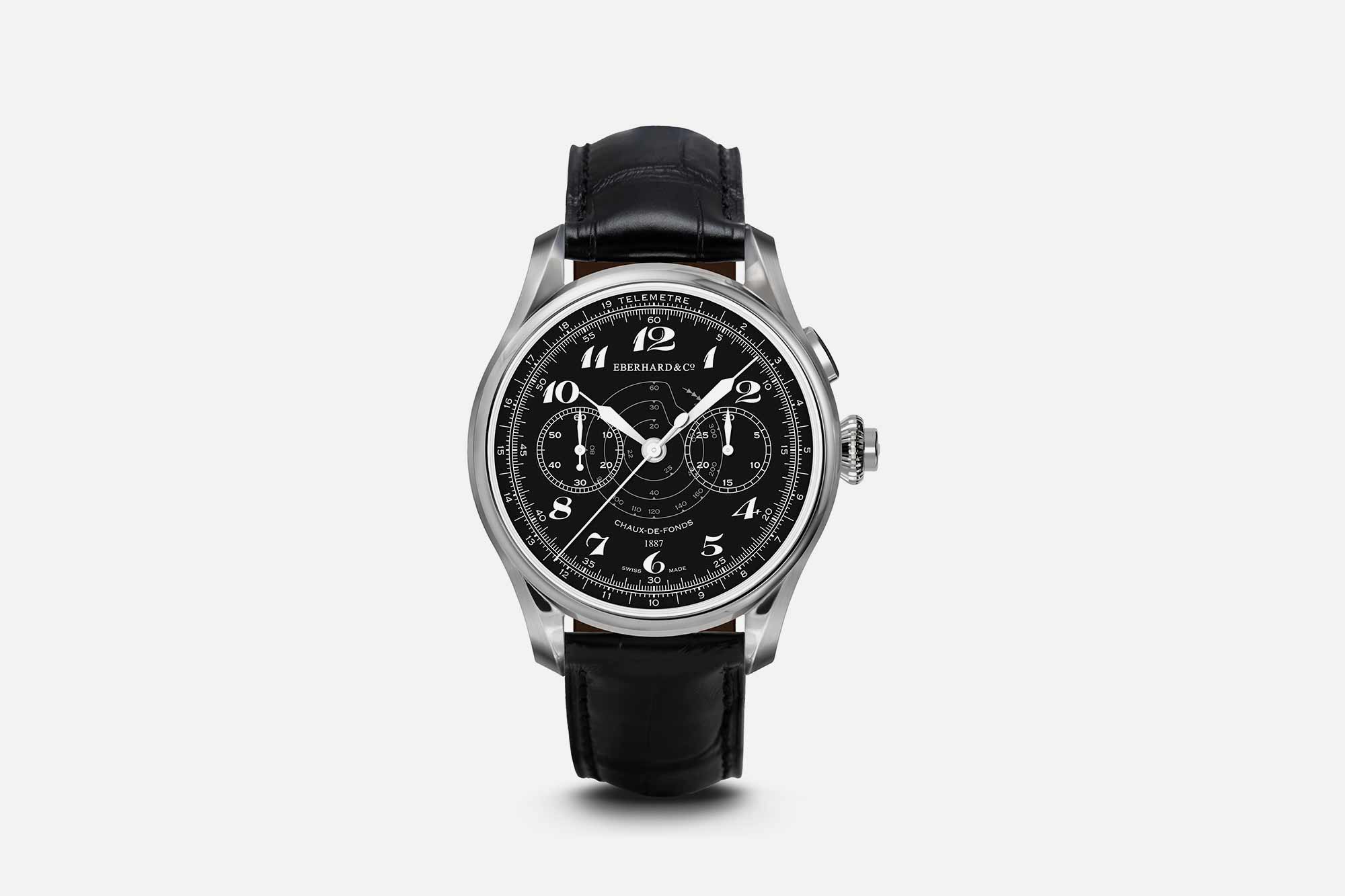
Breguet numerals are the cursive, italic, thick-thin-contrast Arabic numerals designed by Abraham-Louis Breguet for use on watch dials around 1790. The numerals appear consistently on Breguet pocket watches from the late 18th century through Breguet's death in 1823, and were used by his successors and son Antoine-Louis Breguet through the 19th century. The original design intent was a balance between maximum legibility (the cursive forms read clearly at small sizes) and visual elegance (the curves work as dial decoration alongside Breguet's other signatures: blued pomme hands, guilloché dials, secret signature engraving).
The numerals have several distinctive characteristics. Thick-thin contrast: the vertical strokes are thick, the horizontal/curved strokes are thinner, producing a visual rhythm that reads from a distance. Italic posture: every numeral leans ~5-10° to the right, giving the dial a sense of movement and energy. Cursive forms: the 2 has a flowing rounded loop, the 4 is open-topped (no closed triangle), the 8 is two stacked teardrops with a thin neck, the 6 has a rounded outer curve and an open inner counter, the 9 is a mirror of the 6. The numerals work together as a coherent typographic family rather than as 10 unrelated glyphs.
"The Breguet numerals are not difficult to make. They are difficult to make correctly. There are 230 years of variation in how brands cut these numerals, and most cuts are wrong in some small way that the eye can't name."- Hodinkee Reference Points, Breguet design language essay
After Breguet died in 1823 and the firm passed through generations of family ownership and eventual decline, the numerals were preserved in the firm's archives but stopped being a commercial signature. The 1973 Chaumet acquisition of Breguet revived the firm; in 1976 Chaumet relaunched Breguet with a deliberate return to the founder's style, including the numerals. Daniel Roth, then head of Breguet design, codified the modern Breguet visual identity around 1979-1989, the numerals, the pomme hands, the secret signature, the fluted case band, the guilloché dial, all directly traced to Breguet's 1790s catalogue. The design is now the canonical Breguet visual signature.
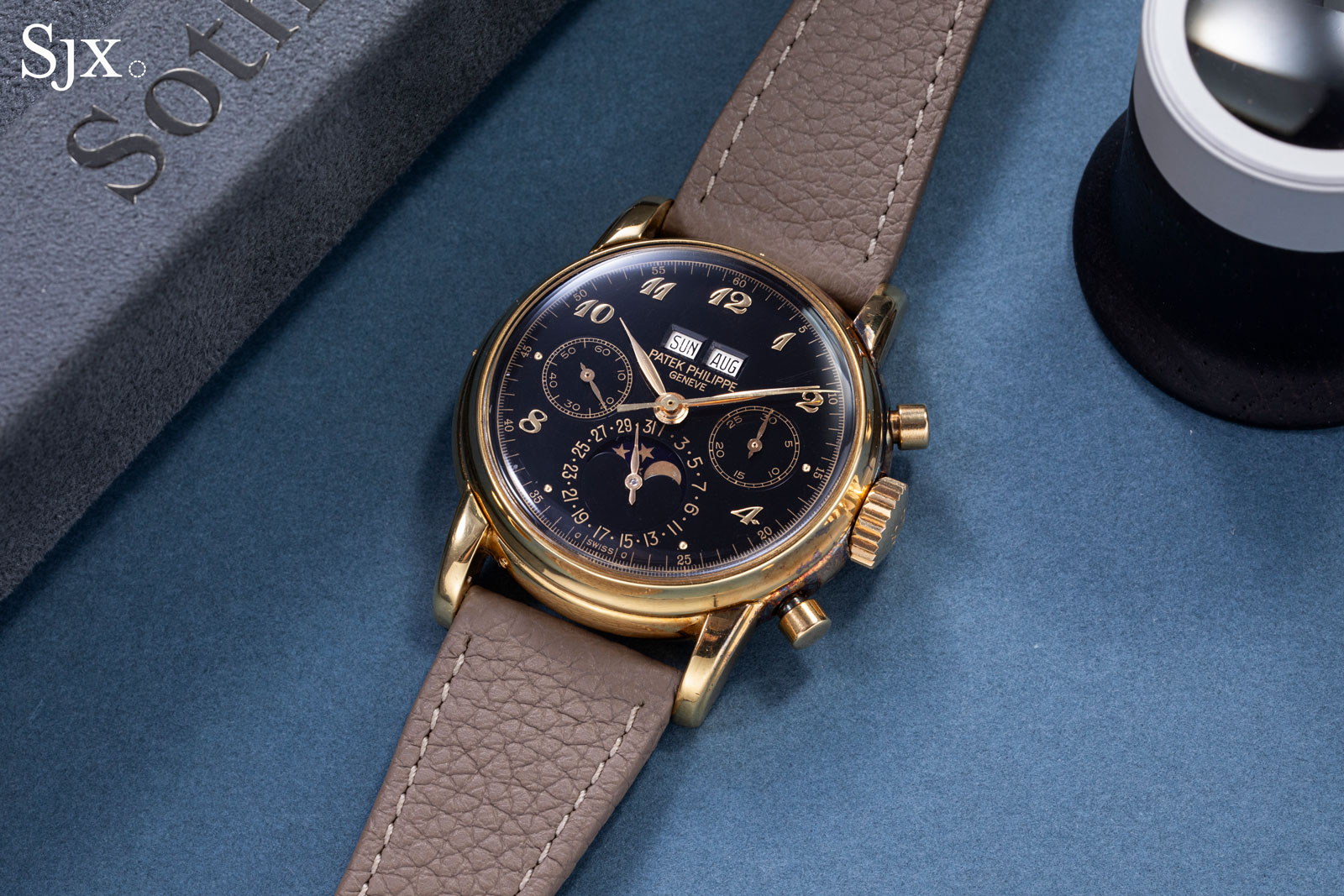
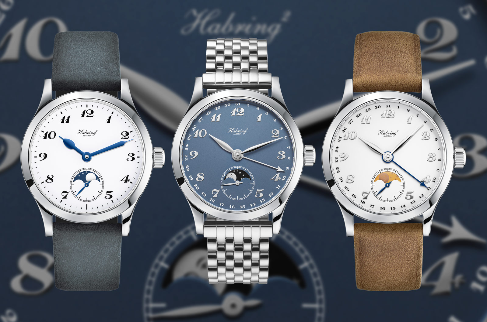
Beyond Breguet itself, the numerals have been adopted by virtually every haute-horlogerie house. Patek Philippe uses them on selected Calatrava dress references; Vacheron Constantin on the Patrimony Tradition and Métiers d'Art; AP on classical references; JLC on the Master Ultra Thin and Geophysic; F.P. Journe on the Chronomètre Bleu and Octa Calendrier; Andersen Genève, Chronoswiss Régulateur, Speake-Marin, and many smaller independents. The numerals communicate "haute-horlogerie dress watch" in a single visual cue.
The numerals are also occasionally seen on non-haute-horlogerie watches as a stylistic borrowing. Longines Heritage Master Collection and Junghans Meister Pilot use Breguet numerals; mid-tier brands like Frederique Constant, Mido Multifort, and Maurice Lacroix Pontos include Breguet numeral variants. The form is not trademarked or proprietary; any dial maker can reproduce the numerals in their own font cuts, though the precise proportions used by Breguet itself remain the reference standard.
In modern collector vocabulary, "Breguet numerals on a guilloché dial with blued pomme hands" is shorthand for classical haute horlogerie dress watch, the visual antithesis of the steel sports watch. The combination has been criticised as conservative or formulaic in some contemporary watchmaking commentary, but persists because it works: the typography is legible, the proportions are timeless, and the signals it sends (heritage, refinement, formal occasion) are exactly what a haute-horlogerie dress watch is meant to convey.


Comments 2